Sales are no longer about reaching out for leads at random or shooting in the commercial dark – they’re about making data-driven decisions that result in genuine revenue-boosting opportunities.
In the Age of Information, data is all around us. If your sales team can use it to its advantage, your business has everything to gain. That’s where sales performance charts come in.
These days, working with rough estimates or ambiguous data will not get you ahead of the competition – working with accurate, interactive visualizations will. And in this hyper-connected landscape, sales charts and graphs are powerful tools that will improve your performance. That said, in this post, we’re going to explore 25 sales graphs and charts that will fuel your imagination while providing you with some useful resources for your business’s revenue-boosting activities. In examining these dashboards, you will also gain a clearer understanding of what type of chart is used for sales.
These charts and graphs each illustrate crucial aspects of your sales BI department that you would be well served to know in-depth and keep track of. And rather than using Excel or Google Sheets to do so, you can focus on these charts instead. Because after all – a business dashboard is worth a thousand Excel sheets.
What Are The Different Types Of Sales Graphs & Charts?
From sales performance and targets through to customer acquisition costs, sales cycle, and beyond — here, we’ll present sales graphs and charts that matter to the ongoing growth of your business, in turn considering the essential question, what type of charts are used for sales?
Without further ado, let’s get started.
1) Sales Graphs For Optimal Performance
If you’re looking for a broad overview of your sales performance, this sales growth graph should do just the trick. It tells you how many new customers you’ve gotten this year, how much revenue each one of those customers is driving, and how much each of those customers costs to acquire – along with many other useful sales KPIs and sales chart data.
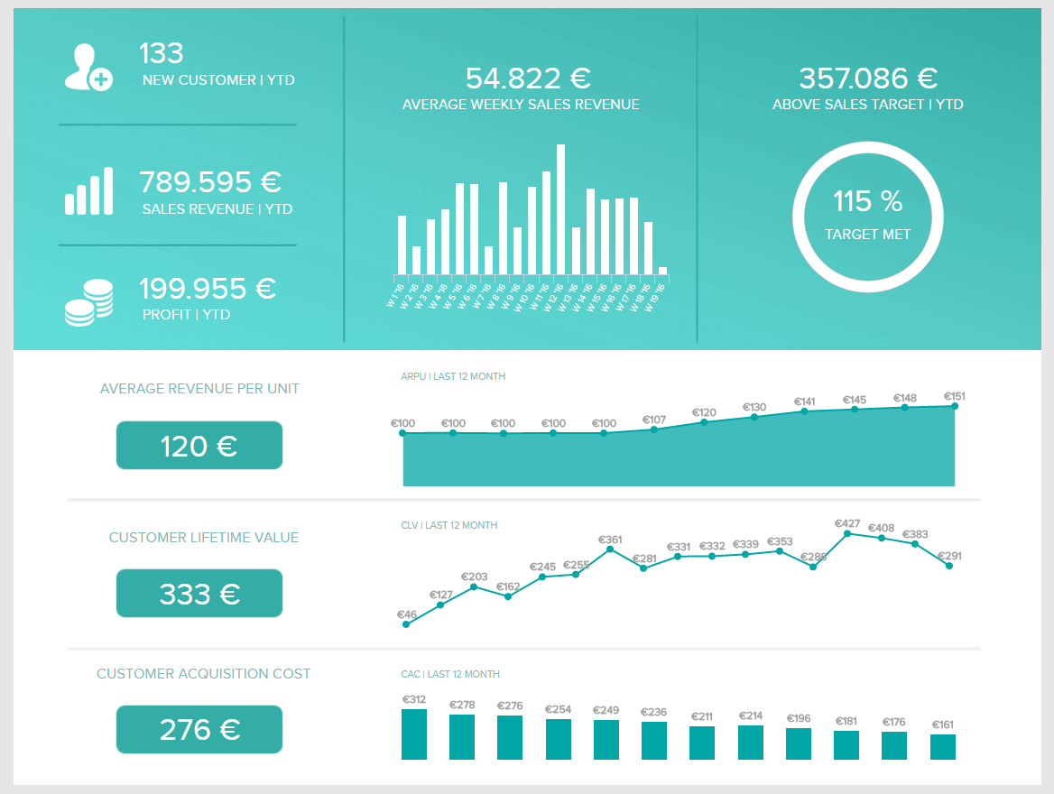
**click to enlarge**
Note the mix of graphs to present sales that show trends over time and standard numbers. This gives to that sales graph an overall sense of visual contrast which makes it much more digestible at a glance.
However, keep in mind that the sales graphs available on datapine are very customizable – so if certain KPIs on this template are too broad for your liking, you can make them more granular at will. Let’s examine how you can do so with the following sales KPIs, created for a comprehensive sales report.
2) Customer Lifetime Value (CLV) Sales Chart
When it comes to sales performance, gaining an insight into how much revenue you can expect to generate per customer is essential. This graph to present sales will help you do just that.
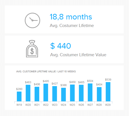
Typically, to calculate your CLV, you need to take away your customer acquisition cost (CAC) from the total level of revenue that you expect to generate from a new customer over the lifetime of your relationship.
The longer you retain your existing customers, and the more they spend, the healthier your sales revenue will be. When you can monitor your CLV with ease, you’ll be able to nip any potential issues in the bud while gaining the information you need to formulate loyalty-boosting initiatives. This is an essential sales graph per week for any modern brand or business.
3) Sales Target (Actual Revenue vs Forecasted Revenue)
The second in our rundown of sales chart examples hones in on sales targets. Setting goals and then keeping track of whether those goals are being met is a hallmark of high-performing teams. After all, if you have no idea what you’re aiming for, it’s pretty hard to achieve it.
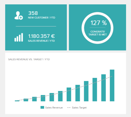
This granular graph, created with a modern dashboard creator, shows you several KPIs related to sales revenue, including the number of new customers you’ve signed up so far, your total revenue to date this year, and how your month by month projections have tracked with your actual revenue.
It can be really useful to see if certain months are higher in sales revenue than others so that you can plan on those trends in the future and not be surprised by having some very low months and other peak months of revenue.
4) Customer Acquisition Cost
Your customer acquisition costs (CAC) is one of the most important KPIs you can keep track of. If all you kept track of was customer lifetime value and customer acquisition cost, you could see a lot of important data about your business.
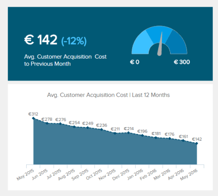
Fundamentally, it’s ideal to have your CAC as low as possible. However, if you have a higher CLV than your competitors, you can beat them by being able to afford a higher CAC.
For example, let’s say you have a website selling digital products of varying prices. If you can set up your email marketing and your marketing funnel to boost your CLV, then you can spend more on Google or Facebook Ads to get customers than your competitors can. In the long run, that’s a pretty powerful competitive advantage.
All of this to say: CAC is important, but it should be viewed in relation to other KPIs and you don’t necessarily need to make it as low as possible. With that being said, this sales chart template will allow you to see the trends in your CAC over time. If you haven’t been strategically embracing a higher CAC, this graph can serve as an “early warning system” for a rising trend. A definitive sales graph example for any growing organization.
5) Average Revenue Per Unit
This sales graph is incredibly useful, as it shows you how your costs of acquiring new customers are comparing to the revenue you’re earning from each customer.
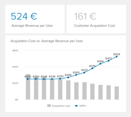
To calculate ARPU, you just divided your total monthly revenue by the total amount of customers you have that month. Again, this revenue graph can serve as a warning system to make sure that you’re staying profitable in the short term. CLV is great and all, but cash flow is king when it comes to keeping the lights on.
A sales graph example generated with a dashboard builder that will prove invaluable regardless of your niche or sector.
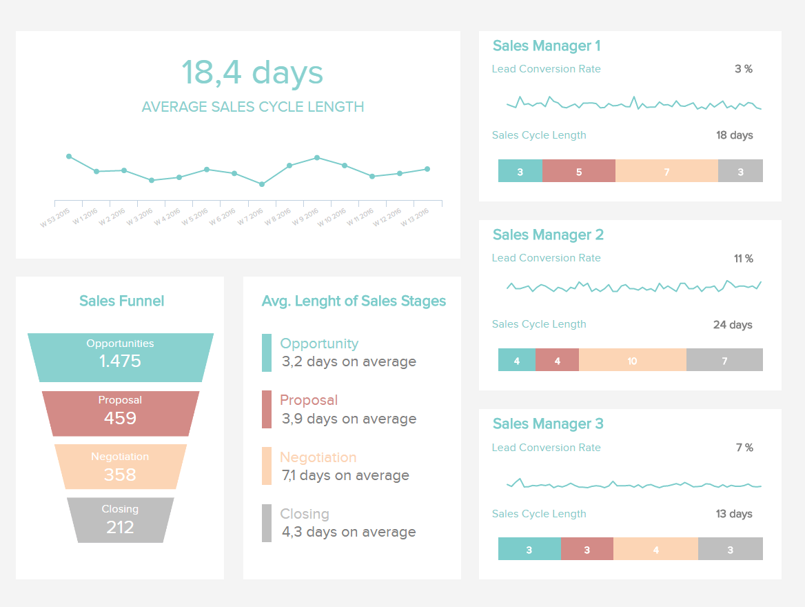
6) Sales Cycle
This sales graph tracks how long it takes accounts to get through your sales funnel on average, all the way from identifying an opportunity to closing an account. All else being equal, a shorter sales cycle is better, and so this graph’s ability to compare your different sales managers/representatives closing rates can show you who your top performers are.
**click to enlarge**
Just make sure to see the size of the deals your managers are closing, and keep track of the CLV of those customers. Because all other things are rarely equal – you may find that one sales manager takes a long time to close deals, but regularly signs large packages with customers that stay on for a while. Telling that manager to shorten their sales cycle could backfire. A sales growth graph that will help make your business robust, adaptable, and of course—profitable.
7) Average Sales Cycle Length
If you need to optimize your sales funnel for increased success, this revenue chart template will work wonders for your business.

If you can optimize your sales cycle for maximum fluency and efficiency, you will be able to shorten it in the process, encouraging more bottom line-boosting sales. Optimizing your sales funnel is effective, as the potential for prospects to engage with your business and, ultimately, convert to paying customers will increase. This will have a positive impact on your bottom line.
A pivotal cog in the machine that shows you how to create a growth chart for sales, this is one of our sales cycle-focused key performance indicator examples that offers a clearcut glance at your current sales cycle performance – data that will empower you to make decisive changes that yield positive results.
8) Sales Conversion
Number 6 on our list is a sales graph example that offers a detailed snapshot of sales conversion rates. that Increasing revenue in a sales-based business can come from several areas, broadly speaking. You can increase the number of leads you target, increase the size of the deals you close, increase customer retention rates, or increase the conversion/closing rates of the leads you currently have.
**click to enlarge**
This sales graph enables you to understand how effectively your team is converting leads to opportunities and opportunities to closed deals, both on an overall basis and for each sales manager. It also lets you see how many leads you are contacting, and gives you a granular step by step breakdown of how many people make it to each stage of your sales funnel.
This lets you see what areas you should focus on. Yes, no sales team is perfect, and you can always get better at any of these areas, but this graph will help you to identify the “low hanging fruit” where you can invest a little bit of effort to get a large ROI.
If you enjoy working with databases, you can easily create this graph with the help of SQL reporting tools.
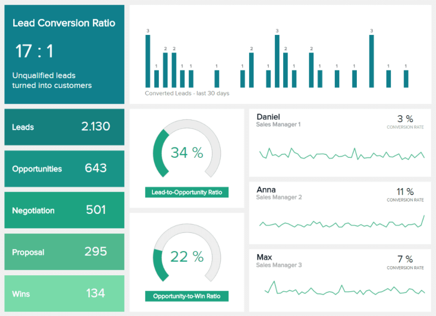
9) Lead Conversion Ratio
The lead conversion ratio is one of the most important metrics for any sales team, regardless of niche or industry.
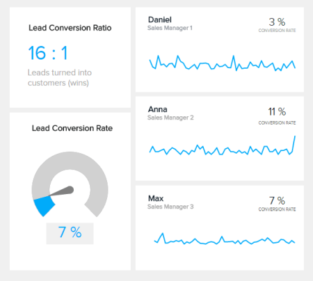
If your lead conversion rate is on the mark, you can rest assured that your sales pipeline is healthy. On the contrary, a poor lead conversions rate will show you that your sales pipeline needs immediate attention.
When it comes to your lead conversion ratio, every industry is different. While a one percent ratio might be healthy for one business, it might be detrimental to another. As such, setting a clearly defined baseline is essential for benchmarking success. Do this right, and you will start to see positive results.
This intuitive, easy-to-navigate KPI is an effective sales graph with territory managers and will keep you in the loop concerning your conversions at all times, keeping you alert, responsive, and efficient on a daily basis.
10) Lead-to-opportunity ratio
In the digital sales landscape, the quality of your leads matter. With so many prospective revenue-generating sources and touchpoints to consider, getting an accurate gauge of your lead-to-opportunity is vital. Cue this handy lead quality-centric revenue growth chart.
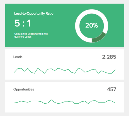
Based on the BANT principle (Budget, Authority, Need, and Timeline requirements), this priceless sales-based online data visualization will tell you the likelihood of a potential lead turning into a paying customer.
Your lead-to-opportunity ratio will give you a definitive insight into the number of leads you need to remain on track with your general revenue targets. Once you’ve set your baseline ratio, you will gain a working understanding of the number of leads you will need to earn a sustainable rate of revenue growth.
By gaining access to this invaluable information, you will be able to streamline your strategies for optimum success on a consistent basis – which is essential in today’s fast-paced business environment.
11) Opportunity-To-Win Ratio
Once you’ve qualified a lead, it’s still important to understand whether it’s likely to result in a bonafide sale or deal. This easy-to-digest KPI is the way to do so.
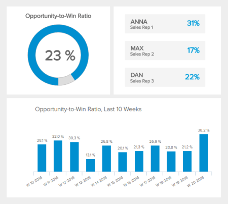
This essential chart will give you a definitive gauge of how your sales team or managers are performing in terms of closing deals or accounts – a crucial metric for ongoing growth, evolution, and success.
While some sales reps are naturals at converting discussions or conversations into sales or account conversions, others may struggle. If you know when and how to help your sales reps convert discussions into revenue-boosting opportunities, you’re likely to see your income soar.
This is a visualization that will empower you to understand, with confidence, how interactions and discussions can transform into profitable transactions with ease, and it’s one KPI that you can’t afford to ignore – a pivotal tool for improving conversions, performance, and qualifications processes.
12) Sales Growth Between Periods
This sales chart example is designed for accelerated business growth. If you’re on a committed, aggressive mission to push your sales numbers higher and higher each quarter, this graph will be your best friend.
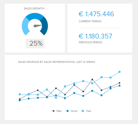
Not only does it show your sales revenue compared to previous periods, but it breaks things down by representative/manager as well, letting you know the rockstars on your team.
13) Revenue And Sales Interactive Management Overview
This is a really fun interactive sales graph, as it lets you see your revenue and sales according to different time periods that you select. In particular, the monthly view is extremely helpful. While it’s kind of neat to be able to look at sales revenue according to the day and the week, these views don’t really lead to any sort of actionable information.

However, being able to see that May is your best month for sales can lead to actions like doing a new marketing campaign in April to boost sales even further. A revenue graph that is worth exploring on a monthly basis by utilizing a modern KPI reporting software.
14) Amount Of Sales By Payment Method
This line graph lets you see how your different payment methods tracked over the previous year, both compared to each other and on an objective basis. This sales graph would be great if you just rolled out a new payment option like Paypal, or if you used Square at a booth to take payments and you wanted to see how much revenue was being brought in through these options.
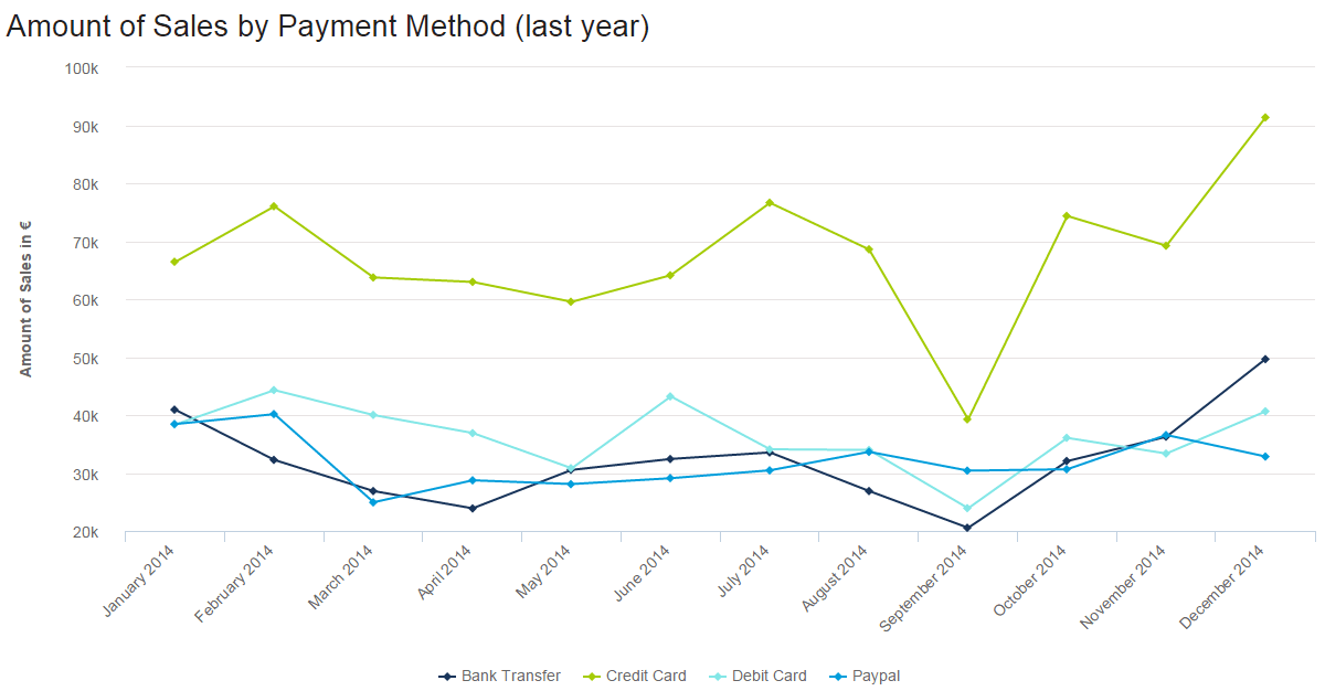
**click to enlarge**
You can also quickly and easily see overall revenue trends by month. For example, in this graph, overall sales dipped quite a bit in September before climbing up to normal and then higher than normal levels in October and December.
15) Sales Opportunity Dashboard
An invaluable sales graph for managers, this revenue chart template hones in on potential business leads throughout the funnel.
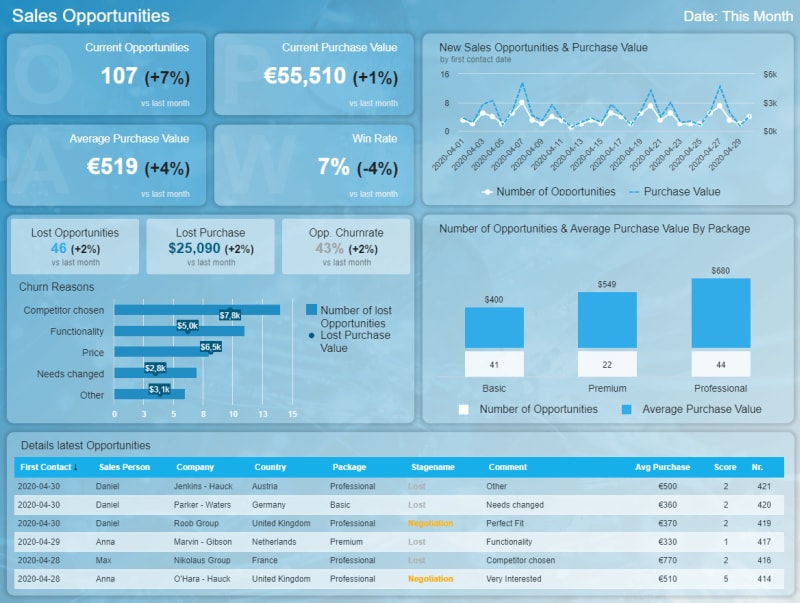
**click to enlarge**
Visually balanced with a mix of at-a-glance information, this dashboard has everything you need to monitor and make the most of your sales opportunity from a variety of sources while making vital operational improvements to your processes.
Featuring charts and data for direct performance comparisons as well as deeper pockets of information on how to generate revenue from various sources, this powerful online dashboard will also help your team to squash inefficiencies while pouncing on opportunities as they emerge.
Opportunities come and go swiftly, so you must seize them at the right time – which is where this dashboard offers so much value. It’s a revenue-boosting sales diagram for any hungry modern business.
16) Number Of Sales Opportunities
One of the most pivotal KPIs in our sales opportunity dashboard, this is a sales graphic that will help improve your sales management activities exponentially.

By gaining a clearcut insight into fresh sales opportunities and purchase volume, you will be able to formulate effective initiatives while spotting any potential bottlenecks early in the funnel.
If you want to fully optimize and boost the value of your various sales metrics, the number of opportunities chart should be high on your priorities list. While quantifying unqualified leads does have its role in business, only verified qualified leads are truly relevant to sales. As such, keeping a close eye on this particular KPI is wise.
This is a performance dashboard that will make your sales team more efficient, more adaptable, and better equipped to close in on opportunities across the board.
17) Sales Opportunity Score
A swift and effective means of prioritizing your sales opportunity, this is a revenue chart every sales team needs in their life.

An incredibly savvy way of displaying sales chart data, this dynamic chart will empower you to rate the potential of your available revenue-generating opportunities on a scale of one to five.
Arguably one of our most valuable sales visualizations, our number of opportunities KPI is an exceptional daily resource for exceeding your sales targets regularly, saving you unnecessary costs while increasing your revenue.
By using this chart, you will increase sales efficiency while gaining the ability to place your resources in the right place at the right time – a surefire way to arrange your priorities for increased operational efficiency and sustainable sales success.
18) Average Purchase Value
Another essential sales opportunity KPI, our Average Purchase Value visualization is one of the best types of sales graphs and charts for developing a sustainable growth strategy.

When looking at how to compare sales performance, this chart delivers. Simply compare your average purchase value with your performance in the past to create viable benchmarks for sales opportunities and growth. Your average growth value is integral to the health of your overall sales – as such, you should monitor this regularly. To see how you can upscale your analysis even more, we suggest you read our guide on data analysis techniques and methods.
19) Revenue and Customer Overview
Finishing with another “overview” style sales dashboard, this quarterly revenue and customer overview shows a ton of your most important KPIs in one, easy to understand format.
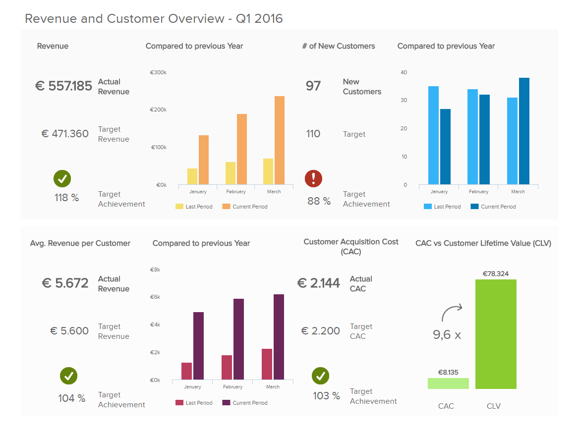
**click to enlarge**
Using a quarterly view is a great practical option for making data-driven decisions, as a month is often too short of an amount of time to see real changes, and a year is a bit too long to make course corrections. You can also adjust this visual and create it as a mobile dashboard.
20) Sales KPI Dashboard
The next in our definitive rundown of sales charts and graphs is the sales dashboard focused on key performance indicators (KPIs) that are integral to sales success as they provide a measurable means of formulating strategies that drive conversions and encourage incremental growth.
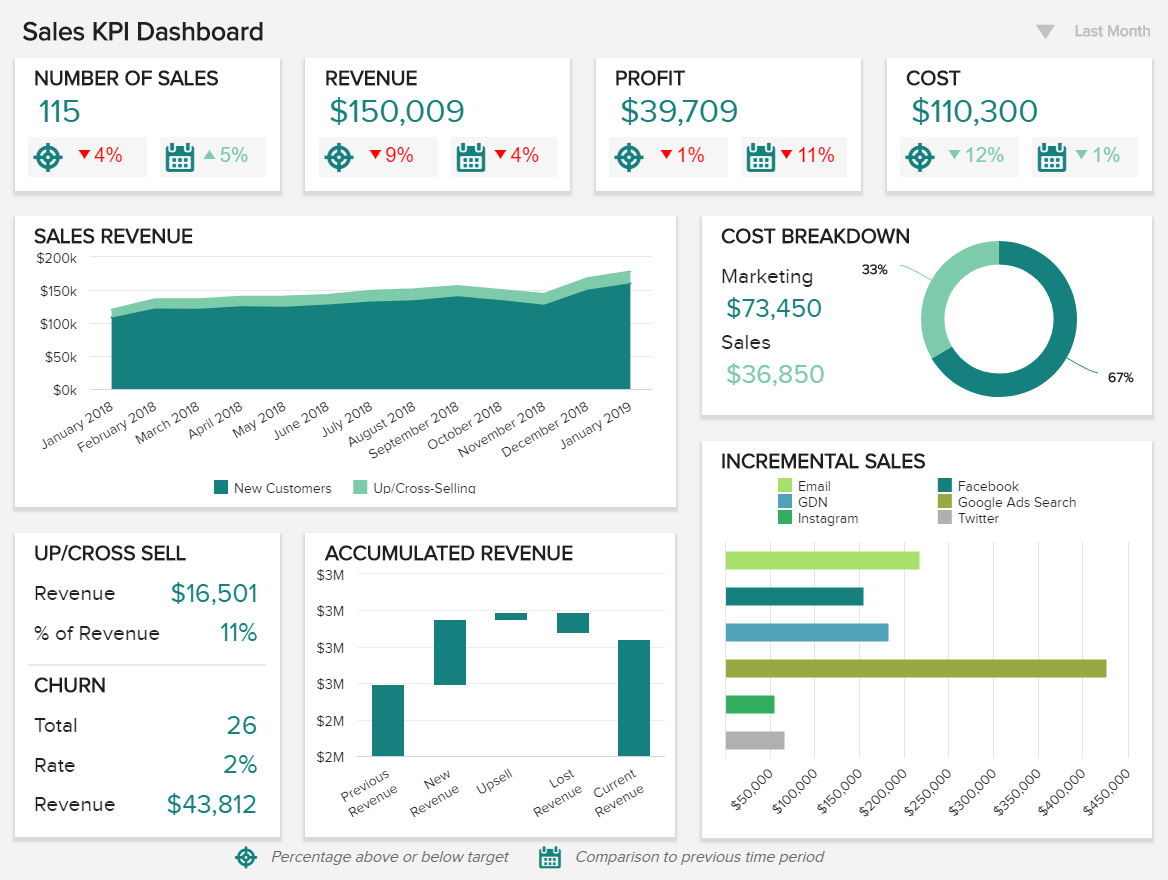
**click to enlarge**
This dynamic sales graph template presents a dashboard design mix of visual KPIs, all geared toward quantifying customer churn, tracking incremental sales levels, analyzing customer churn as well as upsell and cross-sell rates, and drilling down into profit margins. This is a business report example worth exploring since it can provide all the details for a strategic sales development of a company.
With a host of interactive sales graphs and specialized charts, this sales graph template is a shining example of how to present sales data for your business. A versatile dashboard for use on a daily, weekly, and monthly basis.
Primary KPIs:
- Revenue per Sales Rep
- Customer Churn Rate
- Upsell & Cross-Sell Rates
- Profit Margin per Sales Rep
- Incremental Sales by Campaign
Now that we’ve explored our cutting-edge sales KPI dashboard, we’re going to dig deeper into its capabilities by looking at the sales charts and sales graphs that make it tick.
21) Revenue Per Sales Rep
At its core, this particular sales chart template focuses on how much revenue your sales reps are bringing in for the business.
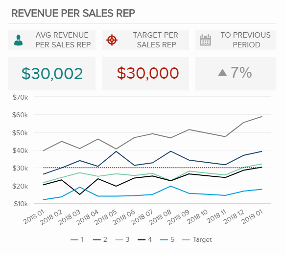
Presented as a coded line chart, this digestible sales template empowers users to extract critical revenue-related data at a glance and create strategies that will help your team perform more cohesively and efficiently.
One of the most essential sales charts for businesses across industries, revenue per sales rep is the key to fortifying your internal processes and providing the right support to the right people, at the right time.
22) Customer Churn Rate
As you are most likely be aware, acquiring a new customer is more costly than retaining one. That said, this most invaluable of sales graph templates will give you a clear indication of how many customers you lose over a certain timeframe.
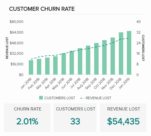
If you’re looking for an example of how to make a graph that shows sales trends, this sales report graph is worth examining. Clear, concise, and informative, this interactive sales graph sample will give you the tools you need to calculate your exact churn rates while spotting critical trends that will enhance your customer acquisition strategies. A must-have sales chart for any ambitious company looking to improve its sales strategically.
23) Upsell & Cross-Sell Rates
Existing customers are easier to sell to, which is what makes the art of upselling and cross-selling so powerful. Upselling is an effective strategy for fresh prospects, but by reaching a repeat customer at the right moment in the sales journey, you stand to boost your profits significantly.
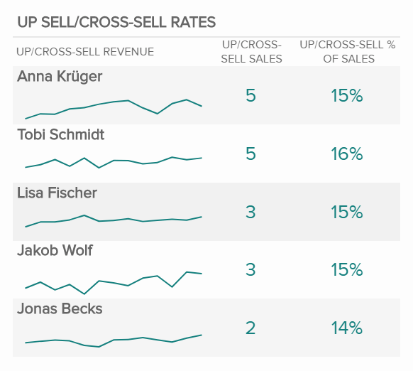
A perfect example of how to present sales data, this profit-boosting sales chart offers a panoramic snapshot of your agents’ overall upselling and cross-selling efforts based on revenue and performance. A sales comparison chart based on team performance and sales marketing strategy, this invaluable visualization will help you boost brand loyalty while squeezing maximum value from your daily, weekly, and monthly flow of customer conversions. Another essential example of how to make a graph that shows sales trends, the right way.
If you’re looking to upscale your performance management even more, you can explore our guide on various KPI scorecard examples.
24) Profit Margin By Sales Rep
Our next sales growth chart is another graph for sales that focuses on the performance of sales reps in relation to the ongoing health of the business’ profits.

In any business, profit margins count, and this sales comparison chart helps you draw direct conclusions by analyzing correlations between particular time periods, margins per sales rep, and sales target per rep.
By exploring these metrics periodically, you’ll be able to drill down into elements including commissions and bonuses, performance consistency, and areas that need improvement, gaining the ability to allocate your support as well as resources more efficiently as a result.
An essential monthly sales graph for strengthening your sales team while taking care of your business’s bottom line.
25) Incremental Sales By Campaign
Last but certainly not least in our rundown of sales graph examples is our incremental sales by campaign KPI. Incremental sales are pivotal to long-term business success as they will give you a definitive indication of which sales strategies prove most effective, which, in turn, will help your business grow, evolve, and prosper over time.

When asking yourself the question, ‘what type of charts are used for sales?’ it’s important to understand that you must account for incremental sales. This powerful sales report graph will help you do just that.
This most essential of sales graph templates offers a linear visualization of incremental sales success over time, coupled with a quick-glance snapshot of campaign revenue by channel.
By gaining visual access to this information, you’ll be able to make your sales initiatives stronger, more sustainable, and more economically efficient, boosting your bottom line while growing your audience consistently over time. A sales growth chart for perfecting small business analytics and large enterprise alike, looking to scale and remain relevant rather than sporadically making flurries of quick sales.
“Think analytically, rigorously, and systematically about a business problem and come up with a solution that leverages the available data.” – Michael O’Connell, chief analytics officer, TIBCO
The Secret To Sales Success: Knowing Your Numbers
To round off our journey into business-boosting sales graph samples as well as the dynamics of a monthly sales graph or sales graph sample, let’s consider how data can enhance the way we approach business sales in a strategic sense, according to these essential insights:
- 90% of the information transmitted to the brain is visual. By presenting your sales & marketing reps with digestible visual data, you’ll help them enhance their overall performance, boosting revenue as a result.
- 19% of buyers want to connect with a salesperson during the awareness stage of the sale process. By working with the right sales report chart, you’ll be able to reach out to your prospects at the perfect moment, increasing conversions in the process.
- 45% of today’s businesses run at least some of their big data workloads in the cloud. Cloud-based visual analytics tools will propel your business forward, helping you take charge of your sales strategies and get ahead of the competition.
- Businesses that embrace big data typically see a profit boost of 8 to 10% — a testament to using visual sales graph samples at the heart of your business strategies.
- Almost 50% of modern businesses state that big data and analytics have fundamentally changed business processes within their sales and marketing departments. Another undeniable insight into the power of using a sales report chart to boost business efficiency.
- 98% of sales representatives in the construction sector that have adopted data analytics as a part of their day-to-day strategy reported dramatic reductions in their timeframe for providing price quotes to new as well as existing prospects. While this insight is industry-specific, it certainly serves to highlight the efficiency of sales chart examples in the modern age.
- 62% of retail businesses report a clear competitive advantage by leveraging information and analytics as a core part of their business activities. By knowing your numbers, taking an analytical approach to your sales processes, and working with interactive, accessible data analytics tools, you will improve your sales exponentially, according to the same report from the previous point.
- A data-driven approach to your sales activities will ensure that your goals and mission statements align which, in turn, will help to catalyze your commercial growth.
“Most of the world will make decisions by either guessing or using their gut. They will be either lucky or wrong.” – Suhail Doshi, CEO, Mixpanel.
We’ve explored visualizations where you need to add a line chart showing a sales trends over the last 12 months; revenue comparison graphs; how to show an increase in sales on a graph; what type of chart will you use to compare the performance of sales of two products, and one thing is clear – sales graphs and charts will accelerate the success of your business while helping you grow consistently.
Knowledge is power, and this is especially true when it comes to sales. These 25 sales graphs offer you insights all the way from a broad overview of a very granular focus.
Selling your products or services to your target audience consistently, cohesively, and in a way that scales the business is pivotal to your survival, regardless of your industry or sector. By knowing your numbers and leveraging the power of the right metrics, you stand to set yourself apart from the pack, boosting your profits in ways you never before thought possible.
Whether you’re talking sales graphs, graph sales examples, sales chart templates, a dynamic sales comparison chart, or any other form of a dynamic visual dashboard, by analyzing the data that’s most relevant to your business’s sales goals, you will meet or even exceed your targets, time after time.
These different perspectives allow you to access all of the data you need to guide your company with business intelligence in the right direction and make sure you’re hitting your goals with the help of the right data quality management techniques. Additionally, some of these sales graphs can serve as effective early warning signals so that you can see potential issues with your cash flow before they become real problems.
Every one of these dynamic sales templates will help you improve your business, making it more informed, more economical, and more adaptable—the key ingredients to creating a booming business in our hyper-connected digital age.
Use these sales graphs and charts as inspiration for your own sales dashboards so that you can have at a glance actionable insights available to you at all times.
If you wonder how you can create effective sales graphs and charts for your own sales dashboard, start datapine’s 14-day free trial, empower your teams, and have at a glance actionable insights available to you at all times.
The post Take Advantage Of The Top 25 Sales Graphs And Charts To Boost Your Business appeared first on BI Blog | Data Visualization & Analytics Blog | datapine.