Companies need to collect, store, monitor, and analyze massive volumes of data in order to manage business performance and successfully deliver profitable results. No matter if your company is small or large, there is a great chance that you’ve been using SQL as the tool to-go when it comes to managing and extracting value from your database. There is still lots of relational database management included when it comes to online data analysis and different possibilities to perform the same. In some cases, you will need a coding solution where you can build your own queries, but in others, you will also look for a visual representation of your realational data. The good news is that you can utilize both with the help of a modern and professional SQL dashboard.
That said, in this post, we will take a detailed look into what is a SQL dashboard, how to create one (or several), and provide you with visual examples that will represent the undeniable power that SQL has on offer. In the end, you will be able to get an idea of what SQL can do for you, and if utilizing SQL reporting tools might make sense for your business, hence you can derive even more insights. But let’s start from the beginning and define this kind of a dashboard.
What Is A SQL Dashboard?
A SQL dashboard is a visual representation of data and metrics that are generated from a SQL relational database, and processed through a dashboard software in order to perform advanced analysis by creating own queries, or using a visual drag-and-drop interface.
While there are other data analysis methods you can use to analyze and optimize your results, a SQL data dashboard is based on a relational database that is updated in real-time, therefore you don’t need to pull reports that are set in the past. In other words, you don’t need to work with historical data since SQL dashboard software can do the hard work for you and automatically update any data you might possess. To use dashboards can be beneficial in many ways and, if you work with databases, you know how important it is to effectively build your analysis and continue delivering value to your business.
Moreover, you have the possibility to use online data visualization and with that in mind, each SQL metrics dashboard can be created and delivered with interactivity levels that traditional tools such as Excel simply cannot provide.
To put things into perspective, we will take a closer look at how to create SQL dashboards and learn about examples used in real business scenarios.
We offer a 14-day free trial. Benefit from great SQL dashboards today!
How To Create SQL Dashboards – Coding & Visuals
To be able to fully utilize a SQL database dashboard, knowing how to utilize SQL is of utmost importance. Once you have connected your database to your preferred online SQL query builder, it’s time to start with the analysis.
Here we will look at examples illustrated with datapine’s dashboard tool and focus on 5 topics that are important when you want to create your own SQL dashboard:
- Creating charts: The start of any analysis begins with creating charts in order to visualize your data or perform advanced cross-database queries.
- SQL Join: To combine and clean data you will use one of the most common SQL Join types (Inner, Left, Right or Full Outer Join).
- Interactivity: By utilizing interactivity, you can drill into your data as much as needed while keeping the dashboard visually clean.
- Comparing different time periods: Providing additional information to dashboard viewers can be achieved through comparing time periods that put numbers into relations.
- Comparing to previous periods: Similarly, comparing to previous periods will enable you to provide additional perspective in relations by implementing also a time filter.
We will start with the SQL chart creation option and show you how easy it is to work with datapine’s SQL report builder, visually and with the code.
1. SQL Chart Creation
When you want to use SQL to create charts, you can simply copy your own code or create a new one based on the chart type and the data you want to show. Let’s see this through an example.
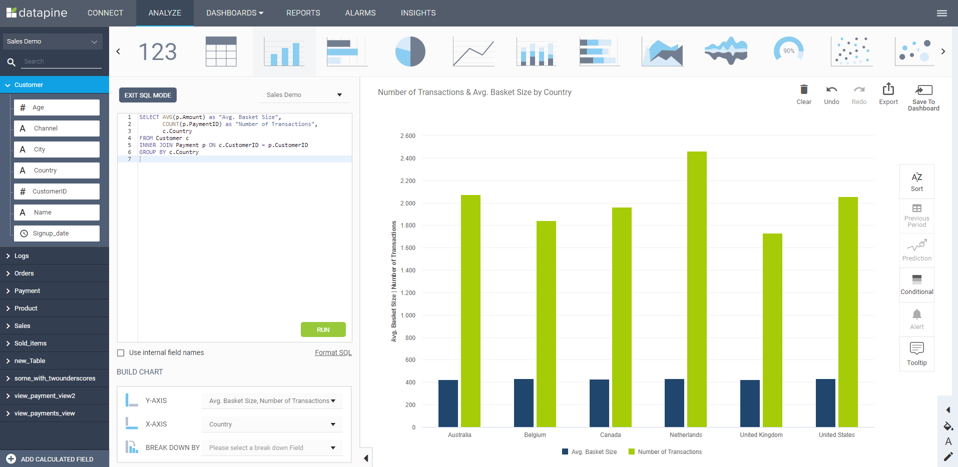
**click to enlarge**
The example above was created with the help of a SQL command that needs to be entered in the dashboard tool for queries in order to generate the visual on the right:
SELECT AVG(p.Amount) as “Avg. Basket Size”,
COUNT(p.PaymentID) as “Number of Transactions”,
c.Country
FROM Customer c
INNER JOIN Payment p ON c.CustomerID = p.CustomerID
GROUP BY c.Country
This simple command will enable you to utilize SQL in a way that shows results immediately, with numerous other options to adjust and tinker the data as much as you need. If you don’t want to use coding, a simple drag-and-drop interface will do the hard work for you. To learn more about different dashboard tips and tricks, you can check out our guide on how to create a dashboard.
Next in our article, we will focus on the SQL Join functions which are based on the concatenation (Concat) of strings to show you how different relations can be achieved through simple commands created with a dashboard tool for SQL.
2. SQL Join
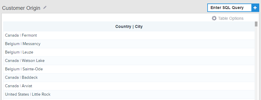
Sometimes you need to adjust the appearance of the data, therefore, you will need to join or clean underlying data (tables) or apply other advanced functions or formulas. That said, when you build your dashboard, it’s particularly useful to use SQL Joins for some chart types (e.g. dynamic textboxes) to customize the look of your dashboard elements. In essence, SQL Joins will combine rows or columns from two or more tables based on common fields behind them by using the Concat command. For a practical explanation, let’s say you have a customer table with columns that depict country and city, like in the example below:
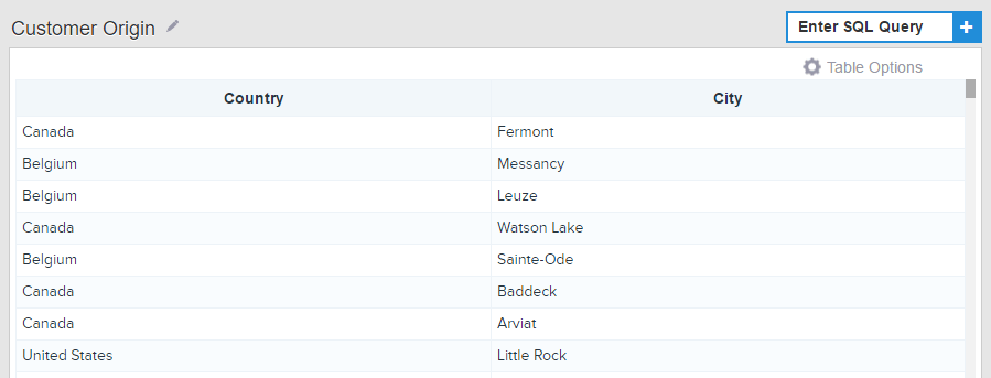
**click to enlarge**
To combine these two columns into one, a simple Concat command needs to be entered:
Select Concat(`Customer`.`Country`, ‘ | ‘ ,`Customer`.`City`) as ‘Country | City’
From `Customer`;
After the command is entered, your table will change and it will display the data in the following manner:
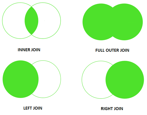
It’s useful to take into account that there are different SQL Join types, and the most common ones are:
- Inner Join: Most commonly used, this type of Join displays the set of records that appear in both tables. The result is a new table that contains all fields from the previous two tables. Simply put, this option will enable you to show just the rows that appear in both tables.
- Left Join: If you want to display every record from one table and the matching records from another, then you will use Left Join. In this case, if there is no matching data, the table will show NULL.
- Right Join: Similar to the Left Join, but with reversed roles, so you will return all rows from the right table and the matched rows from the left one.
- Full Outer Join: If you want to join both left and right tables simultaneously, you will use Full Outer Join.
Those are the most common types of Joins you will probably encounter during your work with a SQL server dashboard tool, but a visual representation of how they behave might give you a clearer picture:
We offer a 14-day free trial. Benefit from great SQL dashboards today!
3. Chart Interactivity With The Zoom Option
The zoom option is an excellent function to add to your charts and graphs since its interactivity will upscale your database dashboards and provide you with the opportunity to drill down into the smallest units of time without the need to overcrowd your visuals.
The command that is needed to create such an option is the following:
Select dp_zoom(DATE_FORMAT(`Sales`.`Date`, ‘%b %Y’)) as Date, COUNT(`Sales`.`SalesID`) as Sales
From `Sales`
Group by 1
Order by `Sales`.`Date`;
To look into the data on such a granular basis will enable you to keep the dashboard clean and avoid overcrowding the elements.
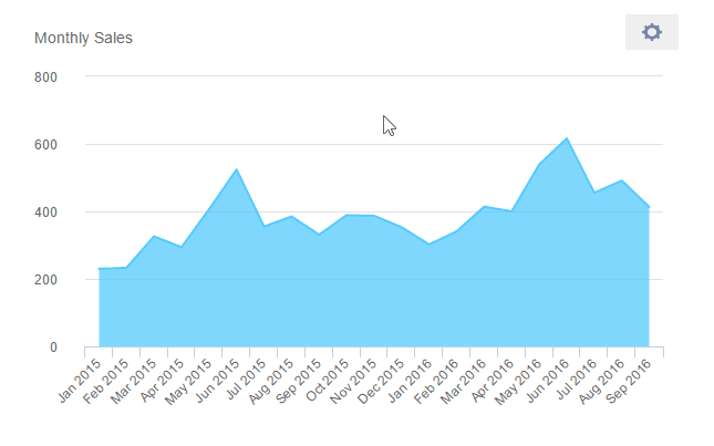
4. Comparing Different Time Periods
When you need to compare metrics to different time periods to see how your business is scaling and identifying trends, it’s useful to use a SQL dashboard tool for that very function. Not only will you be able to see the performance of your business over a set time frame, but compare it to other periods so you have a comprehensive overview of what has changed and how.
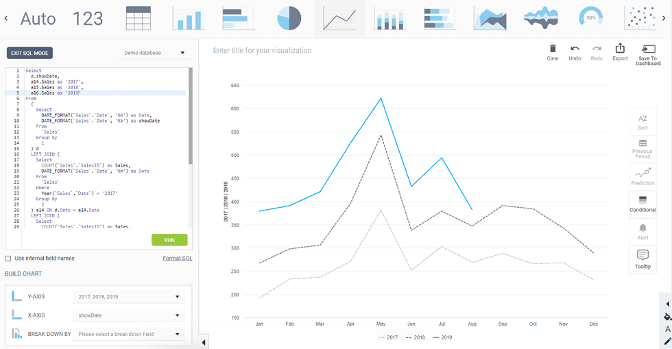
**click to enlarge**
In the example above we can see the command entered on the left side of the screen, and if a line chart is selected, the visual will look like pictured above. This will provide you with the opportunity to see how your numbers performed during different time periods, e.g., sales performance for the years 2017, 2018, and 2019.
5. Comparing To Previous Periods
By adding also the time filter to your charts, you can easily and automatically adjust your comparison to previous time periods. It’s useful in scenarios where you want to view the current performance and compare it to the previous year, e.g., by simply selecting the filter on your charts, as shown in the example below:
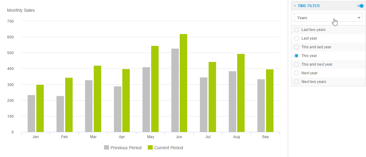
**click to enlarge**
Whether you need to develop a financial dashboard, procurement or sales, this option can greatly improve your view at the numbers since you don’t have to manually perform analysis each time you want to look at the data. By evolving your SQL server dashboard with visuals, interactivity, and filters, your analysis can be beneficial across the board. It can also be favorable in ad hoc analysis, when you need to compile a one-time report so you can quickly take a look at a specific business question you need to answer on-the-fly.
SQL Dashboards – Start Building Your Own!
We have explained the basic definition and provided examples generated with a dashboard tool for queries, and listed some codes you can also use for the development of your own SQL KPI dashboard. When you need to focus on specific business metrics and generate numerous reports or perform basic and advanced analysis to outperform your past results, SQL will always be one of the best tools to do so. Let’s see how a final product can look like:
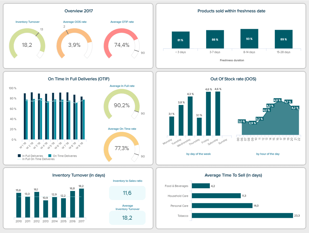
**click to enlarge**
The example above shows the true value of what you can accomplish with SQL. Building an FMCG dashboard by using advanced SQL commands or simply drag-and-drop desired values will prove to be the most efficient way to analyze massive volumes of data. Our example shows crucial metrics such as the out of stock rate, inventory turnover and the average time to sell, among others, to help an FMCG company in improving performance, avoiding inventory issues and maximize profits.
We offer a 14-day free trial. Benefit from great SQL dashboards today!
Building such dashboards is a sure way to optimize and deliver the best possible performance, no matter the size of the company, industry or department. If you want to learn more about this exciting structured language, we suggest you read our rundown of the best SQL books. Finally, to start your own journey of building dashboards for SQL and utilizing both the code and visuals in the most effective way, try our software for a 14-day trial, completely free!
The post Create Modern SQL Dashboards With Professional Tools & Software appeared first on BI Blog | Data Visualization & Analytics Blog | datapine.