The financial health, flow, and fluidity of your business will ultimately dictate its long-term success, which is why monitoring your money matters carefully, comprehensively, and accurately is absolutely essential.
In our data-driven digital age, ‘business intelligent’ organizations with the ability to collate, organize, and leverage the insights that are most valuable to their ongoing commercial goals are the ones that are destined to thrive in the long-term. Online data visualization is taking precedence in business operations, creating more efficient and faster workspaces.
That said, in a time wherein less than two years, around 1.7 megabytes of new information will be generated per second for every single person on the planet, businesses looking to keep their financial affairs fluid need access to KPI dashboards equipped with financial graphs and charts that are digestible, accurate, and deliver the level of insight required to increase efficiency and stop potential pitfalls before they occur.
Download: A pocket-sized guide to invaluable financial graphs and charts
In this article, we will present the basic definition of financial graphs, explain why you need them, and answer the most basic of questions: what graphs to include in financial analysis? By presenting financial data graphically, you will not only make the most out of your monetary information, but simple visuals will do half of the explaining for you. That said, let’s get started.
What Are Financial Graphs?
**click to enlarge**
Financial graphs and charts visually track liquidity, budgets, expenses, cash flow, and many other financial metrics while helping businesses avoid a monetary crisis by leveraging financial data in real-time, with a comprehensive overview of financial information.
To ensure the best possible performance and financial health of a company, conducting regular financial analytics and ensuring the highest quality of data management must be the top priorities of companies no matter the size. If the finance department raises an alarm, everyone must carefully listen because it concerns the most crucial information and can lead to serious damages if ignored. That’s why financial charts and graphs need to be created with the utmost care and attention. Let’s see this in more detail.
Why You Need Financial Analysis Graphs?
As humans, we respond to, and process visual data better than anything else. That said, when it comes to digesting and taking action upon vital financial metrics and insights, well-designed finance graphs and charts offer the best solution. And according to Illinois State University, when it comes to visual aids of this kind, three standards apply: graphs and charts should display unambiguous information, meaningful data, and present said insights in the most efficient way possible.
Fundamentally, you need financial graphs as:
- You will be able to track your liquidity, cash flow, budgets, and expenses accurately with ease, visually, and automate processes that were oftentimes done manually and with higher risks of errors.
- By setting the right financial KPIs for your business, you will be able to set valuable financial goals that result in growth and success. While there are numerous charts out there, we will explain the invaluable ones for any business.
- You will be able to make sense of all the financial data and metrics as they will be split into actionable categories and presented in an intuitive, scannable fashion, no matter the metric you need to include and analyze.
- Pen and paper or static data will no longer cut it in today’s fast-paced, competitive and data-rich commercial landscape. As mentioned, manual work is prone to mistakes that you can easily avoid by using self-service analytics software.
“Every second of every day, our senses bring in way too much data than we can possibly process in our brains.” – Peter Diamandis, Chairman/CEO, X-Prize Foundation
Based on this quote alone, it’s clear that by leveraging the power of robust graphs that deliver accurate, reliable and clear-cut financial insights, busy finance departments will be able to make sense of the insights before them, resulting in success and evolution, rather than getting bogged down with droves of meaningless and convoluted data.
You can start by creating a simple income vs expenses graph, add additional charts relevant for your financial story and finally create a dashboard that will present all your data on a single screen. Let’s see this in more detail.
Which Role Financial Dashboards Play
**click to enlarge**
Data-centric financial dashboards, complete with charts and graphs assist in the tracking of all of your core financial KPIs on one navigable platform. For optimizing reports and detail analysis, you can check our blog article about financial report examples.
These dashboards give time-stretched finance departments the power to remain on top of the economic performance of the business, resulting in more efficient cash management, accurate expense tracking, comprehensive insights on sales, and additional visual data geared toward reaching valuable financial goals.
A financial dashboard offers all of the data, metrics, and insights needed to ensure the success of your financial performance, cash flow, cash management, and profit and loss analysis. The financial graph example above, associated with our business dashboard not only makes extracting key data swiftly but is developed in a way that makes communicating your findings to important stakeholders within the business far more simple. And in contrast to a traditional Excel chart, these financial graphs serve real-time data that will prove invaluable to the financial future of your business.
Not only your business will have the opportunity to explore, monitor and access real-time data, but the interactivity levels are an invaluable resource for managing enormous amounts of data, especially in the financial sector where a small mistake can lead to millions of damages. That’s why interaction with the finance charts and graphs is of utmost importance: a single KPI can be viewed in numerous useful ways and angles that static presentations could never offer. Graph use in financial reports is already a business standard in today’s environment. When you add up intelligent tools, automation, stunning visuals and interactivity, your finance department will significantly increase productivity, and decrease costs. Let’s see this through our top 15 financial charts templates.
See Here Our 15 Financial Graph Examples
To put the importance of a dashboard-based financial graph into perspective, here are 15 financial graph examples that cover the most critical money-centric aspects of the ambitious modern business.
1. Gross Profit Margin

**click to enlarge**
As a key component of our profit & loss dashboard, this financial graph has been developed in the form of a traditional pie-style chart but with a more navigable design. The gross profit chart showcases your overall revenue minus the cost of goods sold, divided by your total sales revenue.
Offering a visual representation of your gross profit as well as clearly defined metrics, this chart will allow you to measure your organization’s production efficiency and ultimately help you enjoy a greater level of income from each dollar of your sales.
2. Operating Profit Margin

**click to enlarge**
As another profit and loss-centric financial graph, this visual is split into an easy-to-digest percentage gauge in addition to a detailed bar chart and will help you to accurately calculate your Earnings Before Interest and Tax (EBIT).
The higher your operating income, the more profitable your business will potentially be, and this financial chart will help this metric from dipping through a mix of historical data and priceless real-time insights.
3. Operating Expense Ratio

**click to enlarge**
The operating expense ratio is also strongly related to the profit and loss area of your finance department’s key activities, and this color-coded health gauge will help you gain access to the information you need, even at a quick glance.
The operating expense ratio (OER) will give you the power to understand the operational efficiency of your business by comparing your operating expenses to your overall revenue. This is the best graph to show profit and loss, but you do need to connect with other charts to create a proper financial data-story. By monitoring this information regularly, you will be able to decide whether your venture is scalable and make necessary changes to your commercial strategy if you feel it isn’t – an incredibly valuable financial chart.
4. Current Ratio

**click to enlarge**
Closely tied to the cash management dashboard, this financial graph example is essentially a liquidity ratio that will give you the ability to understand how equipped the business is to pay your most critical obligations in the short-term, often within a 6 or 12-month period.
Presented in the form of two visual ratio calculations for swift access to your overall liquidity health or performance as well as a bar chart to help you compare data and spot trends, this financial chart will ensure that you will be able to meet obligations, commit to payments, and quash detrimental roadblocks before they unfold.
5. Net Profit Margin

**click to enlarge**
Presented in a similar format to the operational expenses ratio graph, this particular profit graph makes it easy for busy financial teams to obtain and analyze the information they need to delve deeper into the health of your bottom line, as a result gaining the level of insight required to boost your overall net profits.
As one of the most vital financial KPIs a business can track, this graph is invaluable – and by using this robust, reliable, and intuitive chart, you will be able to iron out any inefficiencies and boost your company’s net profit over time.
Download: A pocket-sized guide to invaluable financial graphs and charts
6. Accounts Payable Turnover Ratio
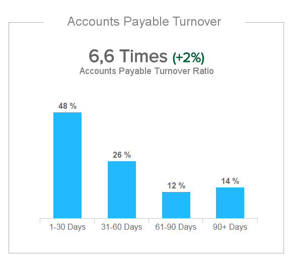
**click to enlarge**
Regarding the smooth and responsible handling of your company’s cash management activities, the accounts payable turnover ratio is another liquidity calculation that will ensure that you are able to pay all of your important expenses within the required deadlines or set timeframes.
The ratio itself changes according to real-time shifts and is displayed in a bold numbered format, while historical or chronological information is presented in the form of a bar graph that showcases turnover percentages, split into different periods of time. A higher ratio gives suppliers and creditors the assurance that your business pays its bills frequently and is a pivotal metric when negotiating a credit line with a supplier, so it’s a chart your company cannot afford to live without.
7. Accounts Receivable Turnover Ratio

**click to enlarge**
Presented as a scannable pie chart, accompanied by vital turnover metrics, this is a financial graph that quantifies how swiftly your organization collects your payments owed, thus showcasing your effectiveness concerning extending credits.
The quicker your business can transform credit sales into cash, the better your liquidity, ultimately translating to a greater ability to handle your short-term liabilities.
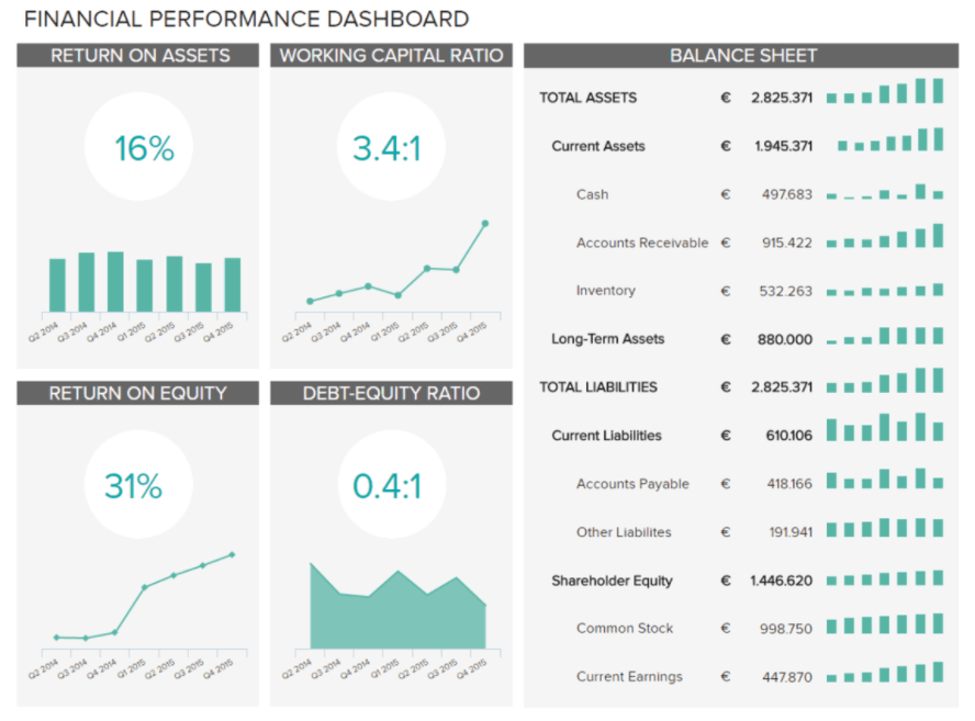
8. Return On Assets (ROA)

**click to enlarge**
This particular chart is incredibly useful as it’s a financial performance KPI that will allow you to understand how well your business can leverage its assets to gain more profit.
Displayed in an easy-to-follow bar chart and trend line format, this graph offers an exceptional visual representation of how profitable your organization concerning your overall asset. The bottom line here is: the higher your ROA, the better, particularly when you compare this metric to your direct industry competitors – so this chart is essential to your ongoing financial progress.
9. Return On Equity (ROE)

**click to enlarge**
This color-keyed financial graph offers a distinct measurement of the level of profit you are able to generate for your various shareholders. This particular metric is calculated by dividing your business’s net income (minus the dividends to preferred stocks) by the equity of your shareholders (excluding preferred shares) – not only does this provide an excellent gauge on financial performance but it’s also effective for comparison with other competitors within your sector.
The better your Return on Equity, the more value you are offering to your shareholders, which will translate to tangible long-term commercial success.
Download: A pocket-sized guide to invaluable financial graphs and charts
10. IT Cost Break Down

**click to enlarge**
This financial graph template focuses especially on the IT department, but you can easily adjust it for any other function in a company. We can see how the allocation of costs behaves in designated units (software, hardware, SP and personnel) while depicting the cost percentage of each of their elements (for example, administration, development, operations, and support). It’s crucial to monitor the expenses graph to identify the main cost drivers on the one hand and possibilities on the other, so that the company can adjust their strategies.
If you see that one unit spends significant amounts of financial resources, it would make sense to investigate further and check if the costs are justified or need more attention. By using a relevant online business intelligence software, you can directly interact with all of the data presented in this visual, and dig deeper as much as you need. Not only will you cut time into exporting, importing, scrolling and searching for the right information, but your comprehension will be much quicker since humans are visual creatures, as stated earlier.
11. Cost Avoidance
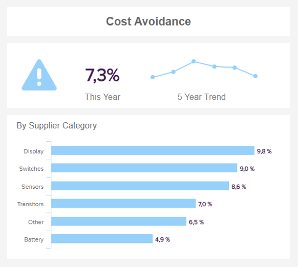
**click to enlarge**
Financial data visualization examples wouldn’t be complete without cost avoidance. This is one of the graphs that are important to take care of since it tracks how much costs, in this case, of a procurement department, have been saved in a specific time frame. You can also depict a 5-year trend like in our example above and organize by supplier category. This metric is not that tangible as direct cost savings, for example, but it does bring value to the whole procurement department.
The goal of every procurement professional is to reduce costs in the future (as well as the present), and this chart can easily depict how much these efforts have brought in a company and had a direct impact on the savings processes. For example, a procurement professional or manager can lock the price of a contract with a vendor to avoid a future price increase. To see more details of procurement operations and management, you can explore our set of procurement metrics.
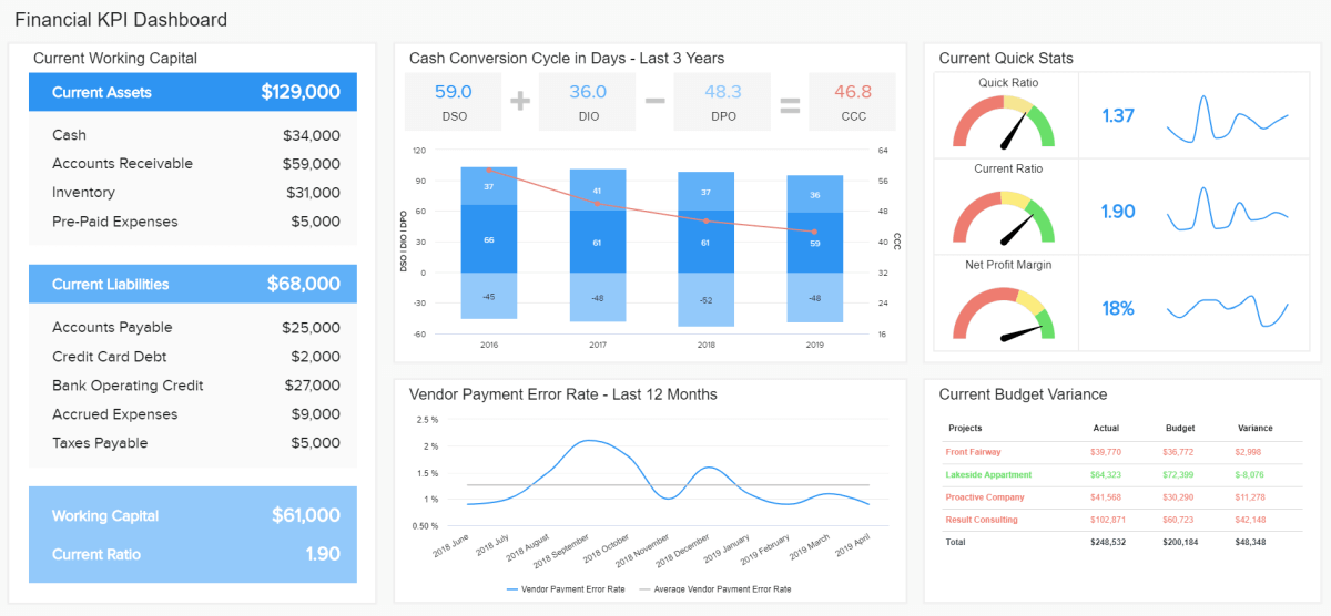
12. Cash Conversion Cycle

**click to enlarge**
The cash conversion cycle (CCC) is a financial metric that helps companies in tracking how much time a company needs to convert its resources into cash from sales. In our example, the formula is also simply depicted so that it can easily be followed: you need to add the days sales outstanding to the days of inventory outstanding and deduct the days payable outstanding to calculate the cash conversion cycle. If you use a finance graph that you can interact with, and calculates the data automatically based on your input, the possibility of making a human error is minimized. You don’t have to manually calculate each time you need a report, but you can monitor your data in real-time, with just a few clicks.
In the end, the goal is always to decrease the cycle as much as possible since an increment can mean that the organization is not fully efficient in its management and operations. It’s simple: if the company sells what consumers want to buy, the cycle is quick and healthy. If not, additional corrections need to be performed so that the company doesn’t fall into even more serious difficulties.
13. Vendor Payment Error Rate

**click to enlarge**
Paying invoices and issuing them to vendors, suppliers or other stakeholders is essential to analyze since it can show how many errors are made and if the accounts payable department is healthy. Of course, mistakes do happen, but sometimes they can be dangerous so they should be kept at a minimum. Errors may include payment to the wrong entity, overpayments or double invoicing, and each accounts payable manager usually strives to reduce those errors as much as possible.
A proper financial, analytical report can help in this process. When you automate your data and digitalize your analysis with the help of modern software tools, you don’t have to worry that your error rate will increase any time soon. In our example above, we can see that our average error rate is 1.3%, but it has started to decrease in the last months. The goal should be to have the lowest rate possible and avoid any possible business disputes.
14. Operating Cash Flow

**click to enlarge**
This cash flow graph gives a clear picture of the business operation’s performance. The example presented above shows how much cash a company generated over the course of 5 years. It doesn’t include investments and/or non-sales related income which basically means it focuses on main cash activities (for example, selling/buying inventory or paying salaries). This graph is important to track since it clearly depicts if a company can sustain its operations and eventually grow. It should be monitored closely and regularly to avoid any potential financial difficulties.
To create such a chart, there are some data visualization techniques that are useful to study and follow. That way your analysis and presentation of vital information will yield the best possible value and ensure the most profitable results.
15. Working Capital

**click to enlarge**
We will finish our rundown of the most prominent charts with the working capital. This is a straightforward graph that gives you an at a glance overview of the financial health of your company. It doesn’t include any ratios or proportions, but solely numbers that represent the state of your current liabilities, current assets, and the total working capital. If the working capital is high, you might want to consider investing the excess cash, as higher values don’t necessarily mean your company is performing well.
Download: A pocket-sized guide to invaluable financial graphs and charts
We have expounded on what graphs to include in financial analysis and explained in detail each, and we hope these financial graphs and charts examples have given you the inspiration you need to optimize your overall financial reporting and analysis. If you would like to for more data-driven, business-based pearls of wisdom, explore these sales report examples that you can use for daily, weekly, monthly or annual reporting.
To get a more in-depth knowledge of financial graphs essential for your business, you can test datapine for a 14-day free trial!
The post 15 Examples Of Financial Graphs And Charts You Can Use For Your Business appeared first on BI Blog | Data Visualization & Analytics Blog | datapine.