
The ability to monitor, visualize, and analyze relevant data gives today’s businesses, across a host of sectors, the power to understand their prospects, make informed decisions, increase efficiencies, and work towards a set of rewarding long term goals.
With so much data available to today’s brands and businesses, to extract every drop of value from an ever-growing raft of digital insights and set the kind of KPIs that will drive your venture forward, having an easy to use, a visually-stunning dashboard is key. That said, there are a host of cool dashboard ideas and designs available today, and we’re going to introduce you to 15 of the best, each hand-picked from our ever-growing selection of dashboard design examples.
Get a pocket-sized summary of our 15 most dazzling dashboard ideas!
The Value Of Different Dashboard Ideas & Designs
We will present dashboard ideas that communicate data analysis in an engaging, accessible way. Building an effective report following some dashboard design principles is crucial to a comprehensive BI process. That said, here are the primary reasons why data-driven design is so integral to business success:
1) Visualization: When working with your analytics and digging out insights from your data, the best way to understand it is through visualization. Great designs, created with a modern dashboard maker, will ensure that your data-driven insights become more accessible, helping you to make more informed, more powerful business decisions. On the contrary, poorly designed dashboards not only fail to convey essential information, but they can make your data completely incomprehensible and, therefore, redundant.
2) Focus: Well-designed dashboards are particularly effective as they offer a greater focus on specific areas of the business. A cool dashboard is not only visually pleasing, but it also offers a level of logical organization that makes it easier to drill down into specific key performance indicators (KPIs), trends, or patterns. In turn, you will improve communication and data-driven competency throughout the organization, catalyzing your success in the process.
3) Collaboration: As mentioned, cool dashboard designs improve communication as they present information in a way that everyone within the organization can understand and digest. By improving internal communication, top dashboard designs also encourage communication. If you follow best practices and display your company’s most invaluable insights in one central location, you will make it easy for departments to share their discoveries, set benchmarks, and work cohesively towards a common goal. The result? Increased innovation as well as a boost in productivity – and most likely, profitability.
4) Responsiveness: By placing ample focus on making great online dashboards, you will increase your level of responsiveness. Cool dashboard designs allow the user to extract valuable insights at a glance and develop swift solutions as they arise. Also, if you’re able to identify a positive trend as it’s emerging, you’ll be able to pounce on it and take full advantage – another clearcut benefit of creating great dashboards.
Spanning a selection of core industries, sectors, and departments, these top dashboard designs, and dashboard ideas are not only incredibly efficient and functional, but also will not tire you of looking at them on a day-to-day basis. Keep in mind that your brand should remain consistent in your visual efforts – a graphic design software, whether free or paid, can have an invaluable effect on your graphic design and overall brand identity.
Best Dashboard Ideas You Can Get Inspiration From
From financial dashboard design and KPI dashboard design to analytical design and beyond, these best dashboard design examples will not only demonstrate the power of modern data analytics done the right way, but they will also inspire your own plans and ideas.
Let’s start by looking at how cool dashboards can help to streamline your company’s promotional efforts.
1) Marketing KPI Dashboard
First of our dashboard design examples, the marketing KPI dashboard is the perfect companion of marketing managers, executives, and budding business owners looking to reach out and connect with new prospects, the marketing dashboard provides a navigable overview of critical KPIs that give a comprehensive insight into elements such as cost per acquisition, customer lifetime value, and most importantly, return on investment.
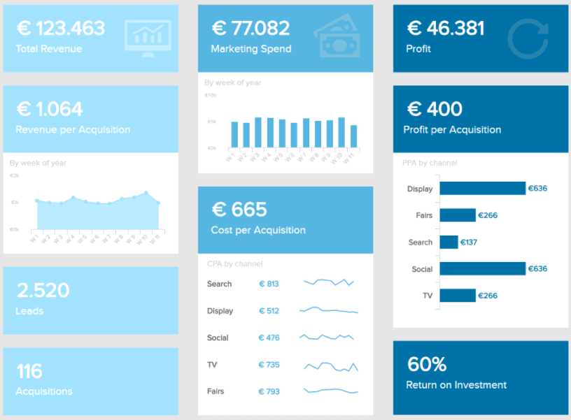
**click to enlarge**
Not only will this dashboard help you to improve, personalize, and enhance your business’s most important ongoing promotional activities, but as it is one of our most intuitive designs, obtaining snapshots of relevant data is quick and easy on the eye. A cool dashboard boasting eye-catching displays and actionable functionality.
Primary KPIs:
- Cost per Acquisition (CPA)
- Customer Lifetime Value (CLTV)
- Return on Investment (ROI)
2) Web Analytics Dashboard
When you’re talking about data-driven designs that provide an easy-to-digest overview of critical marketing KPIs in addition to a logical, aesthetically satisfying layout, our web analytics dashboard certainly delivers.
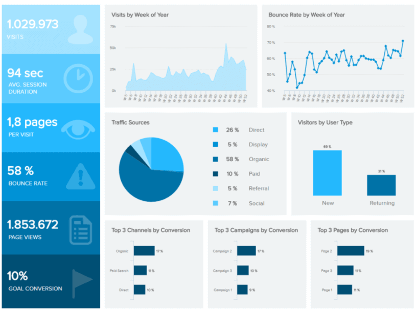
**click to enlarge**
Incredible design aside, this invaluable dashboard is a powerful tool for marketing pursuits and activities across a broad range of sectors as it bestows you with the ability to understand the behavior of your users on a deeper level, in turn, empowering you to connect with your target audience on a more meaningful level while significantly improving the user experience (UX) of your website.
Primary KPIs:
- Bounce Rate
- Average Sessions Duration
- Goal Conversion Rates
- Landing Page Conversion Rates
3) Management KPI Dashboard
For those responsible for their business’s ongoing sales conversions, optimization, and strategy, this particular dashboard boasts a wealth of insights into acquisition costs, management metrics, target revenue, and more in one neat and tidy place.
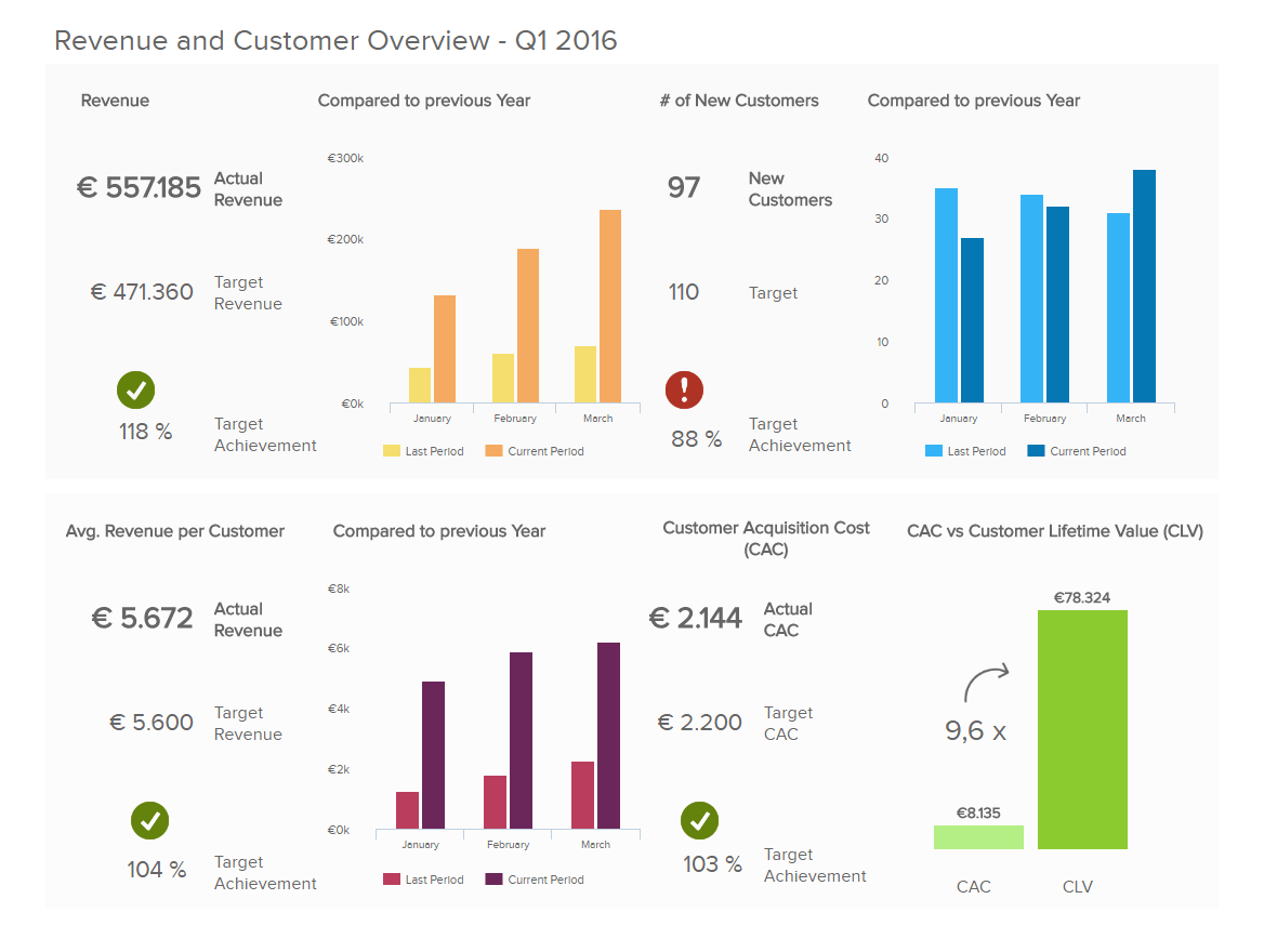
**click to enlarge**
Moreover, this sales report-inspired dashboard sports one of the best designs on the market, visualizing key data through a mix of perfectly color-coded graphs and charts that are not only pleasing to look at but also make extracting important information swift and simple. For top executives, this is one of the good dashboard examples to gain an overview and a strong tool to make the best data-driven decisions for their business.
Primary KPIs:
- Customer Acquisition Costs
- Customer Lifetime Value
- Sales Target
4) Financial Performance Dashboard
When it comes to your company’s ongoing financial health, one of the most critical areas to focus on is your spending efficiency, and a failure to do so could cost your organization plenty of unnecessary expenses in the long run.
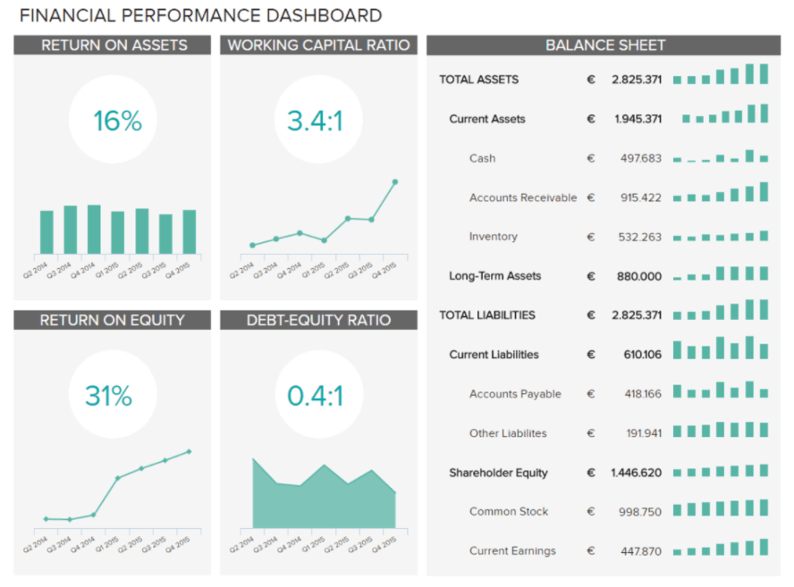
**click to enlarge**
One of our great dashboard designs, our financial dashboard tracks performance and drills down into returns on equity and assets and its linear yet attractive balance sheet coupled with its wonderfully arranged metric charts make it a joy to use.
Primary KPIs:
- Return on Assets
- Return on Equity
- Working Capital Ratio
- Debt-Equity Ratio
5) Employee Performance Dashboard
Your business is only as effective as your workforce which is the very reason that monitoring both individual and collective employee performance is so vital.
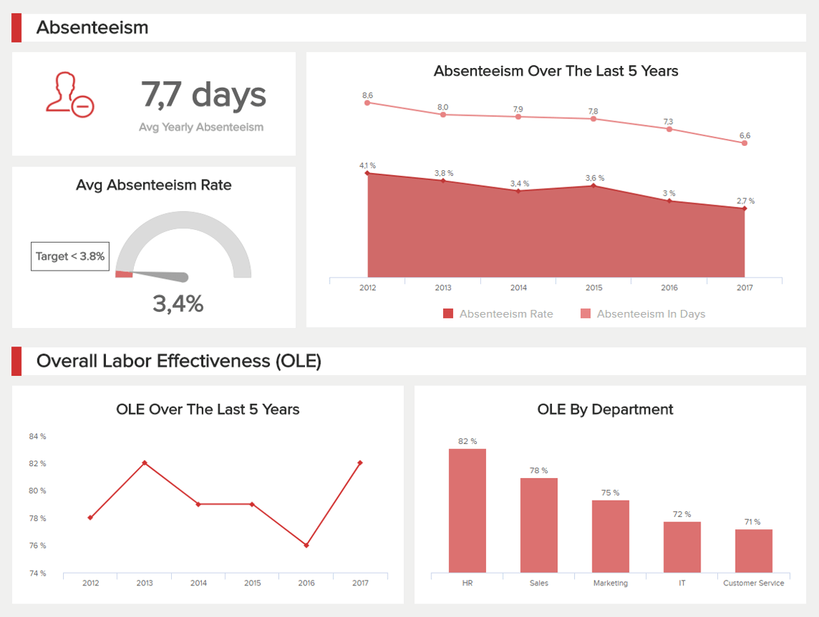
**click to enlarge**
Ideal for HR managers and those responsible for specific departments, the employee performance dashboard is one of our top dashboard design examples with scannable screen arrangement and a striking color scheme to match. By understanding your employees’ strengths, weaknesses, and behavior you will be able to make the changes you need to motivate, inspire, and engage your team for success – and this HR dashboard will help you do just that.
Primary KPIs
- Absenteeism Rate
- Overtime Hours
- Training Costs
- Employee Productivity
Get a pocket-sized summary of our 15 most dazzling dashboard ideas!
6) Customer Satisfaction Dashboard
In today’s hyper-connected digital world, the consumer reigns the supreme hold, trusting the opinions and testimonials of their peers above all else. That said, keeping your customers happy consistently is of paramount importance to any modern business.

**click to enlarge**
One of our most popular and effective dashboard templates, focusing on satisfaction metrics such as customer effort score, is geared towards maintaining a solid NPS score, retaining valuable customers, and optimizing your service levels to remain competitive in a cutthroat commercial landscape. Boasting a digestible color coordination key and a symmetrical design that has been developed for the swift analysis of critical consumer information, this is the dashboard you need to satisfy existing customers and attracting new people to your business.
Primary KPIs
- Customer Satisfaction
- Net Promoter Score
- Customer Effort Score
- Customer Retention
7) Customer Service Team Dashboard
Building on our previous point: to deliver exceptional levels of service to your customers, your customer service team must be happy, productive, cohesive, and firing on all cylinders.
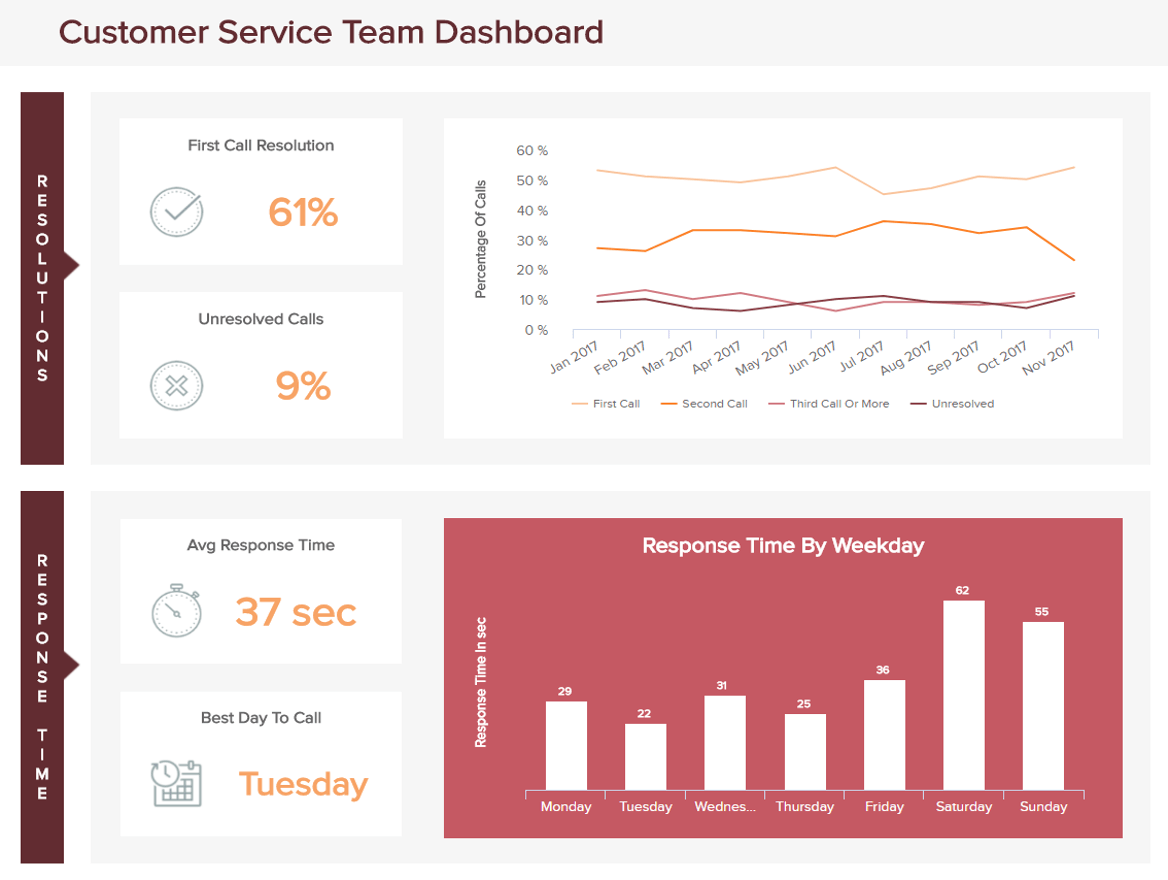
**click to enlarge**
As far as great dashboard arrangements go, this is up there with the best of them, and it offers all of the customer service KPIs and metrics you need to improve your department, develop your staff’s skills, and enrich your consumer-facing strategies. Plus, this most epic of data-driven designs will make improving your customer service efforts and spotting key trends a genuine pleasure rather than an undesirable chore.
Primary KPIs
- Average Response Time
- First Call Resolution
- Top Agents
- Number of Issues
8) Procurement KPI Dashboard
Regardless of your industry or niche, it’s likely that you will have a procurement process or department to ensure the efficient delivery of products, services, and assets. And in many ways, this is one of the backbones of your entire operation.
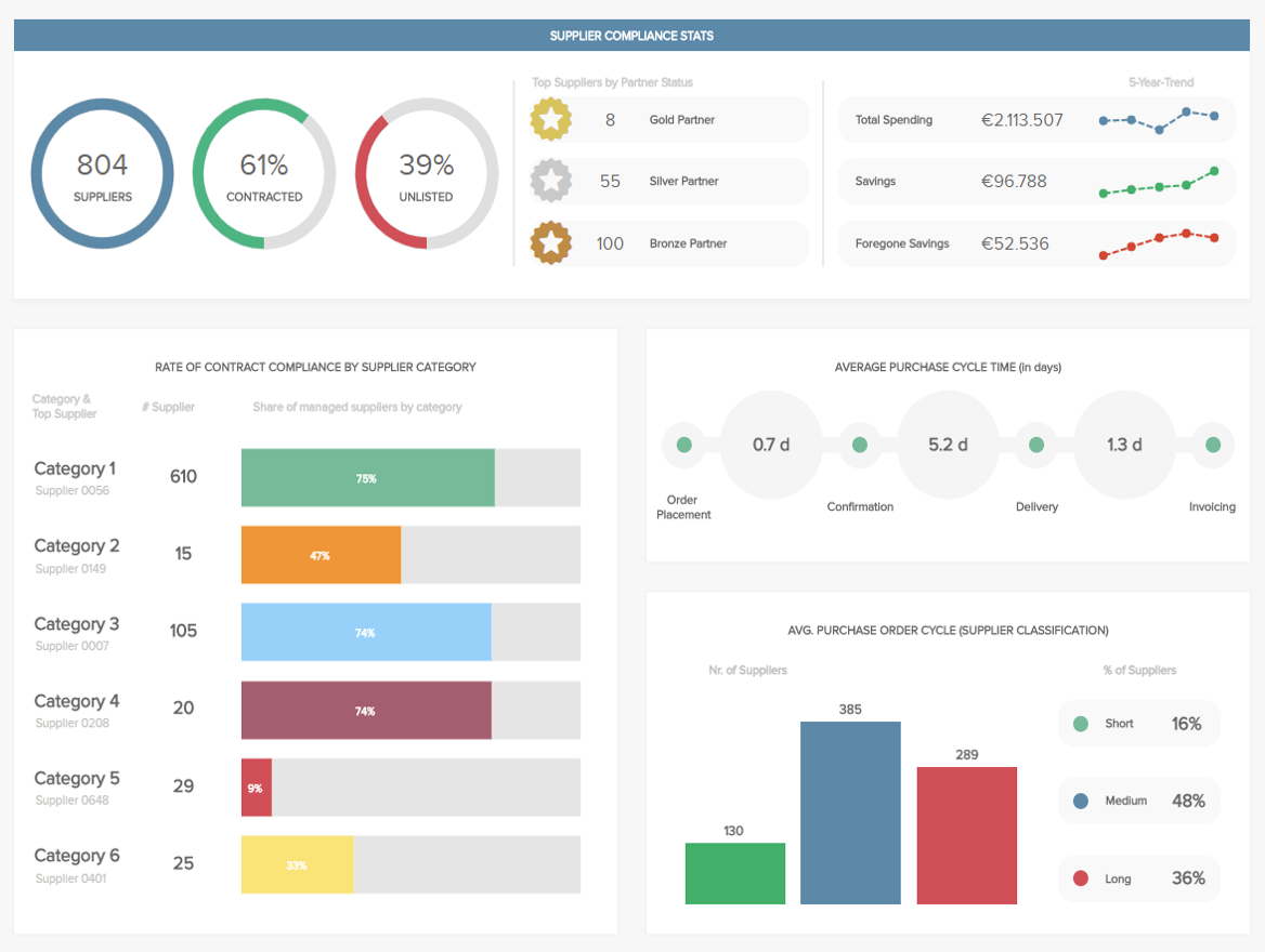
**click to enlarge**
One of the top design inspirations in the lineup, our procurement overview platform provides a detailed bird’s eye overview of important procurement KPIs such as purchase order lifecycles, supplier performance, supplier volumes, and compliance rates. In addition to offering the insights required to make your procurement processes as smooth and cost-effective as possible, the design allows you to view all relevant silos of information in logical segments, speeding up the decision-making process as a direct result.
Primary KPIS
- Compliance Rate
- Number of Suppliers
- Purchase Order Cycle Time
9) IT Issue Management Dashboard
It doesn’t matter what industry you’re involved with, the IT department requires an exceptional level of efficiency and organization to ensure that the company’s infrastructure is operational. A failure to do so could result in disaster.
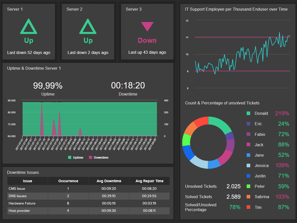
**click to enlarge**
To help avoid such detrimental issues, we have developed an IT issue tracker – and it’s one of our most comprehensive dashboard creations to date. With an irresistible interface, this IT dashboard not only helps technical staff make critical improvements to infrastructure and task completion times but its striking design exists to help manage unsolved tickets, issues, and critical server information with ease.
Primary KPIs:
- Server Downtime
- Meantime To Repair
- Unsolved Tickets Per Employee
- IT Support Employees per End Users
10) Investor Relations Dashboard
For senior personnel and key departmental managers, this most excellent of digital designs provides a functional snapshot of all of the activity, trends, and patterns related to the company’s investments and investors. This financial report example is very helpful to any investor who wants to know where they put their money in.

**click to enlarge**
Assisting in the management and continual development, optimization of all investment-based pursuits, this tool is invaluable and as one of our best dashboards for inspiration, all of the information you need is displayed in the kind of graphics that you will want to engage with on a daily basis.
Primary KPIs
- Return on Assets
- Return on Equity
- P/E Ratio
- Share Price
- Debt-Equity Ratio
Get a pocket-sized summary of our 15 most dazzling dashboard ideas!
11) Transportation Dashboard
It doesn’t matter what your company does or what sector you specialize in. To run your business with any real success, logistics should always be a top priority. The best dashboard for transportation logistics, this dynamic analytics dashboard design example is both visually balanced and functionally sound.
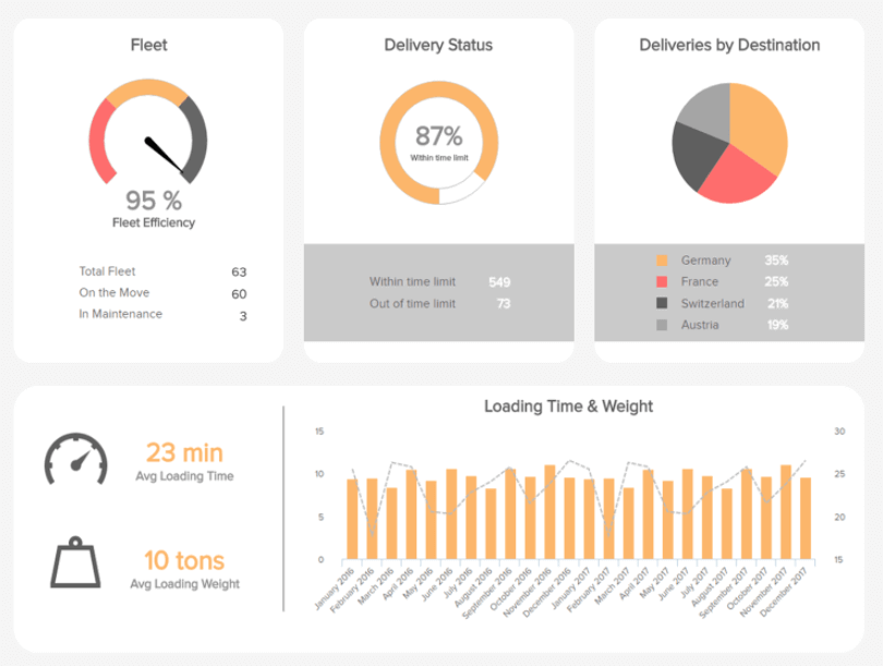
**click to enlarge**
Focused on two critical areas of transportation logistics, this best dashboard illustration offers a wealth of insight into delivery time and transportation cost. With balanced colors, a scannable screen arrangement, and KPI charts that offer clear-cut insights into trends and patterns, this particular logistics dashboard offers everything you could possibly need to streamline your processes while making them more economical, at a glance.
This is one of our best dashboard design examples for logistical operations and something that could save your organization significant amounts of time as well as money.
Primary KPIs:
- Delivery Time
- Transportation Costs
12) Hospital Performance Dashboard
When it comes to hospitals and medical institutions, choosing the right dashboard ideas can make the difference between life and death. With so many functions as well as departments and so few hours in the day, without the right tools and processes, hospital data becomes fragmented and, as a result, diluted. Given the critical nature of hospitals, fragmented, watered-down data simply will not do.

**click to enlarge**
The combination of the right BI tool and a superior KPI dashboard design will make a hospital more fluent, more functional, and better equipped to take care of its patients. Our hospital dashboard is a testament to that very notion.
Peppered with clearcut targets and visual benchmarks, this powerful sample dashboard design created with modern healthcare analytics software, is integral to the ongoing scalability, success, and cohesion of any busy medical institution. Boasting a perfectly arranged visual interface, this dashboard gives you access to integrated operational and economical data at a swift glance.
From average stay and readmission rates to cost by payer, the information featured in this dynamic BI tool will ensure that you keep unnecessary expenditure down while squeezing every last drop of value from your various resources.
Primary KPIs:
- Average Hospital Stay
- Hospital Readmission Rates
- Costs By Payer
13) Manufacturing Cost Management Dashboard
One of our best dashboard examples for companies that physically build or process their goods of products, our cost management dashboard will help you keep a sustainable handle on your ongoing expenditure.

**click to enlarge**
A sample dashboard design that is easy to digest on any screen or device, this is one of our most powerful examples for businesses with manufacturing-based processes. As an asset-heavy sector, to truly thrive, you must be able to evolve and respond to constant change. With manufacturing metrics geared towards managing your asset turnover and maintenance as well as cost per unit, here, you have everything you need to make vital improvements and push yourself ahead of the pack with confidence.
Primary KPIs:
- Asset Turnover
- Unit Costs
- Return on Assets
- Maintenance Costs
14) Daily Operational Zendesk Dashboard
If your company is largely cloud-based and uses Zendesk to manage some of your core customer-facing operations, this is one of the best dashboard examples for you. While Zendesk is a powerful tool, without the ability to drill down deeper into particular pockets of data, you won’t experience the full benefit of the platform.
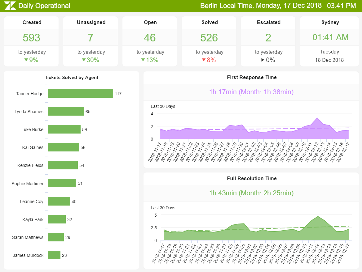
**click to enlarge**
Our operations-based Zendesk dashboard boasts a balanced color scheme in addition to data visualizations that offer accessible insights into practical trends and metrics.
The top section of the dashboard offers scannable call center reporting metrics based on issues and tickets that have either been solved or are in progress, while the bottom half provides visual data offering performance trends over a specified time period.
By gaining access to this integral information in one easy-to-access space, you can make swift improvements to your customer service initiatives while supporting agents that might need a little help or training in specific areas of the business. In doing so, you will accelerate the success of your business, winning on the commercial battlefield, one customer at a time.
Primary KPIs:
- Tickets & Ticket-Status
- First Response Time (FRT)
- Average Resolution Time
15) LinkedIn Company Page Dashboard
In the professional world, LinkedIn is a social platform that provides invaluable networking opportunities, regardless of your industry or sector. Understanding how to use it to your full advantage will help you boost brand awareness while forging connections that will offer a wealth of business-boosting potential.
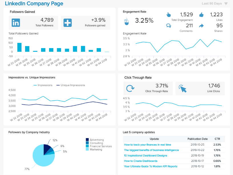
**click to enlarge**
With an expertly arranged mix of 5 cohesive KPI visualizations, this top-notch social media report design allows you to drill down into the performance of your various posts while giving you a glimpse under the skin of your follower demographics.
By getting a firm grasp of post performance and engagement as well as content reach, you will be able to formulate ideas and strategies that will help you connect with the right audience on a personal level. In doing so, you will create a wider sense of brand awareness while growing your audience in a way that will benefit the ongoing success of your business.
Primary KPIs:
- Viewer Information
- Contact & Network Growth
- Profile Views by Job Title
- Post Views & Engagements
In the digital age, it’s important to engage with potential partners or prospects in a way that really resonates with them—cutting through the noise with every piece of correspondence. Our digital dashboard will help you do just that.
“Design is not just what it looks like and feels like. Design is how it works.” – Steve Jobs
Get a pocket-sized summary of our 15 most dazzling dashboard ideas!
Whether you’re talking about financial dashboard design, logistical analytics, marketing strategy, or any other important business function you can think of, by working with the right tools and creating balanced data-driven arrangements, you will make your organization leaner, meaner, and more intelligent than ever.
Data dashboards empower you to make the best choices for your business in a way that is accessible and convenient. By customizing your dashboards according to the best design practices, you will squeeze every last drop of value from the metrics and insights available to you. This is how you will win on today’s hyper-connected digital battlefield.
We hope this specially curated list of 15 great dashboard designs and ideas has served to inspire and enlighten you in the ways of data-driven business evolution.
If you would like to learn more about our comprehensive key performance indicators while gaining a deeper insight into our many department-specific metrics, tools, and platforms, explore our powerful mix of business dashboard examples.
Are you ready to take your business’s analytical efforts to the next level? Try out our cutting-edge BI software for days thanks to our free trial.
The post Best Dashboard Ideas & Design Examples To Boost Your Business Success appeared first on BI Blog | Data Visualization & Analytics Blog | datapine.