Without big data analytics, companies are blind and deaf, wandering out onto the Web like deer on a freeway. – Geoffrey Moore, Author of Crossing the Chasm & Inside the Tornado
In the digital age, brands, businesses, and organizations have a wealth of information at their fingertips: a level of insight that if leveraged correctly, not only has the power to offer a real competitive edge but provides the potential to innovate, inspire and create a well-oiled commercial machine that continues to evolve with the times.
We are indeed living in a time rich in invaluable digital data. By gaining the ability to gather, organize and analyze the metrics that are most important to your organization, you stand to make your business empire more intelligent than ever before – and executive reporting and business dashboards will help you do just that.
Download our guide to boost your business efforts and jump to success!
Companies that use data analytics are five times more likely to make faster decisions, based on a survey conducted by Bain & Company. Moreover, according to Forbes, 85% of industry leaders believe that big data will drastically enhance the way they do business – exploring what it can do for improving the business performance, big data examples in real life can inspire and jump-start your new business solutions.
To put the importance, functionality and organizational benefits of data analytics in business, here we explore executive dashboard templates, offering an insight into what they are, why they work and real-life executive report examples created with a modern online reporting tool.
What Is Executive Dashboard Reporting?
Modern executive reporting consolidates key business metrics while outlining problems and solutions in which KPI dashboards are used to provide additional insights and serve as an added visual representation that usually lacks in executive reports and summaries.
The accessible visual nature of executive reporting means that it’s easy to make sense of specific datasets, spot ongoing trends and take a number of decisive actions that ultimately benefit the business, often in real-time. Primary business areas are enhanced, with the aim of identifying weaknesses as well as strengths, improving internal processes, boosting staff engagement, improving service, raising productivity and making the organization more profitable.
Executive dashboards work by connecting, via APIs (Application Programming Interfaces), with the internal systems currently used within the business – platforms such as accounting software, your customer relationship management (CRM) program, email networks, and in-built website analytics, among others.
Through those connections, your executive dashboard pulls all of this information into one central location, empowering you to view your business’s most important information without logging into multiple platforms or systems. Moreover, executive reporting and dashboards also allow you to set targets, work with specific KPIs and tailor your data to best suit the needs, aims, goals, and mission of your organization.
90% of the information transmitted to the brain is visual. And, given the fact that people following directions with illustrations do so 323% more effectively than those who follow text-only directions, executive dashboards are a powerful tool in today’s competitive commercial landscape.
“By visualizing information, we turn it into a landscape that you can explore with your eyes. A sort of information map. And when you’re lost in information, an information map is kind of useful.” – David McCandless
The Benefits Of Executive Reporting And Dashboards
To paint a more detailed picture of the power and potential of executive reporting and dashboards, here are the key benefits of using these intuitive online data visualization tools:
- Vision: A report offers enhanced visibility and insight, thus allowing you to understand every key aspect of your business in greater detail, and in turn, allowing you to make more informed decisions.
- Evolution: The ability to visualize your data will empower you to make continual improvements to your business, moving with the landscape around you by measuring and building upon your performance.
- Economy: Rather than spending endless hours logging into your business systems and running reports, executive dashboards will allow you to view and engage with all of the information you need in one digestible space. Time is money, and if you’re saving time (while improving your internal processes), you will ultimately save money, making your empire far more economical as a result.
- Realization: By working with executive report-based KPIs that are most relevant to your business, you’ll be able to refine and realize your business plan by working to accurate, valuable targets, and ensure that you reach them, time after time. There is a number of KPI examples you could choose from, but the important thing to consider is to find the right one.
- Development: The digestible visual insights gained from executive dashboards will give you the tools to track individual employee performance, helping you to reward top performers and develop those that need additional training, support or motivation.
- Benchmarking: As executive dashboards offer a wealth of dynamic data visualizations based on very specific KPIs, it’s possible to set frequent benchmarks that will empower senior decision-makers to push organizational boundaries while measuring success in a way that improves engagement, motivation, and interdepartmental performance.
- Communication: By offering access to detailed pockets of information in a way that is engaging and digestible, executive dashboards improve internal communication across the board by empowering everyone with information that improves the collaborative process while boosting individual performance.
- Speed: The quicker and more efficient a business is, the better it’s likely to perform. Executive dashboard reporting helps executives make top-level decisions quicker and more accurately, which serves to catalyze organizational progress in a number of areas. The intuitive and customizable nature of an executive dashboard offers the unique (and powerful) benefit of speeding up existing processes while enhancing the strategy and decision-making process.
- Evidence: While this may seem like an abstract concept, when it comes to data analytics, the more panoramic a snapshot you can access, the better. By being able to dig down deep into a host of invaluable metrics, you’ll be able to back up your decisions with tangible trends, patterns, and visualizations that everyone understands – the kind of evidence that will make your decisions all the more persuasive. This is a notion that we’ll demonstrate later with our examples and executive dashboard templates.
“You can achieve simplicity in the design of effective charts, graphs and tables by remembering three fundamental principles: restrain, reduce, emphasize.” – Garr Reynolds
Download our guide to boost your business efforts and jump to success!
Best Practices In Your Executive Dashboard Reporting
It should be quite clear that dashboards are used for executive reporting. Additionally, they represent a visual part that reports and summaries need in order to obtain a clear representation of data, generating added value to written words. To reap the rewards of executive reports, it’s important to understand what it takes to create an online dashboard that works for your organization in particular. When it comes to reporting data visually, an executive dashboard is an incredibly effective tool so it’s important to get it right from the outset.
Let’s look at the essential steps you should consider when creating a compelling executive reporting practice. From understanding your users to data-driven storytelling, you’ll uncover all of the information you need to make your reports and dashboards as successful as possible.

1. Know your audience
The most fundamental aspect of executive reporting is understanding the needs, aims, and goals of your users. Depending on the key aim function of your executive summary dashboard, you will need to feature data visualizations and functionality that will improve performance while providing analytical opportunities that will benefit the evolution of the organization.
By placing yourself in the shoes of your core users, asking people within the organization which data they would like to improve their performance (or make their role easier), and selecting the right key performance indicators, you will lay solid foundations for your executive summary dashboard efforts. This brings us to our next point.
2. Set your key performance indicators (KPIs)
Choosing the KPIs that best reflect your company’s core aims and goals will ensure that your executive reports are both relevant and effective.
For instance, if you’re looking to improve the financial economy of your organization, you might want to tackle the financial reporting and analysis process, and then choose to set up a financial dashboard, drilling down into KPIs based on operating expense ratios and net profit percentages.
3. Integrate your existing systems
Concerning the setup of executive dashboard templates, it’s important to integrate all of your current business systems through APIs to ensure the accurate collection, curation, analysis and real-time value of your data.
In doing so, you’ll ensure you’ve created an executive dashboard reporting ecosystem that not only presents the insights and metrics that are most valuable to your organization but also a centralized space that will offer data-driven value throughout the organization.
4. Customize your executive dashboard
Once the framework of one of your templates is up and running, you’ll be able to tailor it to your preference, editing your dashboard so it returns your specified insights and metrics in a way that is most valuable to your business.
The best executive dashboards adhere to the best possible design practices. To help customize your executive report templates for success, follow our essential guide to 14 dashboard design principles and best practices.
5. Tell a story with your data
As a species, we thrive on storytelling. By creating a strong narrative with your data dashboards and visualizations, you’ll be able to deliver essential messages in a way that inspires both internal and external stakeholders, leading to increased success in the process.
Creating narratives with your metrics and insights is essentially an extension of the design process. To steer your efforts, here’s a guide to data storytelling for your reading pleasure.
6. Brief your team on new executive reporting processes
Finally, it’s essential that you are clear and transparent about your executive reporting processes with the entire organization, giving the right people access to the right metrics and holding internal workshops to make sure that everyone is up to speed with the new system.
If everyone knows how to use the core features and functionality of your reports, and they’re fully on board with your updated processes analytics processes, you’ll be able to squeeze every last drop of value from the wealth of business data available at your fingertips.
Explore 7 Great Executive Dashboard Examples
These 7 visual executive report examples will demonstrate the function and value of a professional dashboard designer in a real-world business context.
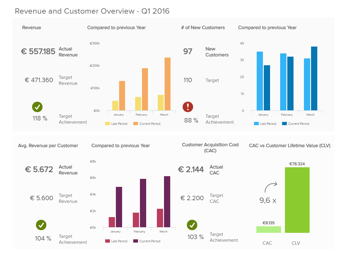
1. Management KPI Dashboard
The management KPI dashboard hones in on revenue on a consumer-based level while offering insights on the cost of new customer acquisition.
**click to enlarge**
By offering a mix of actual revenue metrics based on specific time frames in addition to comprehensive information concerning revenue development, this management report is an invaluable way to spot real-time trends, make significant economic enhancements and set tangible sales targets.
Moreover, the detailed customer-centric information served up by this dynamic management dashboard will give you a better understanding of promotional activities including cross-selling, upselling or the overall value of your service on an individual basis. When it comes to driving down acquisition costs, developing your service and boosting your profitability, these KPIs and metrics are essentially gold dust.
Primary KPIs and metrics:
- Sales Target
- Customer Lifetime Value
- Customer Acquisition Costs
Download our guide to boost your business efforts and jump to success!
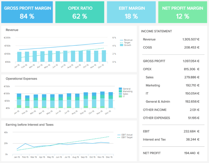
2. Financial Overview Dashboard
Focusing on the financial activity at a top-level, the second of our examples offers a panoramic snapshot of gross profit margin, operating expenses (OPEX) ratio, earnings before interest and taxes (EBIT) margin, and net profit margin, as well as a host of additional relevant insights.
**click to enlarge**
These financial KPIs are often determined from the income statement and not only provide a viable means of streamlining your organization’s financial processes, but also present opportunities to improve the overall financial structure of your business’s financially-driven operations.
Primary KPIs and metrics:
- Net Profit Margin Percentage
- Operating Expenses Ratio
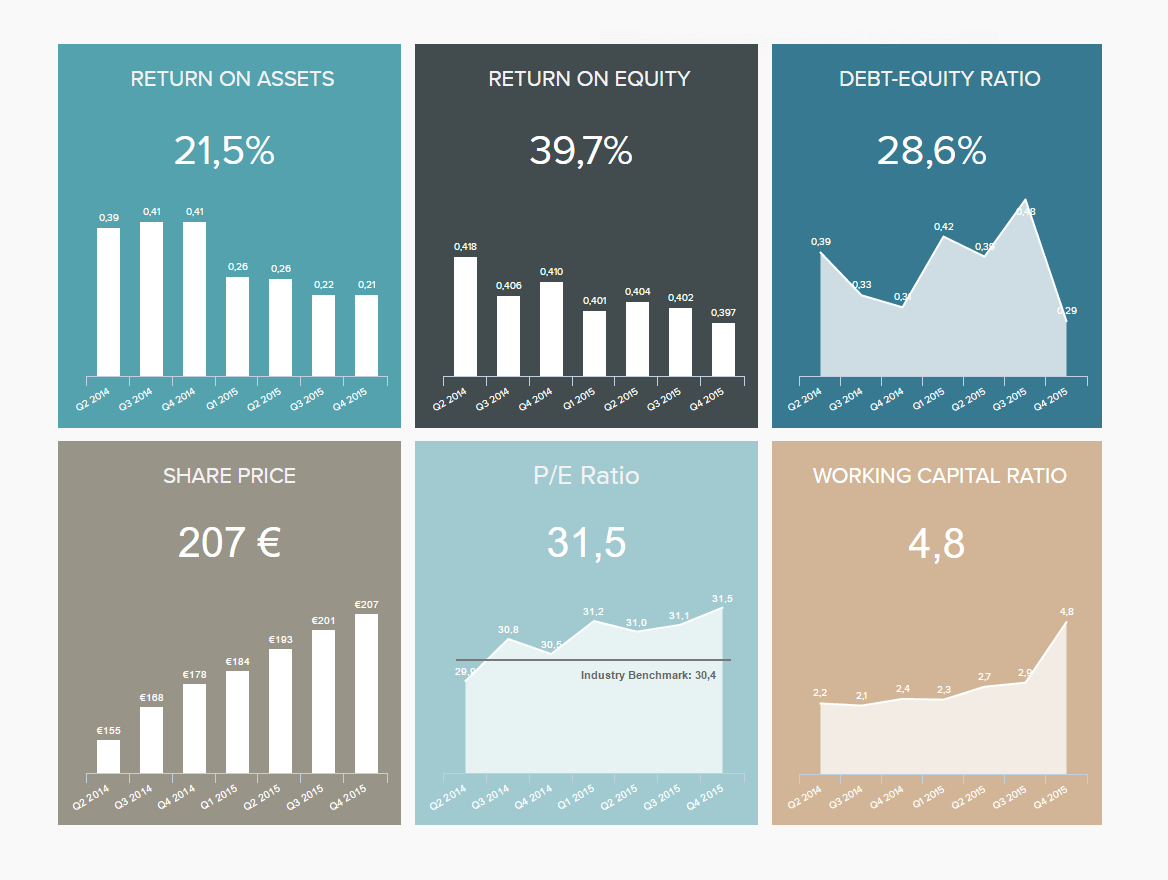
3. Investor Relations Dashboard
The investor relations dashboard, and third of our executive report examples, is pivotal in quantifying your business’s operational KPIs while calculating and communicating top-level metrics based on the company’s overall situation. This level of insight is key in keeping track of the major investors that could make or break your business’s success.
**click to enlarge**
In addition to a host of invaluable equity and assets-centric information, this third of our executive dashboard examples also gives an insight into your company’s share price, the first line of call in finance and a near-absolute indication of the success of your business.
Primary KPIs and metrics:
- Return on Assets
- P/E Ratio
- Return on equity
5. SaaS Management Dashboard
The next of our executive dashboard examples is dedicated to software as a service (SaaS). Covering all of the key aspects of top-level SaaS management, this most dynamic of templates offers a comprehensive birds-eye view of your entire operation.
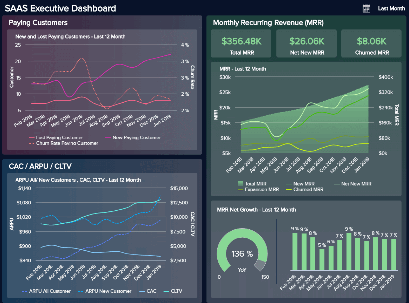
**click to enlarge**
Each KPI within this interactive reporting tool works cohesively to deliver a balanced mix of visual information that drills down into customers, recurring revenue, and costs.
With critical metrics including MRR, APRU, customer lifetime value, and customer acquisition costs, our SaaS reporting dashboard will not only help you improve the efficiency of your software as a service offerings, but you’ll also be able to meet the ever-evolving needs of your customers on a sustainable basis. A powerful business intelligence tool for any ambitious modern tech organization.
Primary KPIs and metrics:
- Customer Acquisition Costs
- Customer Lifetime Value
- ARPU
- MRR
6. CMO Dashboard
One of the best executive dashboards for senior-level decision-makers, our CMO marketing dashboard offers access to a wealth of invaluable information at a quick glance.
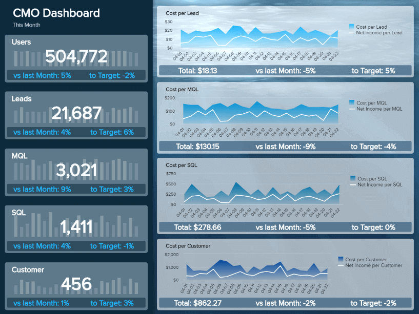
**click to enlarge**
Serving up five effective KPIs in a logical, digestible format, including numeric representations and line charts, this most inspirational of executive dashboard examples offers a wealth of insight in one easy-to-access, centralized space.
As an essential and all-encompassing field, digital marketing is integral to the growth and evolution of any modern organization, regardless of industry. Here, you can drill down into every vital aspect of your marketing performance while spotting integral trends both historically and in real-time. By gaining access to such invaluable data, you can improve your responsiveness while formulating improved marketing reports and strategies that will increase your audience while boosting your return on investment (ROI).
Primary KPIs and metrics:
- Sales Target & Growth
- Website-Traffic-to-Lead Ratio
- Cost per Lead
- Lead-to-MQL Ratio
- MQL-to-SQL Ratio
7. Sales KPI Dashboard
The last (but certainly not least) of our executive summary dashboard examples is our sales KPI report. Naturally, sales are essential to almost every business, regardless of sector, which means working with the right sales KPIs is vital to your ongoing growth and success.
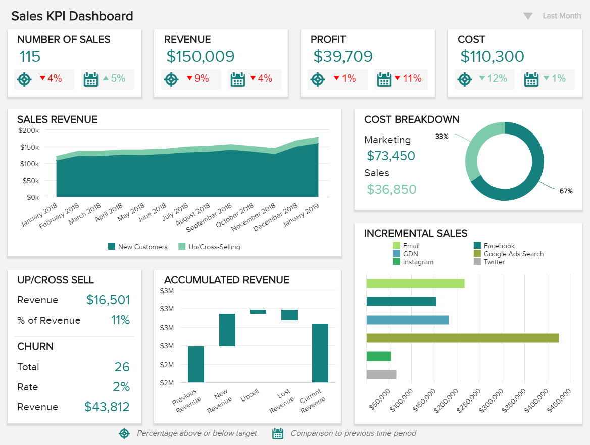
**click to enlarge**
Offering a comprehensive panorama of the practical information required to make sales activities perform to their optimum capacity, this is one of our most comprehensive of executive summary dashboard examples. The range of sales graphs and charts included within this report provides a wealth of information that will vastly improve the internal efficiency of your sales department while helping to reduce costs, improve output, and ultimately, boost your organization’s bottom line.
This reporting tool empowers sales managers and executives to compare a range of metrics and identify where and how to make strategic adjustments that optimize performance. Keeping your sales initiatives on the right track will contribute to your business’ success year after year – and this is the very tool for the job.
Primary KPIs and metrics:
- Revenue per Sales Rep
- Customer Churn Rate
- Upsell & Cross-Sell Rates
- Profit Margin per Sales Rep
- Incremental Sales by Campaign
“The greatest value of a picture is when it forces us to notice what we never expected to see.” – John W. Tukey
Download our guide to boost your business efforts and jump to success!
During our journey into the world of executive report examples and executive dashboard templates, we’ve considered the practical applications of modern reporting tools, looked at the official executive dashboard definition, and explored the many benefits cutting-edge analytical skills bring to the business table.
As a senior-level executive, you will no doubt be responsible for formulating plans and initiatives that can make or break your business. Of course, such vital decisions come with an enormous amount of pressure. But, with executive-level reports and dashboards, you’ll be able to make choices, create strategies, and communicate with your staff with 100% data-driven confidence – something that will make your working life easier and more successful.
It’s clear that executive dashboards and reports provide a window of vision that not only yields greater real-time results but has the unrivaled power of cementing continual evolution as well as a sustainable level of success in an increasingly competitive digital world.
Perpetual growth and progress are essential to the longevity of any company looking to thrive and survive in this cutthroat business age, and senior-level reporting is the vessel that will secure your success year after year.
Ready to tackle your own executive dashboards and try these dynamic reporting tools for yourself? Try our powerful dashboard software for a 14-day trial today – it’s completely free and will open you up to all of the key benefits of digital dashboard reporting. Enjoy!
The post Utilize The Effectiveness Of Professional Executive Dashboards & Reports appeared first on BI Blog | Data Visualization & Analytics Blog | datapine.