
Soon businesses of all sizes will have so much amount of information that dashboard software will be the most invaluable resource a company can have. Visualizing the data and interacting on a single screen is no longer a luxury but a business necessity. That’s why we welcome you to the world of interactive dashboards. Take a comfortable seat, enjoy the power of interactive business dashboards, leave your spreadsheets behind, and utilize the advantages of interactive dashboard design and its features.
But before we delve into the bits and pieces of our topic, let’s answer the basic questions: What is an interactive dashboard, and why you need one? In essence, in this post, we will explain all the details needed for dashboard reporting and creation, compare interactive vs. static reporting, and provide tips and tricks to make your business perform even better. Let’s get started.
We offer a 14-day free trial. Benefit from amazing interactive dashboards!
What Is An Interactive Dashboard?
An interactive dashboard is a data management tool that tracks, analyzes, monitors, and visually displays key business metrics while allowing users to interact with data, enabling them to make well-informed, data-driven, and healthy business decisions. Dashboards are used within the business intelligence (BI) environment, creating a link between managers and the company’s strategy, allowing departments to collaborate more effectively, and enabling employees to perform with an increased productivity level.
The point of such dashboards is not to simplify the working environment and analysis processes since there are massive volumes of data collected on a daily level, and companies need solutions that will bring them to the right answer at the right time. Now that we’ve explained the interactive dashboard meaning, we continue onto the next important aspect.
Interactive Dashboards vs. Static Reporting
There’s no doubt about it: interactive dashboards provide businesses with insights that have never been possible before. A professional dashboard maker enables you to access data on a single screen, easily share results, save time, and increase productivity. Gone are the days of static presentations, stagnate reports, and waiting on analysts to pull reports and then having out-of-date data. Thankfully, it’s also time to take a step back from your spreadsheets and slides. While Excel and PowerPoint, and various other spreadsheet and presentation applications, remain important business tools for many, their interactivity options are limited.
Here are some key benefits that interactive dashboards provide, compared to traditional, static reporting:
- Agility for decision-makers: Interactive analysis empowers users to answer critical business questions on-demand with the most up-to-date data. Additionally, data can be looked at from different perspectives and points of view with just a few clicks. Zooming-in and out, detailing time intervals, filtering countries, or show and hide specific parameters that you don’t need enables you to look at data in the most holistic way, like never before.
- Avoid redundant reports: You need only one tool with the state-of-the-art interactive features to quickly adapt the displayed data instead of creating 10 static PowerPoint slides. Reports use real-time data, with implemented intelligent data alerts that enable users to completely eliminate spreadsheets and presentations. The dashboard will alarm the user every time an anomaly occurs, while neural networks will ensure smart detection and future forecasts.
- Less IT involvement: By empowering users to perform their own ad hoc data analysis, a company can save valuable IT resources since the number of requests for database queries or customizations will significantly decrease. The IT department can then concentrate on other urgent or valuable tasks while business users can get answers to important business questions quickly.
- Speed: There is no doubt, swiftness today is a crucial element for any company trying to survive in our cutthroat digital age. When using traditional spreadsheets or PowerPoint presentations, data is inserted once and updated manually. With modern reporting tools, there is no need to do so. Real-time dashboards enable real-time data and that is the beauty and power of business intelligence at its core.
- Productivity: While static reports have been a useful tool for increasing productivity, in today’s modern economies this is simply not enough. The amount of data that is collected, and needs to be analyzed is continuously growing, and numerous static or paper sheets or millions of rows and columns cannot help as much as they used to. The rise of self-service BI tools has enabled users to tinker with the data on their own, and use modern technologies that will increase their productivity levels.
In essence, why do you need robust interactive dashboard reporting? Interactive dashboards quickly engage end-users with a wide range of technical acumen and provide an intuitive experience and easily digested insights. They provide ROI by quickly highlighting trends and dig out irregularities.
Business dashboards aren’t just for management, they can be easily capitalized on by all teams across a company. They enable you to easily visualize your data, filter on-demand, and slice and dice your data to dig deeper. They can also be fun, and here you can see some of the best data visualization examples, most of them made out of stunning interactive dashboard examples.
Are you sold on the power of these kinds of dashboards? Before rushing off to buy software, or requesting it from the powers that be, there are several important features you should look for. We’ve already written about the 11 necessary features a dashboard software must-have, so now we have to determine our must-have interactive dashboard features.
Our Top 14 Interactive Dashboard Features
To take your data and insights to the next level and drastically improve ease of use, keep reading! If you want to see the power of some of these features in action, you can also check out this short video:
1) Dashboard Chart Filter / Click-to-Filter
A well-built interactive dashboard provides a variety of ways to dissect data. You should be able to easily explore your data to discover a wide range of insights. A great feature to further enable interactivity is a click-to-filter option. This allows dashboard users to utilize the dimensions of the dashboard’s charts and graphs as temporary filter values. It’s as easy as clicking on any data set in your charts. This action seamlessly creates a quick filter that applies to the data of your dashboard and delivers new insights in an instant, whether it is used on an executive dashboard or operational dashboard.
Let’s further explore this interactive dashboard feature. Maps are important data visualizations and at datapine, we love utilizing them in our dashboards. Dashboard maps get even better when using them with click-to-filter.
Say you want to visualize your revenue data by country. With click-to-filter, you simply click on a specific country (or countries!) on the map on the dashboard. You then activate this as a filter for your whole dashboard. The data visualized on the dashboard is now just for that chosen country. You can easily click out of it to return to an unfiltered view or click into another country to access that data. With just a couple of quick clicks, users can easily interact with the data, finding what is pertinent to them. There is now no need to build data visualizations for every country like you would have to do in Excel!
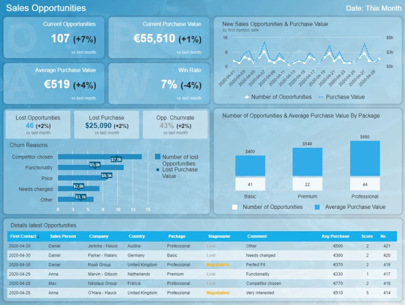
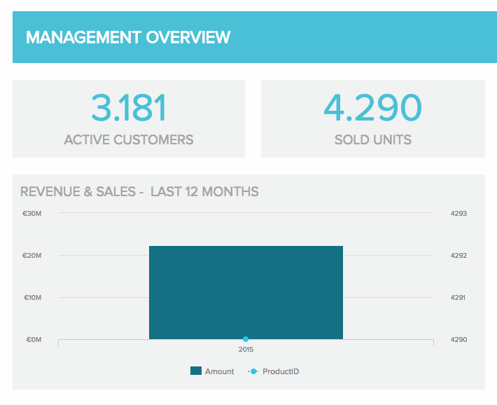
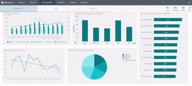
This example filters the dashboard for Australia and February using a click-to-filter feature.
2) Drill-Throughs
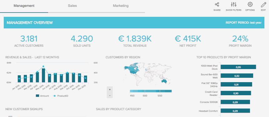
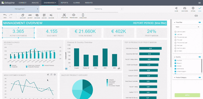
A drill-through is an interactive dashboard software feature that shows you additional, more specific, and detailed information of a particular element, variable, or KPI, without overcrowding the dashboard. Imagine you want to see the exact net profit or sold units of your management strategy. By simply clicking on the specific KPI (in this case the net profit), the drill-through will enable you to visualize this data in a clear manner, without the need to be presented on the main screen. While there are many KPI examples you can choose specifically for your business, this is just one that shows the tip of the iceberg of the power of interactivity.
This example shows additional information for the net profit: the top 5 product categories by using a drill-through.
If you want to show, for example, details about your active customers, sold units, or net profit, the drill-through option is certainly one feature that you will want to add in order to dig deeper into the various details of the selected charts. Do you want to find out what are top-selling products during last year or where are your customers located? The drill-through will help you answer these questions with a couple of clicks.
We offer a 14-day free trial. Benefit from amazing interactive dashboards!
3) Drilldowns
If you want to create an interactive dashboard, drilldowns are one of the features you should look for and get familiar with. This option enables you to add more levels to charts, meaning by simply clicking on your visualization, you can drill into a lower level of the X-axis. Drilldowns give you the possibility to “nest” an additional variable into the chart, and by simply clicking on it, you will be able to change the chart according to your parameters.
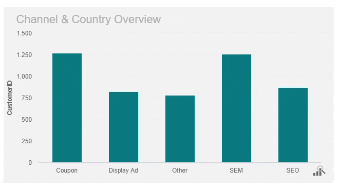
A drilldown feature example showing the amount of customers by channel and country.
As you can see in our example, we wanted to see the performance of our customer numbers by channels in selected countries. When we applied the drilldown, the chart itself changed and we could see the results of each channel in various countries, in this case, Austria, Belgium, Canada, Netherlands, UK, and the United States.
In general, drilldowns can be added to any type of chart. Sometimes referred to as nested charts, they are especially useful in tables, where you can access additional drilldown options such as aggregated data for categories/breakdowns (e.g. by channel or country) as well as change the aggregation type (sum, average, median, etc.). Therefore, nested tables deliver even more compressed information in comparison to utilizing drilldowns in other types of charts, as shown in the picture below:

**click to enlarge**
Similar to drill-throughs, this feature is used in an interactive data dashboard when we don’t want to overcrowd the visuals with multiple charts but simply dig deeper into the data right at our fingertips and provide additional information to the questions that might arise. Thanks to modern data science tools, such analysis is easy to create and demonstrate.
4) Cross Tab Filters
The best interactive dashboards will enable you to apply filters through different tabs in order to save precious time and speed-up the analysis process. Essentially, the cross tab filters will give you the opportunity to dynamically synchronize and apply filters on different dashboard tabs. In practice, let’s say you have created an interactive analytics dashboard with 4 different tabs, and you want to be able to apply one filter to all the tabs that you’re working on. By utilizing a cross tab filter, all other tabs will change, without the need to create it separately, 4 different times.
As mentioned, this filter will enable you to save time, and increase your productivity levels because you won’t need to manually apply filters on each tab and lose some working hours. Moreover, these smart data analysis techniques are used to easily connect the information in different parts of the dashboard, making your analysis much easier and quicker.
5) Time Interval Widget
Another built-in interactive dashboard feature you should look for is a time interval widget. These widgets allow you to enhance individual time scales on different charts on your dashboards with an interactive drill-down function.
With a time-interval widget, you choose the time interval of the data displayed on your chart using a date or time field on the X-axis with a click of your mouse. Use this function to move from a yearly to a monthly, weekly, or daily view of your data without changing the time period displayed on your whole online dashboard. This is especially helpful if you want to change the time intervals of single charts really fast without affecting other data visualizations on your dashboard.
Easily look at revenue & sales across the day, week, month, and year time intervals with the help of the time interval widget.
6) Chart Zoom
While you should be able to open a well-designed dashboard and immediately glean a story, a robust interactive dashboard provides multiple layers of knowledge allowing you to see a 30,000-foot view of your data or zoom into the minute. A chart zoom feature helps you do this.
While a time interval widget helps you choose your desired time interval, you may need to dig even deeper. This is when you need a chart zoom. This function lets you drill-down into the smallest unit of time for charts using any date or time field on the X-axis.
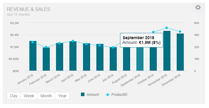
datapine’s chart zoom allows you to simply drag the mouse over the part of the chart you wish to view on a more granular basis and narrow the time period displayed, depending on the selection. In the example below, we have selected the month of February. After the selection, you can see the daily overview of what happened during the whole month, and dig deeper into your data:
The chart zoom filter in action: showing the revenue and sales changed from a monthly to a daily overview.
While we would all love to see perfect data all the time, that isn’t practical. Data visualization is the easiest way to surface data irregularities.
Surfacing these irregularities provides some of the biggest ROI from business intelligence software. A chart zoom feature is an especially useful way to drill-down and investigate your data after finding these irregularities.
For example, after looking at the past week using a time interval widget, you identify a day with 50% less daily revenue. Using a chart zoom, you can hone in to see revenue on this day by the hour and look for inconsistencies. Maybe your online shop was down for several hours last Friday. Now, you can easily correlate your downtime and lack of revenue.
You can even use these insights to justify investing in a better fail-safe! Saving money by zooming in on a chart, that is the power of interactive dashboards.
7) Custom Chart Tooltips
There are many interactive dashboard examples that provide customization levels based on their level of sophistication. One prominent feature that can be adjusted to show details of a specific element is the custom chart tooltips. This option enables you to adjust the shown information when you hover over with your mouse providing a small snippet. Let’s imagine you have a stacked bar chart with various categories. You can adjust your hovering information on:
- Just one category
- All categories
- Adding custom text to a category (for additional explanations, for example)
- Additionally add sums, averages, percentages, etc.
The example below shows that we added the percentage, besides showing just the absolute revenue per month:
A small snippet showing additional details of the performance created with the help of custom chart tooltips.
8) Advanced Data Options
When you’re focusing on interactive reporting, you might want to make sure that you have instant access to the raw data of the chart that you’re exploring. That’s where advanced data options come in handy, especially when additional questions arise and you want to take a look at the raw data itself. That way, you will have the possibility to easily explore each part of the chart in its raw form, and export if needed. Moreover, you will have the opportunity to swipe through each element that will show you exactly what kind of data the visualization is consisted of. Thanks to modern business intelligence solutions, tinkering and exploring business information has never been easier. Let’s see this through an example.
The data option will show the raw data behind a chart.
In this example, we have shown data options for the revenue and sales chart and we want to see the data in its raw form, in this case, a table with columns and rows filled with our information such as the date, amount, product ID, and previous periods. By simply clicking on the option show data, another pop-up will open and you will immediately see the revenue and sales information in its raw form. Swiping left or right will enable you to explore other charts present on the dashboard such as customers by region, top 10 products by profit margin, new customers signups, etc. That way, you have immediate access to a raw table where you can see what kind of information is present, and adjust if needed.
9) Show or Hide Chart Values
A business often has many datasets and sources. It’s most likely that your data isn’t living in one spot. To further complicate things, the data can also be in multiple “languages”. For example, you may have different SQL databases, Google Analytics, and sales data in a CSV. They all host invaluable data for your business. Before business intelligence and dashboard software, it was very difficult to combine these data sources and even harder to analyze them together. Cutting edge, interactive dashboard software allows you to combine and visualize multiple datasets in one dashboard, in just a few clicks.
However, when combining datasets, it’s imperative you’re comparing apples to apples and can easily filter across the combined data. Poorly built filters lead to misinterpreted data and misinformed decisions related to your business.
A “show or hide chart values” feature is one of the many ways to better manage blended data. With a show or hide chart values feature, charts containing more than one dataset are presented with a dynamic legend at the bottom. With a simple click on a dataset variable, the data point will be excluded from the charts. This includes the ignored selected data in all calculations of totals or accumulations in your charts.
For example, let’s say your interactive dashboard design contains a chart of five different sales categories and you only want to dig into two of them. The example below shows all of the categories; all you do is deselect the categories in the legend you don’t want to view, and that data will disappear from all the related data visualizations:
An example of showing or hiding chart values, in this case, the sales performance by category.
We offer a 14-day free trial. Benefit from amazing interactive dashboards!
10) Dashboard Widget Linking
Your business doesn’t live in a vacuum, and neither should your dashboards. Each dashboard created should be a live snapshot of your business. Combining and connecting these snapshots takes your BI to the next level.
Dashboard widget linking helps to further unify your dashboards. It enables you to add links to any widget on your dashboard whether it’s a chart, textbox, or image, and redirects dashboard users and viewers to other related content. You may link to another dashboard tab or even to an external website or resource.
Let’s say one of your dashboards contains a high-level key performance indicators (KPI) tab that provides snapshots of all your departments. You then have subsequent more detailed tabs for each individual department. If you don’t have this resource, this is a dashboard best practice and we highly recommend layering your data like this!
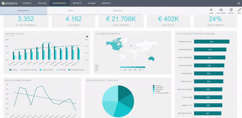
By using a dashboard widget link you can easily move from an overview chart, for sales for example, on the KPI tab to a related sales dashboard tab, where you find many other more detailed charts and sales-focused KPIs, like in the example below:

The widget linking option gives you the opportunity to link additional charts and dashboards.
11) Hierarchical Filter
The interactive feature hierarchical filter provides an in-depth overview of how one filter influences the selection of another. Let’s say you want to generate insights into the product category and a specific product. By selecting a specific product category, the product name filter gets automatically updated, deselecting all products, that don’t belong to the selected product category, like in the example below:

The hierarchical filter expressed on product categories.
By adding this filter to the dashboard, you can eliminate all products that are not relevant for your current analysis. For example, you are interested only in cameras, so you deselect every other product (like computers or games) that is in your dashboard and observe how the dashboard automatically selects just the cameras in your portfolio. Besides having a standard global dashboard filter (that filters the whole dashboard for selected variables with a few clicks), hierarchical filters help you to manage related filters effectively. Simple, and no manual work is needed.
12) Ignore Filter Options
By continuing our filters’ series, we need to stress that interactive BI dashboards need to give the option to ignore filters. Your data tinkering and analysis won’t be complete if you don’t have the possibility to apply various kinds of filters, but also ignore some of them, depending on your use case.
This feature gives you the chance to ignore filters that are applied on a dashboard and exclude a chart from that same filters. In other words, you may prefer that one chart is not affected and shows static values. Let’s take a look at an example:
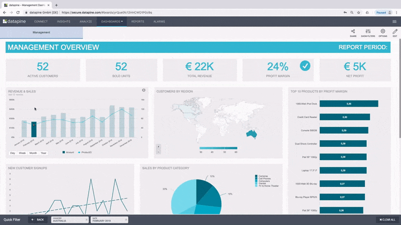
The ignore filters option feature is applied to active customers.
In this case, we have a management overview on which we have applied filters such as the time, product category, and product name, but maybe you have also applied additional quick filters. We can see the number of active customers, but we want to see the total number of customers without any filter interference. By simply applying features of modern online BI tools, we can edit the chart and show the static value of the numbers.
In another case, this feature is useful if you want to compare the total revenue with the selected markets, for example, or simply use as a comparison value in case the presented data is already filtered. Hence, there are different scenarios where you can ignore filters in order to quickly show the original numbers and easily compare the selected chart with the rest of the dashboard.
13) Dynamic Text Boxes/Images
Businesses these days face the issue of monitoring their performance on a daily basis. Exporting reports manually, or writing endless documents takes an enormous amount of effort. This causes an increased risk of overlooking valuable information when you need to know whether your business trends are performing well or need additional adjustments. This can be easily resolved with dynamic text boxes or images, as shown in the pictures below:
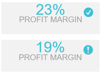
A checkmark showing that the profit margin has performed well while the exclamation mark that we still haven’t reach established goals.
If you have an implemented value or criteria that are under your specified benchmark, a clear exclamation mark will show you that this KPI is underperforming and needs attention. On the other hand, a check-mark will provide a clear signal that the KPI is performing well and the viewer will have an obvious cue of the overall metric’s functioning. This filter can then be implemented on various KPIs within the dashboard and provide additional insights for each and every data needed. It is extremely useful since the dashboard itself will alert you if any differences happen, so manual calculations are no longer necessary.
14) Information Tooltips
There is much information you have to present and explain to your audience, whether as a finance report or management presentation. An interactive dashboard software will also have a function that will enable users to add specific explanations or additional information to text boxes and images, similar to the custom chart tooltips feature, like in the picture below:
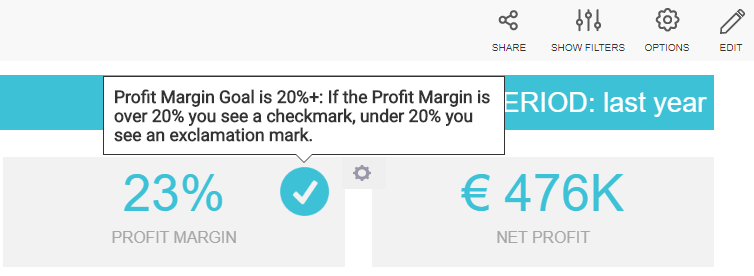
Additional information expressed on the profit margin with the help of information tooltips.
It is triggered once you hover over with a mouse which enables you to see, for example, a definition of a specific KPI or notes about the data you need or present at a meeting. This is useful to include in an interactive dashboard design since definitions and specific explanations are available just by hovering, so the user doesn’t necessarily need to remember every little detail s/he wanted to say or explain.
We offer a 14-day free trial. Benefit from amazing interactive dashboards!
We have answered the question of what is an interactive dashboard, provided examples, interactive dashboard features, tips, and tricks on how to use them in action, and what to look for when choosing your solution. To summarize our article, here are the top 14 interactive dashboard features:
- Dashboard chart filter/click-to-filter
- Drill-throughs
- Drilldowns
- Cross tab filters
- Time interval widget
- Chart zoom
- Custom chart tooltips
- Advanced data options
- Show or hide chart values
- Dashboard widget linking
- Hierarchical filter
- Ignore filter option
- Dynamic text boxes/images
- Information tooltips
Modern interactive dashboard software, like datapine, is helping to drive business with real-time interactive dashboards. This software is easier to use than spreadsheet programs and provides a wider range of options and possibilities. With an innovative interactive dashboard software that provides these 14 interactive features, you can prepare stunning interactive data visualizations of your business data. By simply utilizing interactive business intelligence dashboards, you have the chance to examine countless data sources on a single screen, without profound technicalities. Better yet, you can easily do it on your own with a few clicks and with no advanced IT skills.
Don’t believe us? Start your free trial and check for yourself. You can create your first charts and dashboard in minutes.
The post Move Beyond Excel, PowerPoint And Static Business Reporting with Powerful Interactive Dashboards appeared first on BI Blog | Data Visualization & Analytics Blog | datapine.