
Management reporting is a source of business intelligence that helps business leaders make more accurate, data-driven decisions. But, these reports are only as useful as the work that goes into preparing and presenting them. In this blog post, we’re going to give a bit of background and context about management reports, and then we’re going to outline 16 essential best practices you can use to make sure your reports are effective.
We’ll also examine for some of the examples that illustrate these best practices in action created with a modern report tool. By the end of this article, making stunning and useful managerial reports will be second nature to you. But before we get into the nitty-gritty, let’s start with the basic definition.
What Is A Management Report?
Management reports aim at informing managers of different aspects of the business, in order to help them make better-informed decisions. They collect data from various departments of the company tracking key performance indicators (KPIs) and present them in an understandable way. They basically show the worth of your business over a specific time period by disclosing financial and operational information. Reporting for management provides insights on how the company is doing, empowering decision-makers to find the right path to increase operating efficiency and make pertinent decisions to remain competitive. In order to do so, many companies use professional management reporting software.
When these reports are backed up with powerful visualizations developed with a dashboard creator, no information can stay hidden, eliminating thus the possibility of human errors and negative business impact.
In The Beginning, Financial Reports
Most people in business are familiar with financial reports, which your company is required to keep for external accounting purposes. These reports are generally put out “after the fact” and follow a very clear and established set of guidelines known as Generally Accepted Accounting Principles (GAAP).
While such reports are useful for legal purposes, they’re not ideal for decision-making. They give you a bird’s eye view of your business operations, but without actionable insights or granular data that are useful for making strategic choices. They’re also slow. As Tyrone Cotie, treasurer of Clearwater Seafoods says in 2015 Benchmarking the Accounting & Finance Function report, “…no matter how quickly you compile and release historical financial statements, you never make a decision from them. The challenge for finance is getting timely and accurate analysis that’s forward-looking and helps us make decisions.” This statement is valid today and, probably, in the future as well. Why?
Because this mismatch between usefulness and reality comes from the fact that financial reports were never designed to be useful: they were designed to satisfy legal requirements. They were using historical data only.
Trying to make financial management reports useful
The mentioned mismatch led some companies trying to make their financial reports for legal purposes into decision-making tools by including additional information in them. While this approach has some merit, it has one big drawback: increased complexity and time cost. Considering that financial reports have to hit certain legal deadlines and that any additional information will cause them to be prepared in a more time-intensive way, this approach of “hybridizing” financial reports into management + financial report is not recommended for this type of reporting. Thus, the practice of management reporting separately from financial reporting came about. Managerial reports use a lot of the same data as financial reports, but presented in a more useful way, for example via interactive management dashboards.
As a Growthforce article states, management reporting helps answer some of the following questions for a CEO:
- “Am I pricing my jobs right?
- Who are my most profitable clients?
- Do I have enough cash to make payroll?
- Should I hire more employees? If so, how much should I pay them?
- Where should I spend my marketing dollars?”
To answer these questions, you will need a financial management report, focused not on legal requirements, but business-level, and decision-making ones. In essence, data reporting is a specific form of business intelligence that has been around for a while. However, the use of dashboards, big data, and predictive analytics is changing the face of this kind of reporting.
What Should Be Included In A Management Report And How To Write It: Top 16 Best Practices
We’ve asked the question: ‘what is a management report?’ and explored the clearcut benefits of an effective managerial report. Now, it’s time to consider the management reporting best practices.
Here, we’ll explore 16 essential reporting tips, looking at management reports examples while considering how you can apply these principles to different types of management reports.
1) Set the strategic goals and objectives
For every report that you will write, you will need to start with the end in mind. Why do you need that report in the first place? Do you know the key drivers of your business? How can you tell if your pricing is right? How do you define success? Ask yourself some important data analysis questions that will help you address the needs of the report.
Once you know what you are reporting about and why, it will be much easier to set the performance indicators that will track each specific aspect of the performance. Don’t go further in the reporting process until you have set at least two to three goals.
2) Pick the right KPIs for your audience
OK – so you know that you need to focus on a small number of KPIs. What KPIs should you be putting in?
It really depends on your audience – both on their job function, and their level of seniority. For example, a junior sales manager and a junior marketing manager are both going to want to see different KPIs. And the junior marketing manager is going to be interested in different data than the head of marketing. A good KPI management is critical in the process of manager reporting. A good way to think about the challenge of picking the right metrics is to think: what data-driven questions will the readers of this report want to be answered? A sales manager might be interested in which of his reps are performing the best, while an inbound marketing manager might want to know which piece of content is performing the best in terms of new email signups. Only after answering this question, you will be able to address your audience’s expectations and benefit from effective reporting. You can also read our KPI reports article where you can find precious advice on how to pick your KPIs.
Hereafter is a management-style reporting example for investors that illustrates this best practice well. It focuses entirely on variables that investors would care about, including the share price and the price to earnings ratio.

**click to enlarge**
3) Take customer feedback into consideration in your reports
An additional management reporting best practice is the analysis of online customer feedback. Customer feedback plays into the overall performance of an organization as it caters to the organization’s ability to meet the needs of its customers. Customer feedback not only helps teams gauge what they’re doing wrong on their digital channels, but also what they’re doing right.
Reporting on insights from feedback surveys can aid in forming a more data-driven digital strategy. For example, it can be leveraged to inform your product roadmap, identify pain points across the website (usability), and boost overall customer satisfaction.
Is it overall customer satisfaction you wish to report on? Dive into your charts and show the rise (or fall) of your Net Promoter Score (NPS). Then take it one step further and analyze open comments associated with your scores to uncover what’s causing the drop. From here you can formulate a strategy for boosting the organization’s NPS.
Here is an illustration of an NPS (feedback) chart:

4) Tell a story with your data
Our third management reporting best practices zooms out of hard data and figures to focus more on the style and how to present your raw content. Human beings are primarily persuaded through 3 different types of information: context, content, and meaning. When you tell a story using the data on your report, you can utilize all of them. This form of storytelling is challenging, but you have a few tools at your disposal and some tips:
- Using time periods and historical data. Stories follow a beginning, middle, end pattern, and through the use of showing a data trend over time, you can achieve something similar. For example, you could compare the revenue in Q1 this year to revenue in Q1 last year.
- Contrasting different KPIs and metrics against each other. For example, showing a target revenue number vs the actual number this quarter.
Hereafter is a good management report example of storytelling, mainly thanks to the three large historical graphs taking up most of the display:
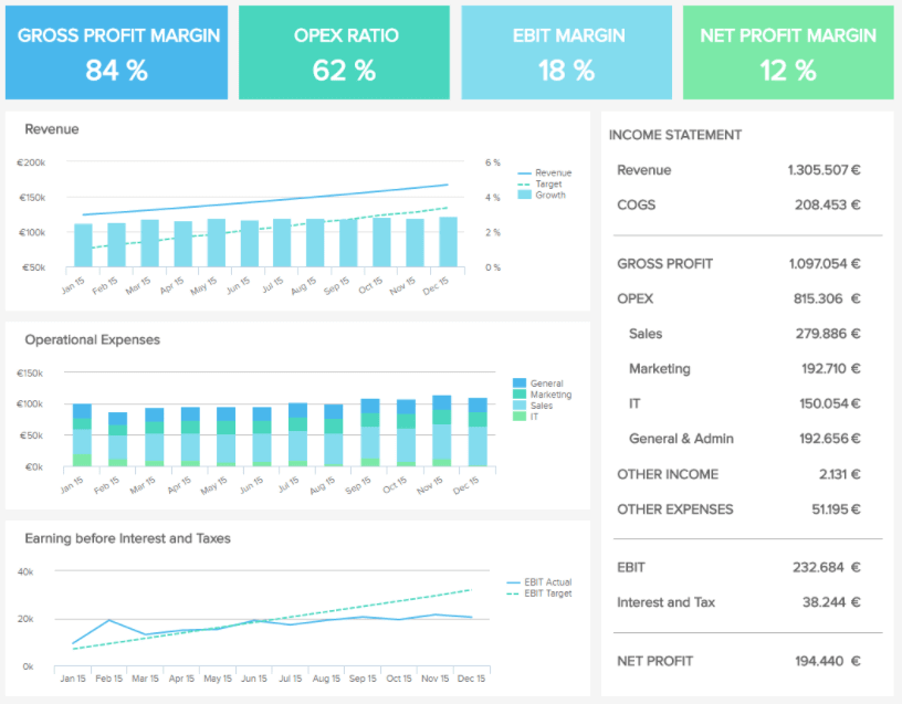
**click to enlarge**
Let’s take a real-world example of how you can selectively use KPIs to tell a specific story: you are the head of marketing and need to justify your current expenditures on content marketing to the CEO. She doesn’t care about email signups or page visits. No, your CEO is interested in revenue and ROI (an essential element of any effective financial management report). It is your job to connect the KPIs you look at revenue so that your CEO understands how important funding your department is.
You could show her the following variables to tell a story:
- Current email list numbers compared to last quarter
- How many new email list signups you’re currently getting per week on average
- The average email list signups you got per week last quarter
- How much money you make, on average, for every new email subscriber and calculate the expected ROI
Using all of this data, you can answer the following question: how much new revenue is being driven by your new content marketing strategy?
This is the kind of story that can make or break funding allocation for a department.
5) Make your report visually pleasing through focus
The human mind cannot process too much data at a time without getting overwhelmed. Getting overwhelmed leads to decision fatigue – which makes it harder for your management team to think strategically. That’s why when it comes to this level of reporting, you should remember the mantra of “less is more”. As a rough rule of thumb, displaying three to six KPIs on a report is a good range, and going too much beyond this is not the best idea.
That doesn’t mean that you can’t have other data presented – but you must have a clear hierarchy of visual importance on your report, and only give the most important spots to your KPIs. Other metrics should occupy secondary or tertiary positions. State-of-the-art online dashboard software allows you to easily build interactive dashboards in no time that will become your best asset when you’ll need to convey your information.
The following revenue report is a good reporting example of this best practice:
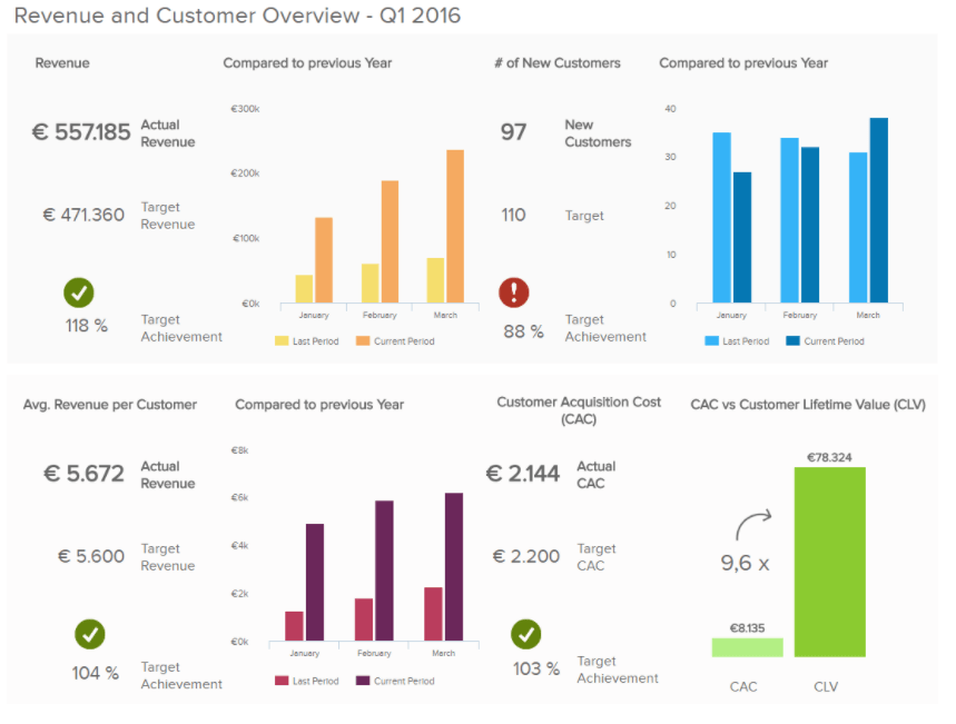
**click to enlarge**
The four KPIs in this report template are prominently displayed:
- Revenue
- Number of New Customers
- Average Revenue per customer
- Customer Acquisition Cost
These KPIs are set in context with historic trends, targets for the period, or other metrics like Customer Lifetime Value, causing this focused graph to tell a story.
6) Make your report very clear
In business writing and in management reporting, clarity is the primary objective. This has several implications for your report design:
- Follow established dashboard design principles – give plenty of white space, make sure your colors stand out from each other, and select colors carefully.
- Don’t forget the small things – have a date range displayed next to the data, and make sure it’s clear whether a given KPI is good, bad, or neutral. A good way to do this is by comparing expected values to real ones, like the expected revenue for a quarter to the actual revenue of this very quarter.
- Use common metrics that everyone who will read the report can understand and has experience with using.
For more tips & tricks on data-efficient data reporting, you can read one of our previous blog posts on how to create data reports people love to read.
7) Go digital!
An important best practice for management reporting is to ditch the paper-based reports and go digital. Online KPI reporting software is a great asset for your business, as they offer real-time updating capabilities, saves money and reduces waste.
These digital reports can be made to be interactive, allowing you to get more granular or zoom out as you please. What’s more, they are collaborative tools that let your team onboard the analytics train and work conjointly on the same report. Another example we will provide you with is the following marketing KPI report:
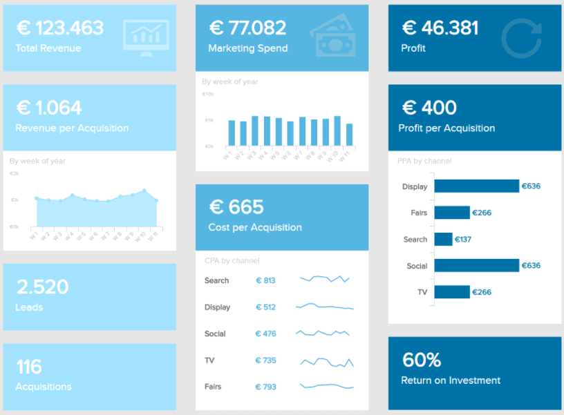
**click to enlarge**
This is the perfect type of report a management team needs to make actionable, data-driven decisions: a high-level overview of the marketing performance is given. Indeed, focusing on the click-through rate, the website traffic evolution or page views wouldn’t make sense. On the other hand, the big picture of how the marketing department as a whole works will be more appreciated: total revenue generated standing next to the total spend, the profit that came out of it, the return on investment, etc.
8) Strike a balance with your data visualizations
We’ve established that making your report clear is vital to success. Another way of making sure that your management report format is digestible is by making sure that your various visualizations are balanced on-page. Our SaaS executive dashboard is an excellent example of a visually balanced management report format:
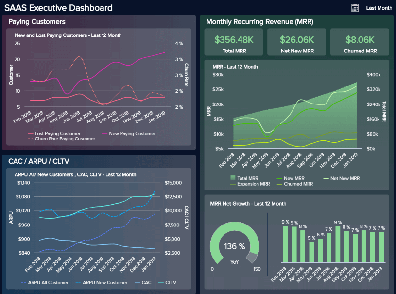
**click to enlarge**
The primary focus of this particular reporting example is to provide a customer-centric view of the costs, revenue, and performance stability of your SaaS-based activities from a senior standpoint.
As you can see, our SaaS executive dashboard serves up 4 KPIs (Customer Acquisition Costs, Customer Lifetime Value, ARPU, and MRR) to offer a concise snapshot for senior decision-makers, with each data visualization selected based on their ability to offer at-a-glance information without clashing or creating confusion.
When choosing data visualization types, it’s important to consider basic design principles while also considering whether each chart, graph, or display works cohesively to provide essential information without causing conflict or consuming too much time.
By taking the previous management reporting best practices into consideration, testing your data visualization choices, and taking your core goals into consideration throughout, you’ll create a managerial report that gets real results.
9) Make your report scannable & drillable
It’s clear that going digital with your management reporting system is essential in our tech-driven age. And, as we touched on earlier, two of the significant advantages of digital management reporting systems are interactive functionality and customizable features.
By being able to customize your reports with ease while taking advantage of interactive features, you can build on your data visualization selection and design best practices to make your management report template both scannable & drillable.
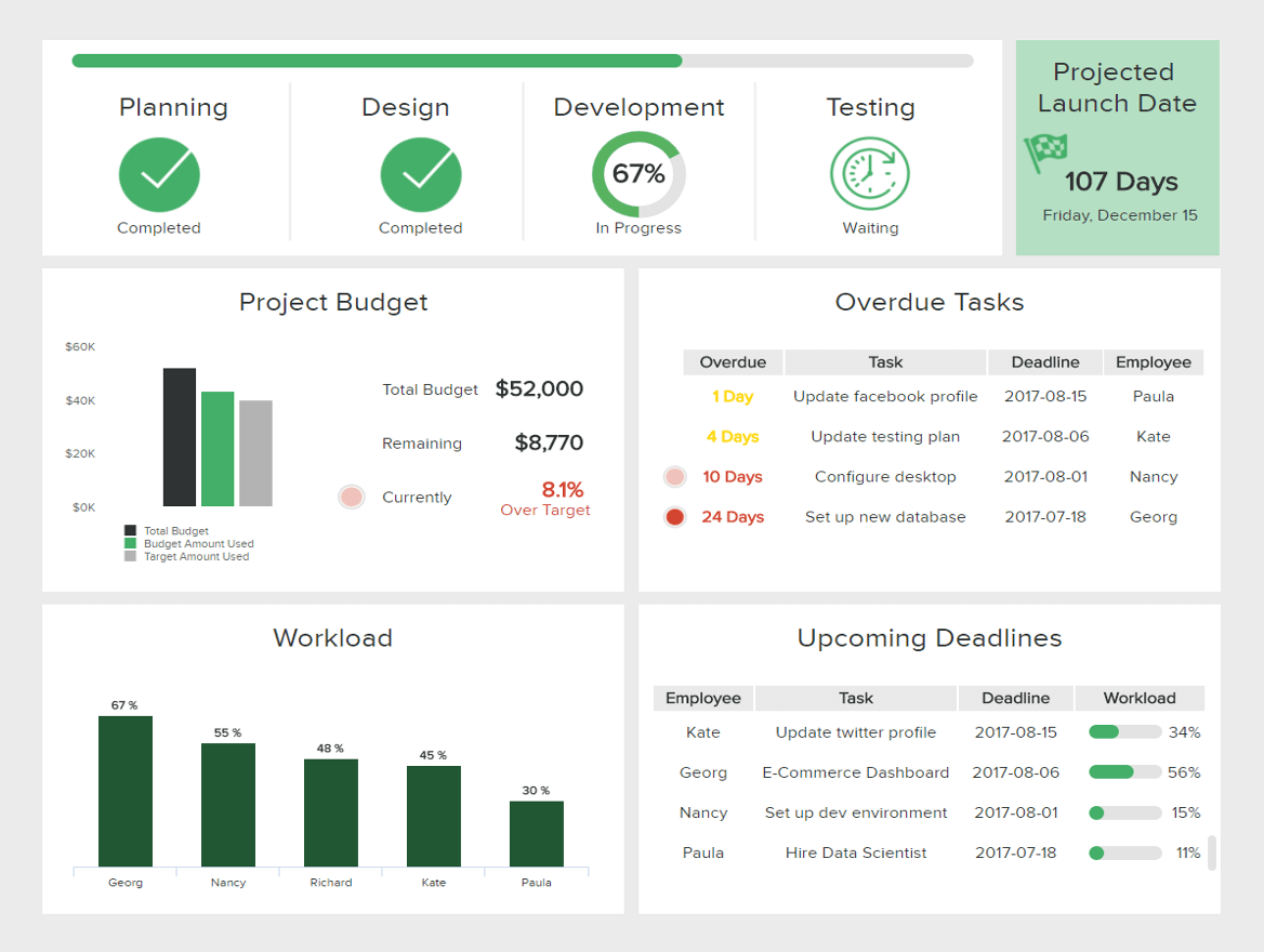
Take this dynamic IT project management report example, for instance:
**click to enlarge**
By making customizations and using interactive functions to drill down deeper into particular pockets of information, this IT report sample is effective for quick access to real-time project performance information as well as comprehensive trend-based data.
Working from the top left to the top right and down the project dashboard in a logical format, you can see the dashboard is entirely scannable, customized for cherry-picking important metrics and data sets. Here, it’s possible to get a clear gauge of project progress, looming deadlines, budgets, and workloads by simply scanning the page.
Plus, by taking advantage of interactive data features and drill down boxes, it’s possible to dig deeper into your data as required. By embracing customizable and interactive dashboards features, you can make your creations flexible, working in real-time or with monthly management report tools. If you want to track your progress in a different format, you can take a look at our KPI scorecard article and organize your milestones differently.
10) Deliver real-time data that aligns with your objectives
Regarding major types of management reports, it’s important to understand when to lean on real-time insights, knowing when to make this kind of dynamic data the most prominent feature of your dashboard.
We’ve covered the importance of data storytelling and selecting a balanced mix of KPIs (for past, predictive, and real-time insights). But what is important to consider with any management report sample is making sure your real-time insights fully align with your objectives.
The next of our management reports examples comes in the form of our energy dashboard – a prime representation of well-placed real-time insights:
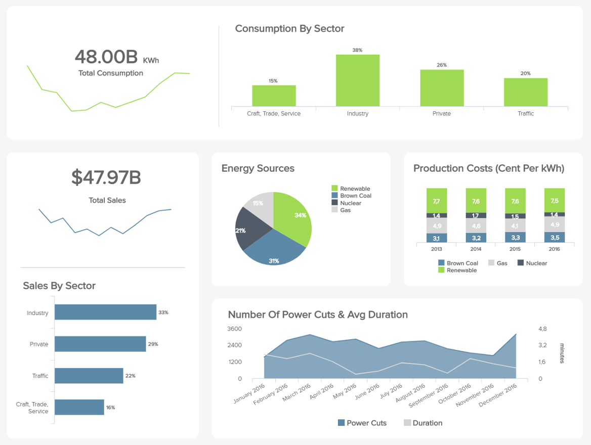
**click to enlarge**
Energy management is challenging as it requires quick responses to potential issues or inefficiencies to prevent major losses or problem escalations by utilizing modern energy analytics solutions. As demonstrated in this most insightful of reporting examples, while you can see a mix of data types, the real-time metrics reflect the core aims of monitoring energy consumption and improving powercut management.
When creating your report, here’s what you should do to ensure your real-time data aligns with your primary goals:
- Revisit your key objectives and KPI selections, studying them in greater detail to see whether your real-time metrics ‘tell a story’ or ‘paint a picture’ that your audience will benefit from.
- Run your report for a week, personally testing it to check if your real-time insights help you achieve your goals and help you make quick, informed decisions.
- Ask other key stakeholders within the organization to test your report and offer their feedback. Based on their (and your) discoveries, make tweaks, changes, or customizations accordingly.
11) Keep your dashboards actionable and improve constantly
Expanding on the previous point: whether a financial management report, a monthly management report or any other type of senior dashboard, continual improvements will ensure your offerings remain relevant and actionable.
The digital world is constantly evolving, and as such, business goals, aims, strategies, and initiatives are always changing to adapt to the landscape around them. To ensure your reports work for you on a sustainable basis, you should periodically test each report to check for any irrelevant data or KPIs while looking for any reporting inefficiencies. This can be done simply by utilizing visual analytics tools that use the power of visualization to ensure your reporting stays on course and improves your business bottom line.
At this point, you’ll have already laid out the framework for your reports, and by committing ample time to make updates as well as improvements, you’ll remain one step ahead of the competition at all times. Get testing!
12) Develop your reports collaboratively
Managerial reporting systems are designed to offer insight, clarity, and direction.
Expanding on our previous point, to squeeze every last drop of value from your managerial reports, you must commit to developing your reports according to the landscape around you—and the best way to do so is as a team.
By taking a collaborative approach to your company management report initiatives, you will increase your chances of making tweaks or enhancements that offer a real benefit to your business.
Suppose you’re in charge of financial management reporting, for instance. In that case, you should create a tight-knit workgroup of relevant specialists within your organization to gather on a regular basis and assess the relevance of your KPIs or metrics.
With this mix of professional perspectives, you will gain the power to spot any existing report management system weaknesses (outdated visualizations, inefficient reporting layouts, unnecessary data, etc.) to ensure that your accounting management reports not only capture every valuable fiscal insight but work in a way that gives every user the tools to perform to the best of their abilities.
As modern management reporting templates offer flexible 24/7 access across a multitude of devices, it’s possible to develop or evolve your visualizations and insights collaboratively on a remote basis, if required.
13) Create a sense of cohesion & consistency
Concerning financial management reporting best practices, our dynamic financial dashboard is as good as it gets. With a balanced mix of scannable visualizations and KPIs designed to drill down into the four primary areas of CFO management, this particular tool demonstrates the unrivaled value of internal management reporting.
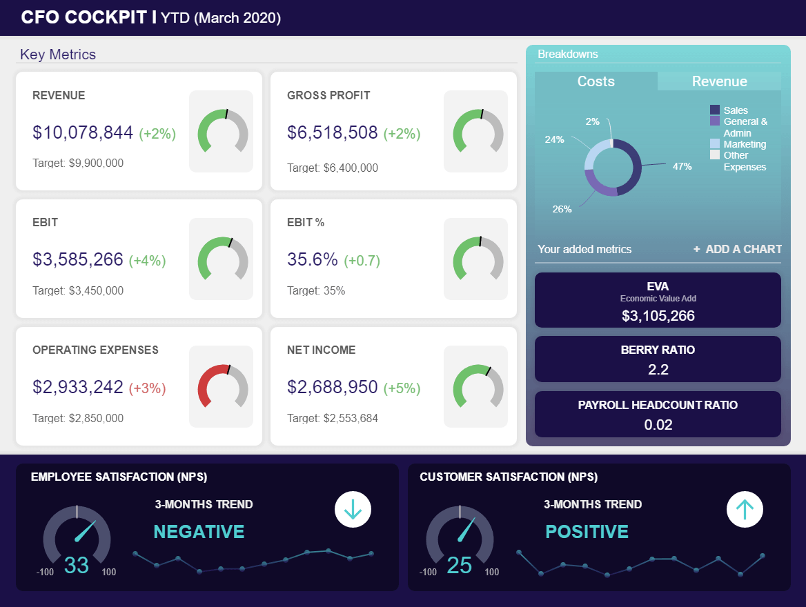
**click to enlarge**
Here, everything is geared towards striking a balance between economic value, improved financial performance, and ongoing employee satisfaction, presented in a logical and digestible format for swift decision-making even under pressure.
One of the main reasons this CFO manager report template works so well is its functional as well as visual cohesion and consistency. Every key element is neatly segmented on screen, with charts that offer a wealth of relevant information at a glance.
As you can see, everything flows, each element fits into the right place, the colors and tones are cohesive, and it’s clear where you need to look when you need very specific nuggets of information in the moment.
Using this template as a working example, which you can adjust also as a CEO dashboard, you can create various types of reports in management with visual and practical consistency and cohesion at the forefront of your mind. If something appears out of place or creates friction, go back to the drawing board and start again until everything is harmonious and offers genuine value.
14) Compartmentalize your data effectively
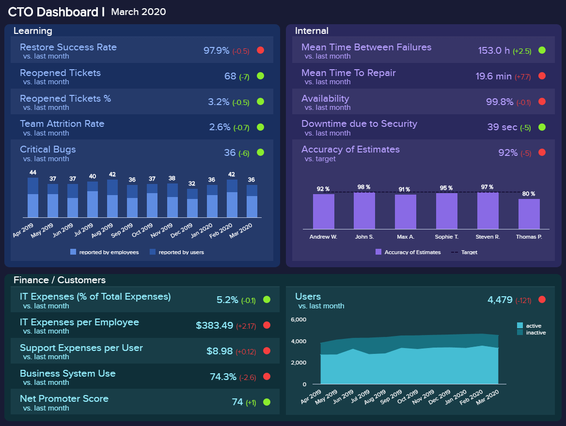
A striking sample management report, our interactive IT dashboard is a dynamic informational toolkit for anyone leading a company’s technical innovation and progress.
**click to enlarge**
Whether you’re a small, medium, or large business (and regardless of your sector), our CTO-centric management reports template focuses on minimizing technical issues, streamlining tech-based processes, improving team attrition rates, managing new developments, and more.
In addition to its streamlined functionality and sheer reporting power, one of the key reasons this managerial report example is so powerful is its effective compartmentalization. Expanding on our last trip, by focusing on cohesion before considering how you will compartmentalize your insights, you will consistently get the most from your management reporting efforts.
We touched on this before, but it’s a vital component of reporting, so it’s worth covering in further detail: once you’ve committed to your data and visual KPIs, examine how each key element fits into your report and place it into the ‘right compartment’ on-page.
Looking at the CTO dashboard, each core branch of information is split into a box under a clear-cut subheading. Within each of these compartmentalizations, there is clearly labeled data, insights, and visualizations.
By drilling down further into how you compartmentalize your reports, you will give yourself the ability to analyze one area of information or grab an entire snapshot at a simple glance. As a result, you will improve your business performance and streamline your decision-making process.
15) Create a scannable timeline
Performance reports help managers make vital improvements to specific functions of the business with clear-cut direction and complete confidence.
Our HR dashboard — a must for any modern HR department — exists to help personnel-based managers keep their employees happy, engaged, and motivated. Employees who feel valued and engaged in the business are generally more productive and more creative, so looking after your talent the right way should be one of your company’s top priorities — no exceptions.
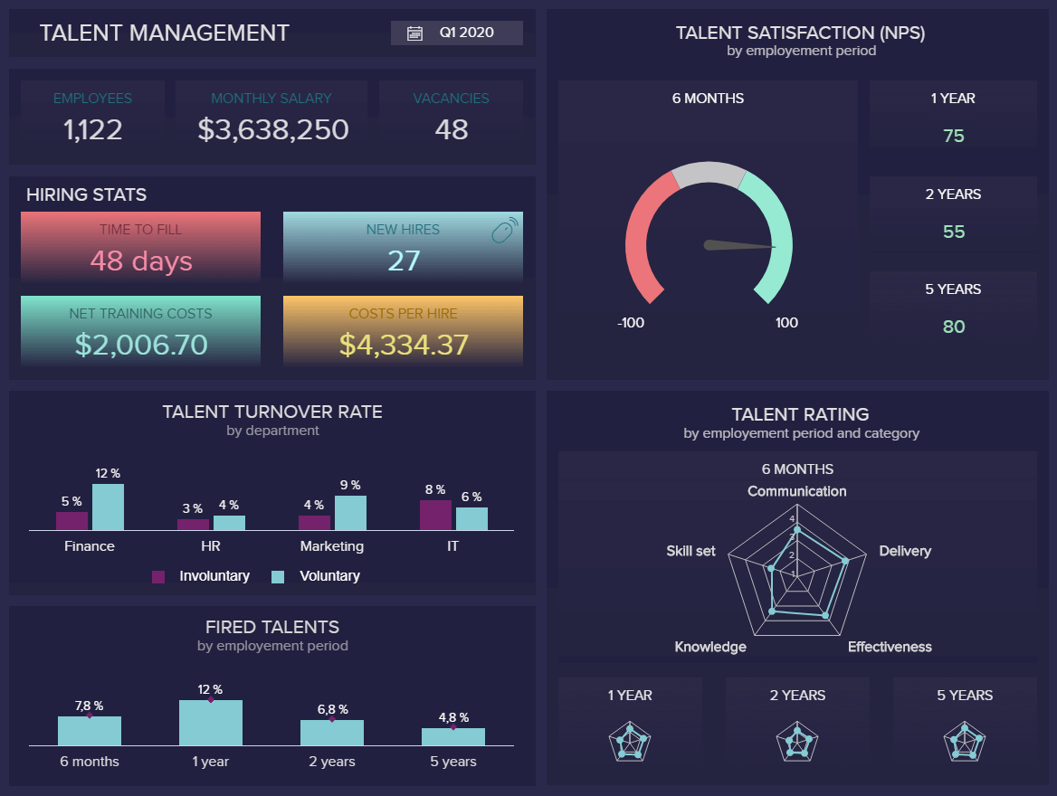
**click to enlarge**
When it comes to management information reporting from any employee perspective, our Talent Management dashboard serves up a perfect storm of data-driven insights that covers staff turnover, dismissal, rising talent, and overall satisfaction levels. For example, the talent satisfaction KPI for HR manager gives you a clear overview of whether your company gives enough incentives to satisfy your current workforce.
But not only as here, you will gain a deep working insight into where you might be going wrong while capitalizing on your strengths and, ultimately, offering the right reward, recognition, training, and support where needed.
What makes this dashboard so successful is the fact that it provides a solid timeline of information. By working down or across, you can access an excellent balance of historical, real-time, and predictive data with ease.
As such, this report paints a data-centric timeline that will empower any HR manager to examine trends, understand fluctuations in employee engagement rates, and create viable strategies that increase retention while boosting productivity.
The takeaway here? When considering the contents of a good management report, it’s always important to look at how your visualizations and design layout create a timeline or that allows you to formulate initiatives that will benefit the business both in the moment and in the future.
16) Encourage a data-driven culture
Last but certainly not least on our list of examples of management reports, we arrive at the concept of company culture. Your company culture is the blueprint for how your business runs as well as how everyone within your business interacts or operates internally. Naturally, your internal culture will have a notable impact on the way your clients, customers, and affiliates view your business.
Seventy-eight percent of top business leaders believe that company culture is among the top five things that add value to their company. That said, if you want to maximize the power and wider organizational values of your data-driven reporting efforts, you should make it a key component of your company culture.
If you place the value of data and using it to its maximum capabilities at the heart of your company culture, you will empower everyone to embrace and make use of the reporting tools that will improve their performance while making their roles easier (which, in turn, will boost employee satisfaction levels).
To do so, you should hold regular data meetings to explain how data reporting can benefit every department within your organization while holding educational workshops where everyone within the business can learn how to use the tools.
Let’s now go over the history of these reports, where they come from, and how they have been developed.
History And Trends Of Management Reporting
In the past, legacy systems were used to prepare reports for management – and still are, in many cases. These systems are much more useful than financial reports but still, have their drawbacks. Legacy systems are often quite technical in their operation and interface, which makes them challenging for most non-IT personnel to use effectively. This creates a situation of “lag time” between a member of management wanting a report and actually receiving it.
In modern times, with the breadth and depth of data available growing at an astonishing rate, these challenges have only escalated. As Peter Wollmert, an EY global leader, stated in a quote for a Financial Director article: “Many [CFOs] are encumbered by legacy systems that do not allow reporting teams to extract forward-looking insight from large, fast-changing data sets”.
Additionally, the article reports that a survey conducted by the EY financial accounting and advisory services (FAAS) indicated that ⅔ of CFOs worldwide say that “the increasing volume and pace of data is affecting their ability to provide meaningful insights to boards”. Clearly, modern business dashboards have a lot to offer to this kind of reporting. Let’s dive into the best practices for preparing and presenting them.
Why Is It Important To Write A Management Report?
For any function and in any industry, reports are more than useful, they are crucial to the well-functioning of the company.
Reporting is all the more important in management as it has higher stakes and holds bigger, cross-disciplinary decisions. In general, reports are important to management for various reasons: they measure strategic metrics to assess and monitor the performance, they set benchmark about said performance, enable the business to learn from its activity by leaving a track record, and finally enhances communication. Here’s a short list of management reporting benefits:
- Measuring strategic metrics to assess and monitor the performance: by now, we’ve understood that if businesses wanted to grow, they would need to implement a way to measure their performance against their competitors – but also against their own
- Helping you understand your position: a management-style report provides you with the right metrics to get a snapshot of your business’ health and evolution. You can compare it to your competitors to focus or realign your strategy.
- Setting clearcut performance benchmarks: thanks to that track record, you have a regular benchmark about how you perform both operationally and financially.
- Learning and reproducing – or not: benchmarks are a guide to tells you what works and what doesn’t. From it, you can learn the best and worst practices to develop or avoid.
- Enhancing communication: among partners, investors, customers, and colleagues. Management-type reports develop the visibility of the different activities across departments and improve communication within the company.
- Improving collaboration: as a direct result of improved internal communication, senior-level reports enhance interdepartmental collaboration. With people working cohesively towards a common goal, departments can use management reporting data discoveries to collaborate on specific projects or initiatives, catalyzing success in a number of key areas.
- Boosting engagement & motivation: a well-crafted manager-level report makes critical company data accessible to all, which improves individual performance. When people are performing at an optimum level and being recognized for their work, they will become more engaged, inspired and motivated. This, in turn, will increase productivity across the organization.
- Fostering continual business growth: solid reporting in management indeed improves productivity and decision-making, which fosters consistency as well as continual business growth. If you’re growing consistently over time, you will ensure long-term success – the most powerful benefit of reporting in management.
How To Prepare A Management Report – Summary

To sum up the main steps we have explored throughout this guide and cement our understanding of the question “what is management reporting,”, here is a list of the ten management reporting best practices you should use to prepare a solid report or overview. By taking the time to get acquainted with these approaches, you will boost your business intelligence (BI) initiatives sooner than you think.
Without further ado, let’s summarize:
- Set the strategic goals and objectives: start by defining what you want to achieve, why you need to write that report, and who you are writing it for.
- Choose the right KPIs for your audience: different positions have different needs – keep in mind who will read what you write so as to know what you need to focus on.
- Take customer feedback into consideration: customers are the backbone of any business, and you need to understand what your business is doing wrong as well as right.
- Polish your data storytelling skills: You have hard data in your hands that need to be understood by everyone: clarifying it with a nice story, backed with a comprehensive dashboard will convey your insights even more easily.
- Make your report visually pleasing through focus: with the help of a BI software, you can build compelling dashboards in no time that will be your best ally when communicating your findings.
- Clarity is the watchword: follow some presentation and design principles to stay on the safe side while elaborating your report.
- Go digital: paper-based reports are of the past. Put your hands on an online dashboard tool that will let you consolidate your data in one central place, quickly and smoothly build interactive reports with always up-to-date information.
- Striking the balance: to ensure you get the most from your centralized digital dashboards, you need to make sure that the visualizations work well on-page and help those within your organization obtain at glance information with ease, devoid of confusion.
- Scannability + drillability = success: by taking full advantage of the interactive functionality of digital reporting dashboards, you can improve the scannability of your dashboard reports while using filters and drill down boxes to dig deeper into important pockets of information with ease.
- Real-time data relevance: real-time insights are invaluable to any organization—but only if they align with your core reporting goals. Test your reports before rolling them out across the organization, checking your real-time metrics for clarity and relevance.
- Keep on improving: the digital world is constantly evolving. Sector, niche, or industry aside, you must regularly test your reports, making changes or customizations to iron out any data that has become redundant or inefficient. Never stop testing; never stop improving.
- Develop your reports collaboratively: When improving and enhancing your reports and dashboards, you should work as a tight-knit team, taking everyone’s ideas and perspective on board. Doing so will ensure your reports are valuable and built for success at all times.
- Create a sense of cohesion & consistency: From both a visual and functional perspective, focusing on creating a sense of consistency and harmony with your KPIs and visualizations will improve your reporting success across the board.
- Compartmentalize your data effectively: In addition to making sure you create cohesion within your on-page reporting layout, you should also compartmentalize every key branch of information, creating separate boxes and subheadings for quick access to effective information.
- Create a scannable timeline: When creating your dashboard reports, developing an informational timeline over a specific period will make it easier for you to put together strategies and initiatives in a wealth of key areas.
- Encourage a data-driven culture: Your company culture is, in many ways, the beating heart of your entire business. By taking measures to place respect and value for data-driven reporting at the heart of your business, you will empower everyone to embrace the concept, boosting the value of your dashboard-centric efforts.
With all of these reporting best practices, you can now make online reports that will help your company’s leaders to make effective, data-driven decisions
“The greatest value of a picture is when it forces us to notice what we never expected to see.” – John W. Tukey
On our journey, we’ve considered the question, “what is management reporting,” outlined the management reporting definition, looked at management reports examples, explored best practices, and drilled down into the business-boosting benefits of dynamic digital dashboards.
It’s clear that by embracing the wealth of digital data available to your business and harnessing it effectively, you stand to make the kind of management decisions that will drive your organization forward with force, accelerating your success in the process.
“A point of view can become a dangerous luxury when used as a substitute for insight and understanding.”— Marshall McLuhan, a renowned Canadian communications professor
In a nutshell, you should follow the management reporting examples by hand-picking a small number of relevant KPIs to display and telling a clear story with your data. It’s also essential to work collaboratively, creating a healthy ecosystem of data-driven innovation that will empower everyone in the business to benefit from the unrivaled power of managerial-style reporting. Knowledge is indeed power, and if your business runs on it, you will reap great rewards, both now and in the long run.
Combine this concept with the help of our online data analysis tool that will empower you to work on the evolution of your data in real-time while enabling you to create efficient dashboards, and you will drive your business well above the competition.
Take charge of professional destiny today by trying datapine with a 14-day trial, completely free, and start creating your own reports just with a few clicks!
The post Top 16 Management Reporting Best Practices To Create Effective Reports appeared first on BI Blog | Data Visualization & Analytics Blog | datapine.