
The secret is out, and has been for a while: In order to remain competitive, businesses of all sizes, from startup to enterprise, need business intelligence (BI) and different types of dashboards.
Business intelligence has evolved into smart solutions that provide effective data management – from extracting, monitoring, analyzing, and deriving actionable insights needed to stay competitive on the market, to powerful visualizations created with a dashboard builder which enables business users to interact with data and drill into bits and pieces of information they might need, at any time, any place.
But what do you do with all this business intelligence? You can have the most robust BI infrastructure in place. However, if the underlying information isn’t easy to access, analyze, or understand, it is pointless. This is where the power of business dashboards comes into play. Dashboards often are the best way to gain insight into an organization and its various departments, operations, and performance. Well-built, focused dashboards easily serve up summaries and reports of the BI that’s most critical to the organization. Moreover, different types of dashboards will enable you to convey an improved message to your audience, organize your data more effectively, and boost business processes across the board.
Explore our modern dashboard software for 14 days, completely free!
That being said, in this post, we will explain what is a dashboard in business, the features of strategic, tactical, operational, and analytical dashboards, and expound on examples that these different types of dashboards can be used. Let’s get started.
What Is A Dashboard In Business?
A dashboard in business is a tool used to manage all the business information from a single point of access. It helps managers and employees to keep track of the company’s KPIs and utilizes business intelligence to help companies make data-driven decisions.
Let’s take an analogy to explain this notion further: A car dashboard instantaneously identifies and provides feedback regarding the status of the automobile: speed, servicing needs, tire pressure, fuel level, etc. Dashboards in business do the same thing, only much more. Through dashboards, organizations can quickly identify current and historical performance. Organizations can also further utilize the data to define metrics and set goals. By integrating these key performance indicators (KPIs) and goals into their dashboards, companies can proactively identify issues, minimize costs, and strive to exceed performance expectations. Of course, it is also important to choose the right KPI.
In the recent years, dashboards have been used and implemented by many different industries, from healthcare, HR, marketing, sales, logistics, or IT, all of which have experienced the importance of dashboard implementation as a way to reduce cost and increase the productiveness of their respected business. It doesn’t matter from which business you’re coming from or how big your company is, you always want effective results and clear actions to be taken after an issue is discovered.
Let’s explain that with a dashboard example:
**click to enlarge**
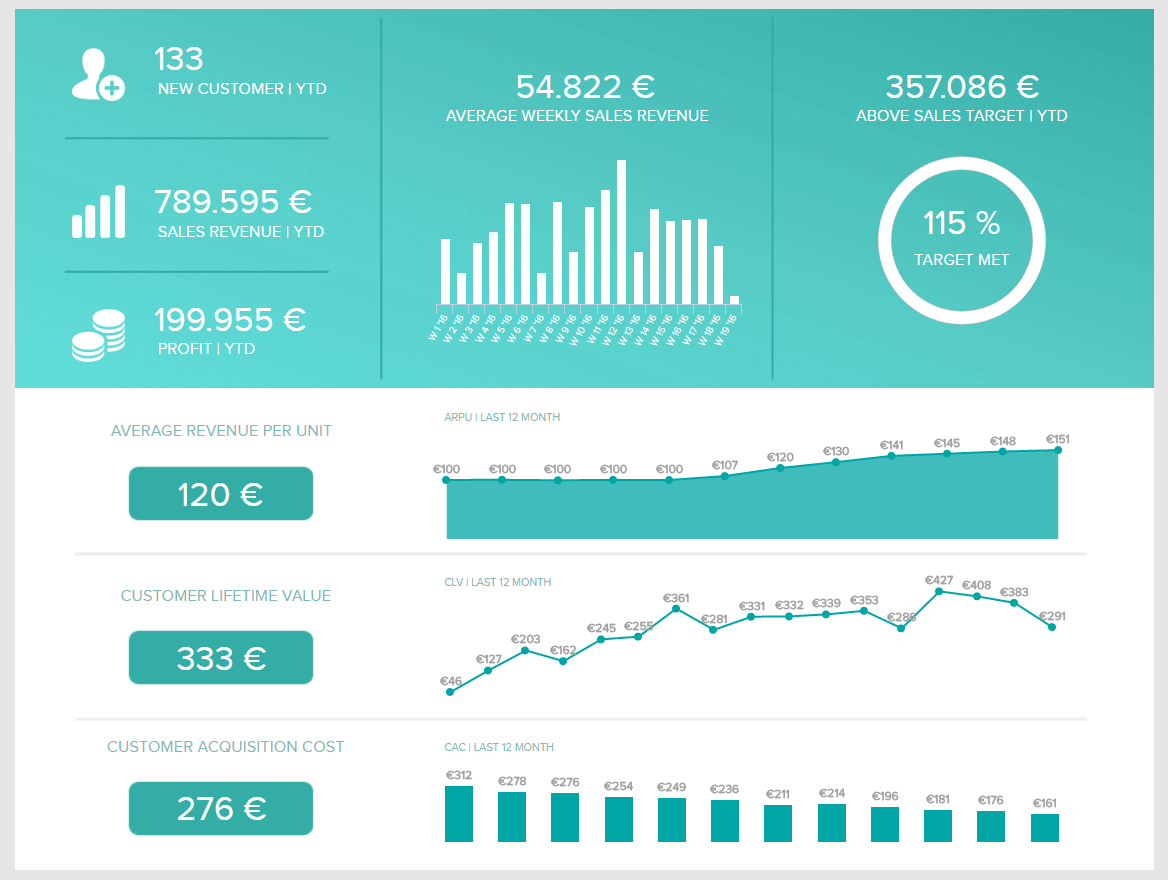
The sales performance dashboard above is a one-stop-shop for sales insights. The dashboard provides the perfect overview of the progress of the sales department by focusing on various sales KPIs: sales growth, sales targets, average revenue per unit (ARPU), customer acquisition cost (CAC), and customer lifetime value (CLV).
At a glance, sales managers can see whether or not their team is meeting their individual goals. Managers can also see if the team as a whole is reaching its goals. The value this brings to the business is significant. Once companies gain regular insights into their KPIs, they see deeper into their data and generate actionable insight.
This type of analysis is not feasible with traditional paper reports and spreadsheet tools. The traditional types of reporting don’t meet the requirements of today’s data management nor can they produce efficiency like an interactive dashboard where sets of data are presented in a complementary way. An effective dashboard combines information dynamically to measure performance and drive business strategy. That interactivity is indeed what drives a profitable result by visually depict important data that can be accessed by different departments. Cloud-based, real-time online data visualization software enables fast, data-driven action by decision-makers.
Digital age needs digital data. Now when you have plenty of information about dashboards, let’s take a closer look at each type, and how to choose the one you need in your daily operations or strategic goals.
Explore our modern dashboard software for 14 days, completely free!
What Is Your Dashboard Type?
There is another important factor to a dashboard’s success, besides avoiding “data puke.” It is as simple as choosing the right type of dashboard.
As mentioned, the purpose of a dashboard is to drive action. In this data-driven world, many dashboard types are changing the way a successful business intelligence strategy is conducted. That means that although you can have a healthy approach to your business development, if you don’t communicate the right sets of data to the right people in your company, long-term success can be jeopardized and costly. This is why choosing the right type of dashboard can bring lasting and cost-effective results.
But that’s no easy task. With all the amount of data these days, and all the objectives and goals that managers need to achieve in a short timeframe, it’s not uncommon to be confused and overwhelmed with all the dashboards out there. The first and foremost, you need to ask yourself the question of all questions:
What Problems Are You Trying To Solve?
To help you on your way to determine what kind of problems you need to solve, you should start with these inquiries: What is the main purpose of a dashboard? And, is your dashboard analytical or operational? Determining which overarching category your dashboard sits in is the first order of business.
Operational dashboards look at current performance related to your KPIs. They help organizations understand, in real-time, if its performance is on target. They are often used across various levels of an organization.
Analytical dashboards help organizations establish targets based on insights into historical data. They are often complex: utilizing complex models and what-if statements. Analytical dashboard’s ownership usually falls on business analysts/experts.
When discussing dashboard types, it is easy to get caught up in a game of semantics. Of course, there is overlap between the two genres and dashboard naming conventions are evolving with the field. The important thing is that you identify what questions you are trying to answer before you build a dashboard.
So What Types Of Dashboards Work Best For You?

Now that we have separated the dashboards into two large categories, let’s dig deeper. There are 4 general subtypes of dashboards:
- Strategic – focused on long-term strategies and high-level metrics
- Operational – shows shorter time frames and operational processes.
- Analytical – contains vast amounts of data created by analysts.
- Tactical – used by mid-management to track performance.
Yes, with our current hierarchy you can have an operational-operational dashboard. We told you we could get into some dashboard semantics. Each of these dashboard types comes with different requirements for the level of summary, analytic capabilities, and user interfaces.
What Is A Strategic Dashboard?
A strategic dashboard is a reporting tool for monitoring the long-term company strategy with the help of critical success factors. They’re usually complex in their creation, provide an enterprise-wide impact to a business and are mainly used by senior-level management.
Strategic dashboards are commonly used in a wide range of business types while aligning a company’s strategic goals. They track performance metrics against enterprise-wide strategic goals. As a result, these dashboards tend to summarize performance over set time frames: past month, quarter, or year. When the strategic dashboard is properly developed, designed, and implemented, it can effectively reduce the amount of time needed to accomplish a specific business key performance indicator, while reducing operational costs. To know what is a dashboard in strategic planning doing and why it’s important, it’s important to keep in mind that these dashboards can provide senior teams a clear picture of strategic issues, and therefore, grant them the opportunity to accomplish a specific course of action.
Although they can provide opportunities for specific departments’ operations and further analysis, strategic reports and dashboards are usually fairly high-level. As mentioned, senior members of a team can identify strategic concerns fairly quickly and provide comprehensive strategic reports with the analyzed data. The importance lies in analyzing management processes, using common qualitative and quantitative language, and identifying a specific system, which has to be incorporated into the dashboard so that every decision-maker understands the presented data.
Let’s see this through 3 strategic dashboard examples.
a) Management strategic dashboard
This management dashboard below is one of the best strategic dashboard examples that could easily be displayed in a board meeting. It isn’t cluttered, but it quickly tells a cohesive data story. The dashboard focuses on revenue in total as well as at the customer level plus the cost of acquiring new customers. The dashboard is set to a specific time frame and it includes significant KPIs: customer acquisition costs, customer lifetime value, and sales target.

**click to enlarge**
This dashboard answers the following: What is my customer base and revenue compared to this time last year? While addressing specific values, incorporating specific key performance indicators, and using a common qualitative and qualitative language, this dashboard represents the management board clear value and specific course of action, while using comparison metrics and analysis.
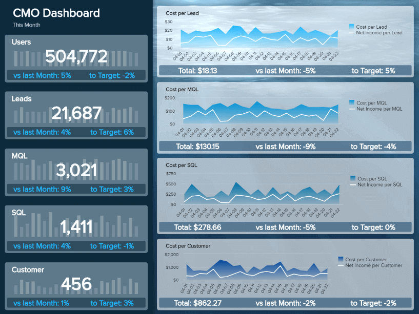
b) CMO strategic dashboard
Another example comes from the marketing department. Chief Marketing Officers (CMOs) often don’t have time to check numbers such as traffic or CTR of certain campaigns. But they do need to have a closer look at a more strategic level of marketing efforts, even cooperating with sales to reach the best possible marketing results a business can have, and, therefore, generate profit. This marketing dashboard shows these important strategic KPIs in a visual, informative, and straightforward way.
**click to enlarge**
The strategic dashboard example above expounds on the cost of acquiring each customer, leads, MQL, and compares them to previous periods and set targets. A CMO must have a birds-eye view of the strategic goals so that he/she can react promptly and keep the department’s results under control. An executive can immediately see where his/her targets are, which gives them the ability to drill down further into these marketing KPIs and see what can be improved in the overall marketing funnel.
To build this strategy dashboard, you don’t need to have extensive IT skills or advanced database management knowledge. The important part is that you understand your strategic goals, and the KPIs you need to achieve them. The rest is done by a simple drag-and-drop interface of a KPI software which enables you to cut the manual tasks of data management and dig faster into your data by interacting with each metric.
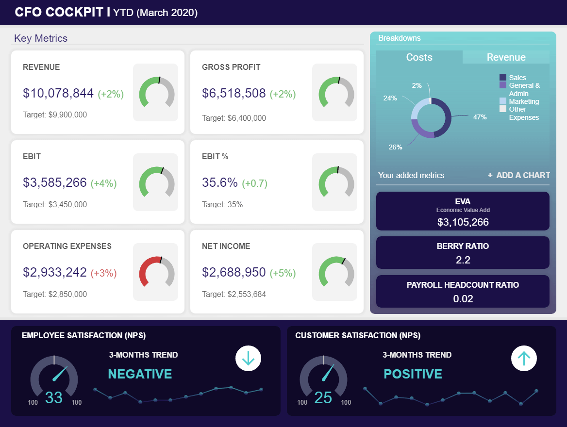
c) CFO dashboard for strategic planning
Chief financial officers need to keep a company’s strategy on track, monitor the financial performance closely, and react when there are deviations from strategic goals and objectives. But not only, as the finances of a company are affected also by non-direct factors such as employee and customer satisfaction. For example, if employees are not satisfied with their working environment, they can call in sick or leave the company which will cause financial bottlenecks. But let’s take a closer look at what kind of dashboards for strategy CFOs need.
**click to enlarge**
We will start the dashboard analysis with key metrics critical for strategic financial analytics optimization, expressed here both in dollars and percentages while simple gauge charts immediately put the focus on red and green colors. The visual interface will immediately show you that operating expenses are higher than expected, which you can use to dig deeper and identify the causes. On the other hand, we can see that metrics such as revenue, gross profit, EBIT, and net income are kept under control and, in fact, generate positive values. A quick overview of the targets shows exactly how much the gains increased, expressed in dollars.
By having all these numbers in a clear and concise format, each CFO can utilize the visual as a comprehensive financial report template, consolidate data from multiple touchpoints and automate this strategic plan dashboard for future use.
Let’s continue with more details on the right of the dashboard. The costs are visualized through a percentage breakdown depicting sales, general and admin, marketing, and other expenses. Here we can see that sales use up most of the costs, followed by general and admin. Maybe there is space to eliminate some costs but be careful not to cause the opposite effect.
Finally, employee and customer satisfaction levels are financial charts that are not directly related to the general financial performance but they can certainly affect it. Modern times require modern solutions, hence, CFOs need to have a close overview of other elements that can impact the company’s finances.
Now that we have illustrated the power of these strategic reports, it is time to take a closer look at our next types of dashboards, continuing with operational dashboards.
Explore our modern dashboard software for 14 days, completely free!
What Is An Operational Dashboard?
An operational dashboard is one of the types of dashboards used for monitoring and managing operations that have a shorter time horizon. Since they focus on tracking operational processes, they’re usually administrated by junior levels of management.
Their value in today’s digital age lies in the fact that businesses start to realize the importance of fast and correct data between operational teams and departments. While the unprecedented developments in the field of dashboard reporting and analysis have made operational undertakings quite simplified, operational managers can also greatly profit from using these kinds of dashboards, and visually and interactively point to a real-time data issue that has to be swiftly addressed.
These kinds of dashboards are arguably the most common ones. They are mostly used for monitoring and analyzing a company’s activities in a given business area. These dashboards are usually focused on alerting about business exceptions and are based on real-time data. Operational metrics dashboards usually end up in the hands of the subject matter experts. This often leads to more direct action, then further analysis. Because of this, operational dashboards often are more detailed than strategic dashboards. They can also provide operational reports with a more detailed view of specific data sets.
Operational dashboards help departments stay proactive and ahead of problems. For example, a manufacturing firm may use an operational dashboard to track products manufactured along with the number of defects, complaints, or returns. This helps in the manufacturing analytics processes – with a dashboard, any problematic changes would be highlighted in real-time.
But let’s take a look into another marketing example. We have illustrated a strategy dashboard of a marketing department in our last example above, and now we will focus on an operations dashboard example, also for marketing purposes.
a) Marketing operational dashboard
The marketing performance dashboard above is one of our top operational dashboard examples. It shows the performance of 3 campaigns over the past 12 weeks. It provides important operational information and key performance indicators for the marketing team on cost per acquisition, the total number of clicks, total acquisitions gained, and the total amount spent in the specific campaign. Any significant changes would immediately alert the marketing team. Why is it useful? Because a fast-paced marketing department or agency can adjust their operational activities based on real-time data and teams don’t have to wait for extensive, traditional reports and analysis presented in a spreadsheet.

**click to enlarge**
We can see how each campaign performed and what kind of results brought in a set timeframe. This is extremely useful when each campaign needs to be optimized to deliver the best possible results, and often it’s done on a daily basis, especially in agencies. Operational reports need to be built fast, and this dashboard can help each campaign manager by having real-time, accurate data.
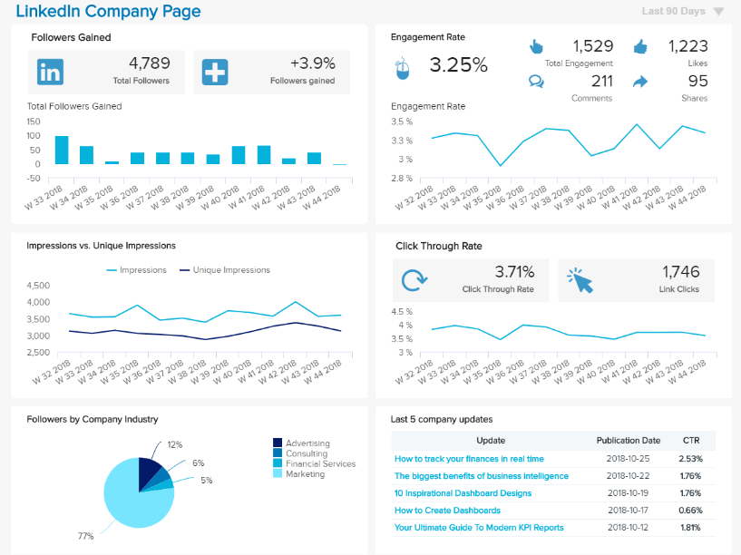
b) LinkedIn operations dashboard example
We continue our list of operations dashboard examples with LinkedIn. This social media network is critical for building business relationships, either on a profile level or company. With the number of users steadily growing and reaching more than 610 million members in 2020, LinkedIn should be on a higher priority for companies that want to reach decision-makers and business professionals. To effectively manage a company’s presence, companies can use an operational data dashboard that will solve multiple social media problems such as automation, customization of reports, and provide advanced analytical features. Let’s take a look at an operational dashboard design example specifically created for LinkedIn.
**click to enlarge**
To understand how your company is developing, managing your account in a shorter time frame is a must in the fast-paced social media world. Communicating with followers, monitoring the engagement rate and recent updates will ensure you stay present and reachable for any social messages that you receive or send. If you compare your results over time, you can identify trends, spot inefficiencies in your operational management, and create a social media report that will consolidate all LinkedIn-related communication.
In the example above, we can see the numbers of followers gained and the development on a weekly basis. It’s good to have an increment in the number of followers as your posts will have a greater chance to reach more people. The dashboard continues with metrics such as impressions, followers by industry, and engagement rate. It’s important to know where your audience is coming from since different industries require different content. The breakdown of the engagement rate through total engagement, likes, shares, and comments will let you know what kind of content works best so that you can reuse it in the future. Examine what happened if you see a certain spike and try to recreate the same strategy again.
The final part shows the CTR and the last 5 company updates. These metrics are critical to track since you will find out how many users actually click on your link and how your most recent updates behave. Modern BI reporting tools will ensure all these data is calculated automatically and delivered on a time frame that you set (for example daily or weekly), without the need to export numerous spreadsheets or work with other potential limitations.
c) Customer service operational metrics dashboard
One of our next operational dashboard examples focuses on customer service. By having all the important customer service KPIs on a single screen, the team can manage its operations much more efficient. Let’s see this through a visual example.
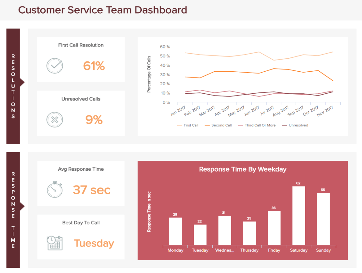
**click to enlarge**
This type of a dashboard expounds on the customer service team’s performance over a shorter timeframe, in this case, daily, with an additional monthly overview of the first, second, third call, and unresolved ones. We can see that the customer service dashboard is divided into 2 parts: the resolutions and the response time. Each day of the week gives an additional insight which helps teams to reduce the response time metric if they track it on a regular basis. That way a team can know if they need more staff or a better schedule during the days where response time is higher. That’s why it is important to keep the operations on track and keep an eye on the team’s performance on a daily level. For added value, you can check our article on the top call center KPIs and ensure the best possible customer service.
We have seen our operational dashboard examples focused on marketing and customer service, now we will continue with additional, different types of dashboards concentrated on the analytical processes of a company.
What Is An Analytical Dashboard?
An analytical dashboard is a type of dashboard that contains a vast amount of data created and used by analysts to provide support to executives. They supply a business with a comprehensive overview of data, with middle management being a crucial part of its usage.
Like mentioned earlier, the importance of an analytical dashboard lies within their impact on historical data usage, where analysts can identify trends, compare them with multiple variables and create predictions, and targets, which can be implemented in the business intelligence strategy of a company. They are often useful when complex categorized information is massive and broad, and need visualization to perform a clear analysis of generated data.
The analytical dashboard can also be found at the intersection of the strategic and operational dashboard. They consist of different modules that can bring a positive effect on the performance of a business if used correctly.
a) Financial performance dashboard
In the example below, the analysis of the financial dashboard focused on performance can help decision-makers to see how efficiently the company’s capital is being spent and to establish a specific operational task to structure future decisions better.

**click to enlarge**
With the important financial KPIs such as return on assets, return on equity, working capital, and the overview of the balance sheet, a finance department has a clear picture of their capital structure. This analysis dashboard enables the department to, consequently, set specific operational activities to improve further.
b) Procurement cost dashboard
Another dashboard focused on costs but, in this case, specifically for the procurement department. As we know, procurement is found in most companies as a function that connects a company with its suppliers, contractors, freelancers, agencies, etc. It’s not only critical for industries such as manufacturing but service-oriented as well. To see the analytical perspective of a procurement department, let’s take a look at a visual example.
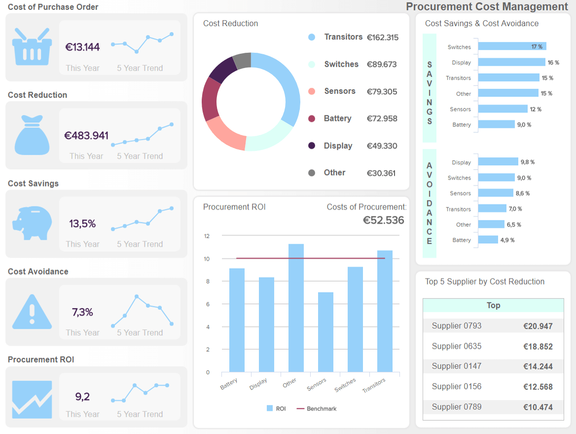
**click to enlarge**
The procurement department handles large volumes of data and by analyzing the costs and purchase of the procurement cycle, analysts can present data that will provide a building block for different units in order to save invaluable time. A procurement dashboard as visualized above can serve as a tool to present data in a visual and straightforward manner.
The dashboard starts with a depiction of cost and savings-related metrics and the trends that are occurred in a specific time frame. The trend lines show you that, in fact, most of the indicators increased but the reason could be that the number of orders also increased. The cost reduction in the middle of the dashboard is divided into different product categories and, that way, management can identify if there is space for even more rationalization of procurement costs. The dashboard continues with the ROI, a procurement KPI that is, actually, calculated differently than the regular ROI. In this case, you need to divide the annual costs savings by the internal costs and express it as a ratio. Setting a target will help the management to immediately spot if the cost-related efforts were successful. In this case, the target was set at 10 so you can clearly see how it developed for different categories.
On the right side, we can see details on cost savings and avoidance, which is important to keep an eye on since it can ease the decision-making process for managers that want to avoid future costs by introducing specific measures such as better negotiation processes. Finally, the top 5 suppliers will show you where are your costs allocated in relation to the suppliers which management can use for further optimization.
This kind of analysis is essential since procurement departments usually gather data from multiple sources such as ERP, databases, or CSV files, e.g. In order to optimize the cost management and increase the overall positive results, an analytic dashboard such as this one can prove to be beneficial.
c) Analytical retail KPI dashboard
Another analytical dashboard example comes from the retail industry. It creates an analytical parallel between management and customer satisfaction since the supply chain can directly affect it. This comprehensive dashboard shows us an overview of important aspects of a retail business that enable analysts to identify trends and give management the support needed in business processes. Retail analytics made simple.
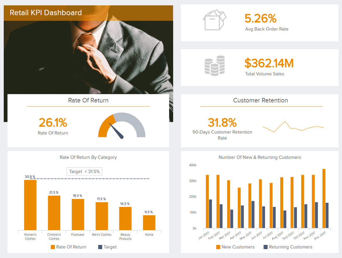
**click to enlarge**
As we can see on the retail KPI dashboard above, some of the crucial metrics such as rate of return (also depicted by category), the total volume of sales, customer retention rate, and the number of new and returning customers through a set timeframe, can give us a bigger picture on the state of the retail business. These retail KPIs can show how good you are in keeping your customers and developing brand loyalty, the management can clearly see which aspects of the business need to be improved. If you keep your back order rate as low as possible, customers won’t get frustrated and your overall numbers will perform well. It’s simple, keeping a customer happy will enable you to grow.
Our next type of dashboard is focused on pure analytics that supports strategic initiatives: a tactical dashboard.
Explore our modern dashboard software for 14 days, completely free!
What Is A Tactical Dashboard?
A tactical dashboard is utilized in the analysis and monitoring of processes conducted by mid-level management, emphasizing the analysis. Then an organization effectively tracks the performance of a company’s goal and delivers analytic recommendations for future strategies.
Tactical dashboards are often the most analytical dashboards. They are great for monitoring the processes that support the organization’s strategic initiatives. Tactical dashboards help guide users through the decision process. They capitalize on the interactive nature of dashboards by providing users the ability to explore the data.
The detail level of a tactical dashboard falls between the strategic and operational dashboards. A tactical sales dashboard can track your sales target (actual revenue vs. forecasted revenue). It allows for various filters and segmentation, including region, sales manager, and product. An operational dashboard would alternately track sales of these specific products against their competitors at different times throughout the year. As they are a bit higher level, tactical dashboards also tend to include more data visualization than operational dashboards. Let’s see this through an example in project management.
a) IT project management dashboard
The example below shows a detailed overview of a project with specific timelines and efficiency of the parties involved. You can define specific risks, see the overall progress, and average times of conducting specific tasks. After the project is finished, you can create a comprehensive IT report, evaluate the results, and make future projects more successful.

**click to enlarge**
The goal in every IT management is to increase efficiency, reduce the number of tickets, and deliver a successful project. By having the right tool in the form of an IT operations dashboard, a single screen can provide a project manager with all the data he/she needs to analyze all the important aspects of the project. While there are various types of project dashboards, this particular visual above is set to monitor project management efforts and alarm leaders if there are any anomalies within the process.
b) Social media dashboard
Since there are different types of business intelligence dashboards that cover various purposes and we have expounded on LinkedIn as a separate channel that needs to be monitored daily to keep companies in touch with their follower base and expand their reach, but now, in a tactical sense, a KPI scorecard can provide multiple benefits for managing social accounts and, consequently, ensure users have enough data to generate recommendations for future. To put this into perspective, we will show a business process dashboard focused on 4 main social media channels: Facebook, Twitter, Instagram, and YouTube.

**click to enlarge**
The dashboard starts with Facebook as the biggest social media network in the world with, currently, more than 2.5 billion monthly users. In our example, we can see that the number of followers did not reach the set target but it did increase in comparison to the previous period. In this case, social media managers can dig deeper to understand why and if this Facebook KPI needs particular attention.
Other metrics and channels have the same structure and tactical approach: the analysis of targets with additional comparisons, which enable managers to dig deeper into the data and derive recommendations for the future.
c) Supply chain management tactical dashboard
When you create a tactical dashboard strategy, it is important to focus on the analytical and monitoring part of the process that gives a backbone for effective, data-driven decisions. Our next dashboard concentrates on the supply chain of a logistics company.
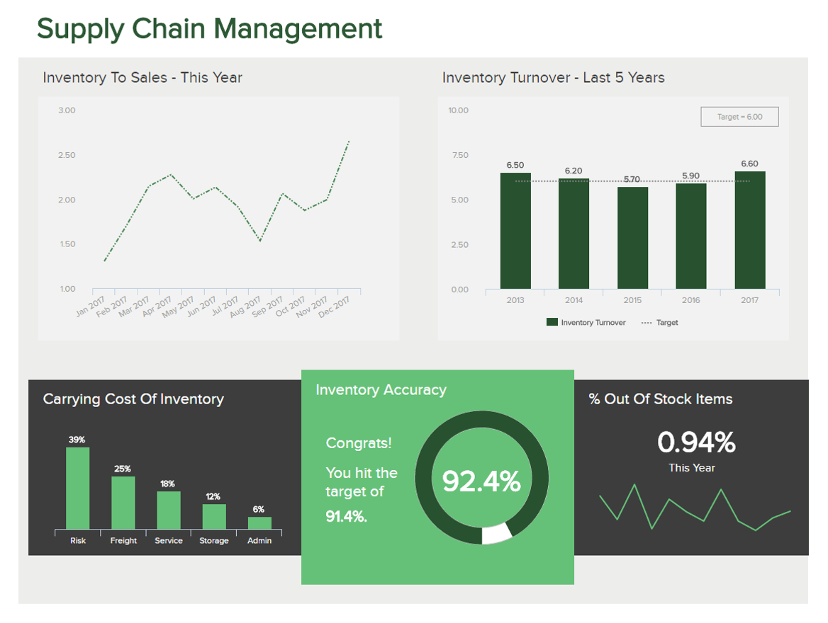
**click to enlarge**
The supply chain metrics depicted in our example above shows us how data-driven supply chain should be monitored to ensure a healthy process of the company. Additional focus on the inventory management will enable the company to have a clear overview of the logistics KPIs needed to stay competitive and avoid out of stock merchandise.
And not just that; you can monitor your inventory accuracy and act when you see this ratio drop. Discrepancies are normal but should be kept on a minimum. Other metrics such as inventory-to-sales ratio and the inventory turnover show the financial stability of a company – you need to know the ratio between your sold items and items in stock. The turnover will then measure how many times per year your company sells its entire inventory, adding up the efficiency of your organization: you can then analyze it on an operational level (remember our operations dashboard examples?) and see how you answer the demand of your products, what kind of operational practices you have and how your shipment management works, for example.
By fully utilizing logistics analytics, you stand to reap great rewards in your logistics business, and, ultimately, manage to retain customers.
Explore our modern dashboard software for 14 days, completely free!
Benefits Of A Successful Dashboard Implementation
So, you are now sold on the power of dashboards. Before you run off to the dashboard printing presses, we mean data visualization software, let’s talk about using the right ways to build and use dashboards. It is always best to start off with the right plan and implement dashboard design principles that will take into account the most relevant data of your company. A successful dashboard implementation will:
- Save time across an organization: IT, analysts, managers, C-suite, etc.
- Save companies money by highlighting unnecessary operational costs
- Provide insight into customer behavior
- Effectively align strategy with tactics
- Ensure a goal-driven and performance-based data culture
- Encourages interactivity and analysis
An ineffective dashboard implementation doesn’t maximize these dashboard benefits and can quickly derail any data-driven culture. Have no fear! Read on to see how you can easily avoid dashboard fatigue at your organization.
There are 2 most important parameters to keep in mind when implementing a dashboard:
- Don’t “data puke”
- Choose the right type of dashboard
Avinash Kaushik, Co-Founder of Market Motive and Digital Marketing Evangelist for Google, has great insight into some of the ways that dashboards fail. He has also come up with some rules for creating powerful dashboards. Kaushik’s biggest, and most entertaining, the rule is “don’t data puke.” It is important to remember that dashboards are not just reports. Make sure your dashboards include insights, recommendations for actions, and business impact. It also needs to deliver context! You don’t want executives and whoever else ends up with your dashboard making their own interpretations of the data. A dashboard should tell a clear enough data story where interpretation is unnecessary. Also remember, when it comes to KPIs, segments and your recommendations, make sure to cover the end-to-end acquisition, behavior, and outcomes.
Kaushik drives his rules home by stating “This will be controversial, but let me say it anyway. The primary purpose of a dashboard is not to inform, and it is not to educate. The primary purpose is to drive action!”
Now You Can Get To Dashboard Building!
By knowing the difference between the dashboard types, you can ensure you are presenting the right information to the right people, at the right time and using great data visualization types. While still stressing that you should always know what you are building, sometimes your strategic dashboards may seem a bit tactical, and tactical dashboard a bit operational. Don’t worry about it. Self-service analytics give you the opportunity to best fit dashboards to your needs, and create a dashboard strategy that will establish and develop a data-driven business environment.
To summarize our detailed dashboard types presented in this article, here are the most important ones you should consider when building your strategy.

If you’re ready to start building your first dashboard completely free, then our 14-day trial can provide you with a perfect solution!
The post Make Sure You Know The Difference Between Strategic, Analytical, Operational And Tactical Dashboards appeared first on BI Blog | Data Visualization & Analytics Blog | datapine.