
“Without big data analytics, companies are blind and deaf, wandering out onto the web like deer on a freeway.” – Geoffrey Moore
We live in the age of information. And, as a business, if you use your data wisely, you stand to reap great rewards.
Data brings a wealth of invaluable insights that could significantly boost the growth and evolution of your business. If you fail to use big data to your advantage, you could find yourself falling behind your competitors and eventually become obsolete.
But, with so much data and such little time, where do you even begin? Digital dashboards not only help you to drill down into the insights that matter most to your business, but they also offer an interactive visual representation that assists in swifter, more informed decision-making as well as the discovery of priceless new insights.
A data-driven business dashboard is your gateway to advanced business intelligence (BI) – the kind that will accelerate your success in an increasingly competitive commercial world.
Moreover, a dashboard builder is an invaluable business tool – if you use it right. To help you on your path to digital dashboard software enlightenment, we’ll define digital dashboards, look at the business-boosting benefits of data-centric dashboards, and present a selection of real-life examples.
Try our professional dashboard software for 14 days, completely free!
To begin our journey, let’s define digital dashboards.
What Is A Digital Dashboard?

A digital dashboard is an electronic tracking tool used to build an interactive, visual representation of data from a host of sources including databases, CRM- and ERP data or other web services to monitor important business metrics and overall company’s performance.
The user can, then, oversee a number of key areas by displaying historical trends, actionable insights, and real-time information in a digestible, presentational format.
If you’re curious to present your data in a meaningful way, online data visualization is a powerful tool to do so indeed – data-driven dashboards offer a means of gaining access to vital information and delivering it throughout the organization with ease.
The 6 Key Benefits Of Using Digital Dashboards
Now that we’ve asked ourselves the question, “What is a digital dashboard?” and looked at a definitive dashboard definition, it’s time to explore the six key benefits of using these online data analysis tools within your business.
- Decision-making: The accessible visual nature of digital dashboards facilitates faster data-driven decision-making in all key aspects of the business by empowering users to analyze and drill down into important metrics and insights with ease.
- Accessibility: Expanding on our previous point, the fact that these kinds of dashboards offer intuitive data visualization means that comprehensive training isn’t necessary. On the contrary – digital dashboards are designed to be accessible and easy to navigate. Their graphical nature allows for easy interaction with invaluable information.
- Mobility: Digital dashboards are customizable and present every single strand of relevant data in one central location and the best platforms are also accessible through mobile devices and apps, which means you can gain access to essential information no matter where you are in the world.
- Business intelligence: By gaining the ability to access past, real-time, and predictive analytics in addition to clearcut KPIs aimed at growth, evolution and professional development, you will enhance your team’s business intelligence skills – and ultimately, get ahead of your competitors.
- Benchmarking: Sector or industry aside, the best way to achieve or even exceed your goals is by working to clearly define benchmarks that align with your most important objectives. Digital-style dashboards feature dynamic visual key performance indicators that not only serve up invaluable real-time information but will also help you gain a deep understanding of what you need to do to meet important milestones.
- Communication: Organizational silos kill productivity and stunt innovation. The flexible yet detailed nature of BI-based dashboards makes sharing and discussing data-driven discoveries swift, simple, and effective. In turn, such tools encourage cross-departmental communication while breaking down communication barriers – both of which are essential to success in the digital age.
“Information is the oil of the 21st century, and analytics is the combustion engine.” – Peter Sondergaard
How Do I Make A Digital Dashboard: Best Practices

Now that you have a working knowledge of dashboard benefits and a data dashboard definition for reference, it’s time to move onto the next step.
To help you understand the key ingredients of data-driven dashboards – those that yield real results – here’s a glance at best practices.
1. Take care of your design
First of all, let’s focus on design. To get maximum value from your dashboards, you should always ensure that your dashboard design is clear, concise, and present only the information that is relevant to your organization – nothing more, nothing less.
Visually, you should always ensure your dashboard helps to tell you a story and answers all of the questions related to your business’s performance directly, meaning you should never cram in too many widgets as they will only serve to convolute matters. Moreover, you should place all of your information in a logical format that will help you paint a panoramic picture of your information. Consider placing tables at the bottom of the page as they typically offer less value than charts, graphs, or other metrics. To help you on your way, you can see our guide on the most popular dashboard ideas.
2. Communicate with stakeholders
Secondly, you should sit down collaboratively with other key stakeholders within the business and decide on your business’s core aims and goals, both time-sensitive and ongoing. By doing so, you’ll be able to make sure that your dashboards are designed to offer practical value and, therefore, actionable results.
3. Take advantage of the 5-second rule
Known in the design world as the “five-second rule,” your dashboard should always provide relevant information in around – you guessed it – five seconds. If that’s not the case, you should go back to the drawing board and make the tweaks necessary to make your dashboard more digestible.
One way of ensuring this is the case is by employing the “Inverted Pyramid” method where your most urgent or “newsworthy” information is displayed at the top, followed by your most important metrics and details, with any other relevant or miscellaneous information presented at the bottom, as shown in the diagram below. Now, while this type of framework is usually synonymous with journalism, it’s becoming an increasingly valuable blueprint in data-driven dashboard design.

**Source: Wikimedia Commons**
4. Set the right key performance indicators (KPIs)
When we define digital dashboards, it’s always important to remember that the primary goal of the best BI tools is to provide actionable information on a specific area of the business.
That said, when creating or developing data-driven dashboards, it’s vital that you focus on the most relevant data while working with the right benchmarks, no matter if you need to work on HR KPIs, procurement or marketing. By looking long and hard at your core business goals, you will be able to select dynamic KPIs that will provide interactive visualizations that empower you to drill down into specific organizational strategies, processes, and functions.
By choosing your KPIs wisely, not only will you be able to identify strengths and spot weaknesses, but you will gain the ability to tell a story with your data, making it more accessible to other stakeholders within the business.
5. Select the right charts and visualizations
With the right presentation and representation, digital dashboard software will be one of the best investments you will ever make. In addition to leveraging a digital dashboard with key performance indicators, you should always further refine your efforts by considering which chart types will prove most effective for the story you’re looking to tell or the insights you’re looking to display. To help guide your dashboard development efforts, here is a quick rundown of the most powerful chart types for digital dashboards in a business environment:
- Bar charts
- Line charts
- Sparklines
- Scatterplots
- Bubble plots
- Number charts
- Maps
- Area charts
You can get acquainted with these powerful interactive visualizations by exploring our definitive guide to choosing the right data visualization types for your business.
6. Utilize professional digital dashboard development software
In terms of data-driven dashboard capabilities, working with robust, adaptable, cutting-edge dashboard software will ensure that everything you do will be optimized for ongoing and sustainable business success.
Working with the right digital dashboard with key performance indicators will offer you a panoramic view of your most invaluable organizational data in all core areas, from finance and HR reporting to IT support, customer service, internal performance, marketing strategy, and beyond.
The digital dashboard capabilities of such tools are vast, as you can gain access to every facet of information from one easy-to-navigate, centralized location. Moreover, digital dashboard development tools are optimized for a multitude of devices, including smartphones and tablets, so you can gain access to all of your business insights from wherever you are 24/7. And, as interactive dashboards are customized, it’s possible to tailor the tools and layouts to your specific aims or preferences. Digital dashboard software brings all of the above best practices together in a way that is swift, seamless, and built for ongoing success, accelerating business intelligence for go-getting modern businesses across industries.
By following these best practices, you will create a dashboard that is not only efficient but also offers optimum value to everyone in the business, role or department aside.
With these best practices in mind, you will create an open, collaborative, and idea-driven internal culture that will set you apart in your niche while making your company more efficient than you ever thought possible.
“The most valuable commodity I know of is information.” – Gordon Gekko
Try our professional dashboard software for 14 days, completely free!
Take Advantage Of Digital Dashboard Examples
We’ve explored a digital dashboard definition and its value in a business context, now we’re going to share 6 real-life dashboard examples that drill down into key areas of management, IT, service & support, sales, social media, and retail.
1. Investor Relations Dashboard
For those in a management position, keeping a firm grip on the company’s operational initiatives is essential – but curating, calculating, and communicating key insights about the business’s overall situation are equally important. That’s where this dashboard comes in:
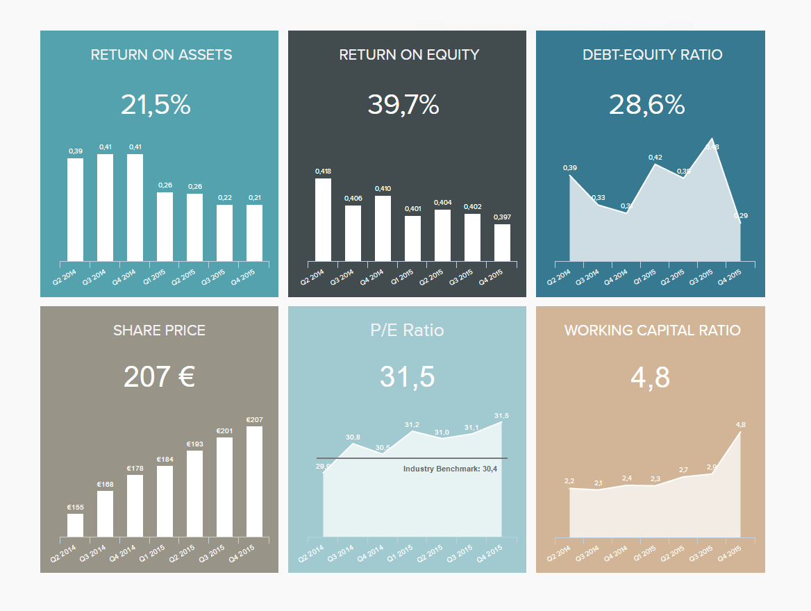
**click to enlarge**
The investor relations dashboard, part of our management dashboard examples series, serves up priceless data centered on the company’s investors, the information that they would like to see, and the type of insights that help ensure the health and consistency of these relationships.
Drilling down into KPIs including return on assets, return on equity, and P/E ratio as well as the all-important share price, this digital dashboard software provides all critical investment-centric information in one central location.
Primary KPIs:
- Return on Assets
- Return on Equity
- P/E Ratio
2. IT Cost Dashboard
As digital technologies evolve and internal systems become increasingly hyper-connected, the ability to track and manage your IT KPIs, especially costs, is pivotal to the ongoing success of your organization.
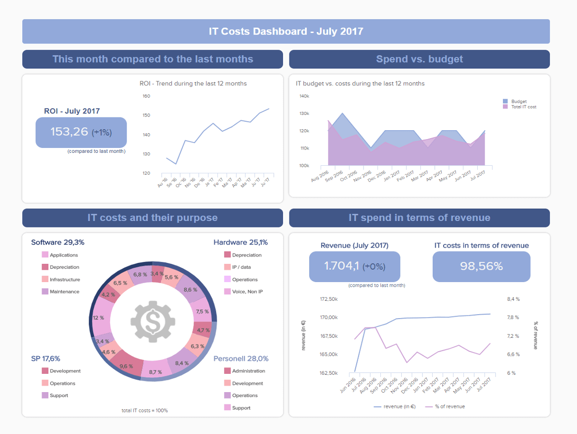
**click to enlarge**
By gaining a more in-depth view of elements including IT return on investment (ROI), a detailed breakdown of IT costs, and how those costs offset against revenue, this digitally-driven dashboard software offers all of the tools for continual departmental success and development.
Every IT manager or decision-maker has to factor costs into their daily operations, and the metrics offered by this particular dashboard will help drive down spending while boosting efficiency. A testament to the power of digital dashboards in a business environment.
Primary KPIs:
- IT ROI
- IT Costs Break Down
- IT Costs vs. Revenue
3. Customer Satisfaction Dashboard
Without a doubt, customers are the beating heart of almost any organization, and keeping your customers happy will result in ongoing commercial success. To help with such initiatives, the customer satisfaction dashboard focuses on all of the customer service KPIs and metrics necessary to track, analyze, and make positive changes to increase overall customer engagement and satisfaction levels.

**click to enlarge**
Here you will be able to enhance the level of customer experience you offer, improve your consumer touchpoints (websites, landing pages, etc.), deal with issues more swiftly, and boost customer retention rates overtime – essential to growth, evolution, and development.
Primary KPIs:
- Customer Satisfaction
- Net Promoter Score
- Customer Effort Score
- Customer Retention
“You can’t solve a problem on the same level that it was created. You have to rise above it to the next level.” –Albert Einstein
4. Sales Digital Dashboard
A data dashboard template with a great deal of depth features a comprehensive mix of sales KPIs, each designed to help modern sales teams monitor revenue while reducing churn rate and formulating strategies that boost profits on a sustainable basis.
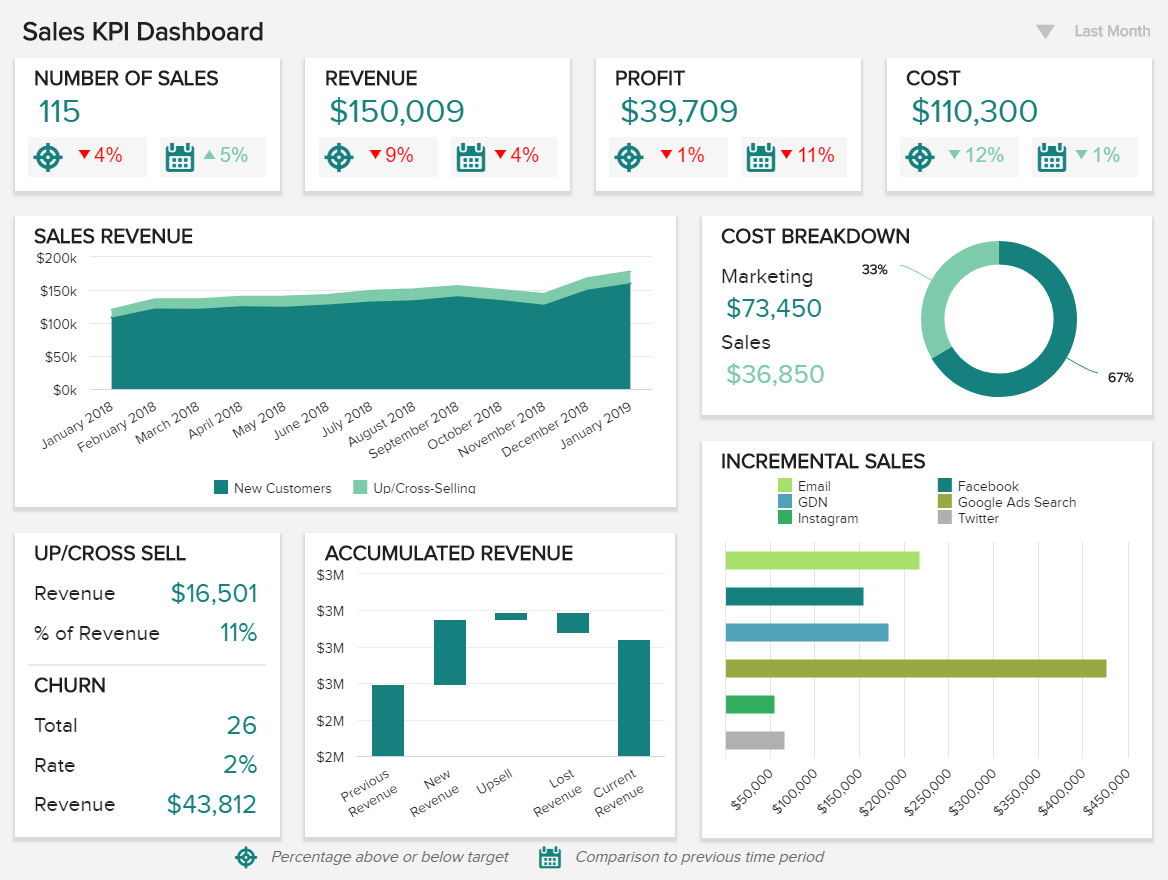
**click to enlarge**
In addition to helping sales representatives monitor performance over time, this cutting-edge sales digital dashboard offers a wealth of insight into cost breakdown as well as an interactive sales chart showing incremental sales revenue, among others.
Visually balanced and built to cover all strategic bases, this is the sales dashboard you need for both responsive, at-a-glance information and long-term strategic planning.
This is one of our most powerful and result-driven digital dashboard examples to date and a tool that will ensure your sales continue to grow over time.
Primary KPIs:
- Revenue per Sales Rep
- Customer Churn Rate
- Upsell & Cross-Sell Rates
- Profit Margin per Sales Rep
- Incremental Sales by Campaign
Try our professional dashboard software for 14 days, completely free!
5. LinkedIn Company Page Dashboard
The fifth of our digital dashboard examples, this most dynamic of additions focuses on optimizing your success through LinkedIn—the world’s number one professional social network.
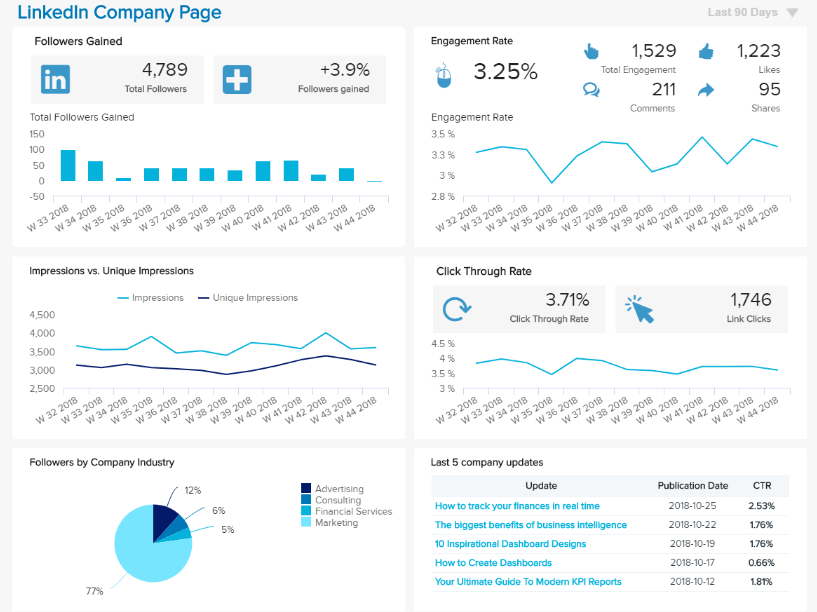
**click to enlarge**
Designed specifically to manage the ongoing growth and evolution of your company’s official Linkedin page, this fluid visual representation of core LinkedIn metrics will help you understand how to encourage engagement and expand your reach on the platform.
Digital dashboards in a business environment don’t get much more valuable than this, because if you have the power to optimize your LinkedIn company page, you will start to generate a comprehensive social media report that will enable you to gain a wealth of new leads, forge new business bonds, and become more authoritative in your field.
This perfect storm of metrics, visualizations, and KPIs will ensure that you have the right content at the right time, accelerating your commercial success as a result.
Primary KPIs:
- Followers’ Demographics
- Number of Followers
- Impressions & Reach
- Engagement Rate
- Company Update Stats
6. Sales & Order Dashboard
Last but certainly not least in our definitive rundown of digital dashboards for business, our retail dashboard, focused on sales and orders, is an essential tool for any retailer or eCommerce brand, regardless of niche.
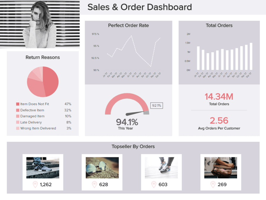
**click to enlarge**
In our hyper-connected digital world, online shopping is growing exponentially – and as such, online retail data is vast and plentiful.
While it’s true that gaining access to eCommerce-based data is relatively straightforward, without knowing how to channel it, it’s unlikely that you’ll ever be able to use your metrics or insights to their full potential.
By drilling down into sales and orders, this powerful tool provides a dynamic visual representation of key operational elements including order totals, order status, orders placed by region, perfect order rate, and even reasons for product return.
This cohesive tapestry of visual data and KPIs offers a level of depth that will empower any ambitious online retailer to save money, enhance efficiency, and boost their bottom line on a sustainable basis. An invaluable tool for the modern eCommerce entrepreneur.
Primary KPIs:
- Total Orders
- Total Sales by Region
- Order Status
- Perfect Order Rate
- Return Reason
“Processed data is information, processed information is knowledge, and processed knowledge is Wisdom.” – (Ankala V. Subbarao)
Try our professional dashboard software for 14 days, completely free!
We’ve considered how to define “digital dashboard” in a practical business context, examined benefits as well as best practices, and explored a powerful mix of real-world examples. During our journey, it’s become abundantly clear that there is everything to gain from using these dynamic business intelligence tools to your advantage.
Interactive, intuitive, and informational dashboards in a business environment will not only boost your internal intelligence but also offer everyone within your organization a level of insight that will foster better performance and efficiency, more cohesive internal communications, and more efficient operational processes across the board.
Dashboards of the digital variety are priceless to commercial success and are the very best tools for presenting your intelligence in a way that will yield actionable results – the kind that will help you make real waves in your niche while remaining adaptable in an ever-changing business environment. Embrace the power of dashboards today, and you’ll reap endless rewards tomorrow – don’t hesitate.
For more insight into data-driven tools for your organization and how to use them to propel your business ahead of the pack one insight at a time, read our essential guide to getting started with business performance dashboards.
If you want to create your own dashboards and take your organization to the next level, try our cutting-edge software for a 14-day trial, completely free!
The post Utilize The Potential Of Digital Dashboards In A Business Environment appeared first on BI Blog | Data Visualization & Analytics Blog | datapine.